Evaluating Defenders With PATCH

Today we’ll look at players in Europe through the lens of my PATCH defensive metric. If you can’t be bothered trawling through an entire post to understand the method, you only really need to know this: PATCH measures how much a defender prevents their opponents from advancing the ball through their territory. Clearly that leaves lots of information about defenders and defences in general on the table, but you’ll have enough information by the end of this post to bash me over the head with specific examples of players you think it’s misjudging. In fact, I’ll even help you out along the way and spell out all my worries about the metric, and the things I think it ought to do in the future.

That said, in PATCH’s defence, it has some nice characteristics:

  • A team’s medianish PATCH score correlates pretty well with shot numbers conceded by a team over a season, at around 0.7.
  • It correlates slightly better with xG conceded by teams, at around 0.75.
  • It persists year-on-year for teams, correlated at around 0.6.
  • A player’s median PATCH persists year-on-year at around 0.3.

But putting numbers aside, let’s see how you feel about some individual player values. If you look at the standard deviation of median PATCH values by minutes played, you can see things settle down at around 600 minutes:

patch-stddev

That’s because at very low values you get some weird outlying games, where players haven’t had any opponents in their territory and so score very highly. Just to be safe, we’ll set a cutoff a little higher, so here are the top European centre-backs with more than 900 minutes this season:

Competition Team Player PATCH
Italian Serie A Fiorentina Gonzalo Rodríguez 6.27
French Ligue 1 Lyon Samuel Umtiti 5.79
Spanish La Liga Real Madrid Pepe 5.52
Spanish La Liga Barcelona Gerard Piqué 5.24
German Bundesliga FC Bayern München Jerome Boateng 5.20
Spanish La Liga Barcelona Javier Mascherano 5.20
Spanish La Liga Málaga Raúl Albentosa 5.19
Italian Serie A Roma Kostas Manolas 5.06
Italian Serie A Lazio Wesley Hoedt 4.99
German Bundesliga Borussia Dortmund Sokratis 4.94
Italian Serie A Fiorentina Davide Astori 4.91
French Ligue 1 Paris Saint-Germain Thiago Silva 4.86
English Premier League Liverpool Martin Skrtel 4.72
English Premier League Liverpool Mamadou Sakho 4.72
Italian Serie A Internazionale Jeison Murillo 4.71
Italian Serie A Milan Alex 4.66
Italian Serie A Juventus Andrea Barzagli 4.63
French Ligue 1 St Etienne Loic Perrin 4.59
French Ligue 1 GFC Ajaccio Roderic Filippi 4.57
Italian Serie A Juventus Leonardo Bonucci 4.49

There are some clumps of teams here, so we should immediately be suspicious that we’re measuring team effects as much as player effects – PATCH currently doesn’t adjust for teams average scores, and for that matter nor does it score leagues differently. But these numbers are mostly defensible. It’s fun to note that Raúl Albentosa was a Derby County signing during Steve McClaren’s reign, and he’s recently been targeting Samuel Umtiti at Newcastle, so it’s nice to know I’ve built the perfect metric for him, even if you don’t buy it.

The same metric works for defensive and centre midfielders too:

Competition Team Player PATCH
Spanish La Liga Barcelona Sergio Busquets 5.66
French Ligue 1 Lyon Maxime Gonalons 5.50
Spanish La Liga Barcelona Ivan Rakitic 5.21
Italian Serie A Fiorentina Milan Badelj 5.19
Italian Serie A Roma Daniele De Rossi 4.84
French Ligue 1 Lyon Corentin Tolisso 4.81
Italian Serie A Fiorentina Borja Valero 4.60
Italian Serie A Fiorentina Matias Vecino 4.48
Spanish La Liga Sevilla Grzegorz Krychowiak 4.45
Italian Serie A Lazio Lucas Biglia 4.31
Italian Serie A Internazionale Felipe Melo 4.30
Spanish La Liga Las Palmas Vicente Gómez 4.28
English Premier League Liverpool Emre Can 4.26
Spanish La Liga Sevilla Steven N’Zonzi 4.26
German Bundesliga Borussia Dortmund Ilkay Gündogan 4.26
Italian Serie A Roma Radja Nainggolan 4.25
German Bundesliga FC Bayern München Xabi Alonso 4.24
German Bundesliga FC Bayern München Arturo Vidal 4.11
Spanish La Liga Rayo Vallecano Raúl Baena 4.10
English Premier League Liverpool Jordan Henderson 4.09

Busquets on top, all is right in the world.

Prospects

We can already see some talented youngsters in the tables above, so let’s focus purely on players that were 23 or under at the start of this season. I’ve relaxed the minutes to 600, here’s the top 30, taken from all midfielders and defenders:

Competition Team Player Date of Birth Minutes PATCH
French Ligue 1 Lyon Samuel Umtiti 14/11/1993 1852 5.79
Italian Serie A Lazio Wesley Hoedt 06/03/1994 1507 4.99
French Ligue 1 Lyon Corentin Tolisso 03/08/1994 2188 4.63
German Bundesliga FC Bayern München Joshua Kimmich 08/02/1995 727 4.54
English Premier League Liverpool Emre Can 12/01/1994 2054 4.44
German Bundesliga VfB Stuttgart Timo Baumgartl 04/03/1996 1287 4.30
German Bundesliga Bayer 04 Leverkusen Jonathan Tah 11/02/1996 2076 4.27
French Ligue 1 Lyon Sergi Darder 22/12/1993 696 4.15
German Bundesliga VfL Wolfsburg Maximilian Arnold 27/05/1994 877 4.10
German Bundesliga FC Bayern München Kingsley Coman 13/06/1996 895 3.98
Spanish La Liga Rayo Vallecano Diego Llorente 16/08/1993 2228 3.97
French Ligue 1 Paris Saint-Germain Marquinhos 14/05/1994 988 3.95
Italian Serie A Empoli Federico Barba 01/09/1993 927 3.93
English Premier League Tottenham Hotspur Dele Alli 11/04/1996 730 3.93
English Premier League Tottenham Hotspur Eric Dier 15/01/1994 2375 3.79
English Premier League Arsenal Héctor Bellerín 19/03/1995 2346 3.79
Spanish La Liga Real Sociedad Aritz Elustondo 11/01/1994 1643 3.68
Spanish La Liga Atlético de Madrid Saúl Ñíguez 21/11/1994 1337 3.66
Italian Serie A Lazio Sergej Milinkovic-Savic 27/02/1995 715 3.65
French Ligue 1 Monaco Wallace 14/10/1994 1654 3.63
German Bundesliga Borussia Dortmund Matthias Ginter 19/01/1994 1414 3.62
Italian Serie A Milan Alessio Romagnoli 12/01/1995 2102 3.62
German Bundesliga Borussia Dortmund Julian Weigl 08/09/1995 1575 3.59
Italian Serie A Lazio Danilo Cataldi 06/08/1994 1024 3.55
Italian Serie A Napoli Elseid Hysaj 02/02/1994 2279 3.52
Spanish La Liga Sevilla Sebastián Cristóforo 23/08/1993 614 3.51
English Premier League Chelsea Kurt Zouma 27/10/1994 1949 3.51
French Ligue 1 Nice Olivier Boscagli 18/11/1997 792 3.48
Spanish La Liga Getafe Emiliano Velázquez 30/04/1994 745 3.44
Italian Serie A Sampdoria David Ivan 26/02/1995 785 3.41

Note: the tables above filter to performances at centre-back or in midfield, if the values differ in this last table it’s because it considers their performances in a wider variety of positions.

So, cheer up Timo Baumgartl, PATCH doesn’t count mistakes. You’ll note again big clumps of players from the same teams (kudos, Lyon) – we know by now we’re probably measuring some systematic effects here. It’s also worth pointing out that if a young player is getting this level of minutes, in the big 5 leagues, they’re probably at a certain level without even looking at their numbers. But again, at first glance, this is a decent list.

Liverpool’s First Choice Centre-Backs

At the Opta Pro Forum I blurted out to the Liverpool contingent that my pet defensive metric quite liked their defending, to which they replied “ours doesn’t.” So I was a little crestfallen, but I’ll continue to talk myself out of a job here: Liverpool concede the second fewest shots in the league, so I’m right. They also have the worst save percentage in the league but nevertheless renewed Mignolet’s contract, so they’re wrong. QED. Let’s look more closely:
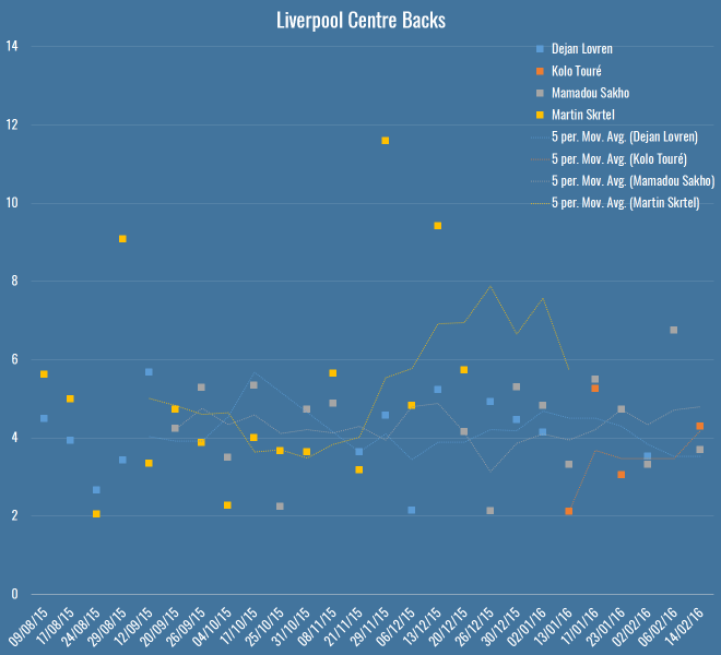
liverpool-cbs

Here you’ve got all Liverpool’s games this season – Rodgers up to the fateful Merseryside derby on the 4th October, Klopp soon after. The markers show individual PATCH performances, and the lines are five-game moving averages (although Touré isn’t quite there yet). The average PATCH for EPL centre-backs is around 3.3, and you’ll note that Liverpool are regularly exceeding that. You can also see that Skrtel had some insane outliers, but maintained pretty good form for Klopp until his injury (which – if you’re to believe renowned fitness troll Raymond Verheijen – was inevitable). The fight for second place is closer, but even taking Lovren and Sakho side-by-side, I don’t believe you’re left with a terrible pairing.

So, I don’t believe Liverpool’s defence is terrible and I think they have a solid foundation both in defence and midfield for Klopp to build on over the next season. I do believe they’ve been unlucky, as James Yorke points out in this article on Statsbomb. It’s funny to compare Everton and Liverpool’s defences this season – they both sit on 36 goals conceded in the league. Tim Howard has taken a lot of heat this year for his performances, all while facing 4.7 shots on target a game – the fourth worst in the league. Mignolet’s been facing 3.3 – the second least. While Howard has now been unceremoniously dropped and is soon to be shipped off to the MLS, Mignolet gets his contract renewed. Sure, some of of this is luck and not entirely his fault, but I genuinely believe you should not lay the blame on Liverpool’s defence, there’s not a lot more they could do to make Mignolet’s life quieter.

Arsenal’s Midfield

Through injuries, sentimentality or pure stubbornness, it’s hard to tell if Wenger knows his best midfield this season. I asked on Twitter and a lively debate ensued, but excluding the lamentation of Wilshere believers, the most common answer was Coquelin & Cazorla, with some pondering ways to insert Ramsey into the mix. What does PATCH think, purely defensively, of their appearances in the centre of the field?

arsenal-cms

Okay, well, first thoughts are that this is a graph format looking to get retired early, but here you have the four players who have put reasonable minutes into Arsenal’s central midfield, with the markers again showing their PATCH values in each game week, and the lines again showing a five game moving average. The average PATCH for a midfielder in the EPL is basically the same as a defender, around 3.3. This graph seems to imply that Cazorla has very good and very average games, and similar could be said for Flamini. Ramsey doesn’t seem like anything special, but is pretty low-variance. Coquelin seemed to start the season very strongly, but was fairly average in the lead-up to his injury.

Let’s break it down more simply, here are the averages:

Player PATCH
Santiago Cazorla 4.17
Francis Coquelin 3.83
Mathieu Flamini 3.79
Aaron Ramsey 3.60

So in black and white, we seem to more or less agree with Arsenal fans’ instincts.

N’Golo Kanté

What of players whose defending we rave about but who don’t make an appearance high up the PATCH ratings? N’Golo Kanté is way down the list, with a very middling  3.12. What’s happened there? Well, let me reiterate that PATCH measures territory and ball progression, nothing else. As I mentioned on the Analytics FC podcast recently, not all ball progression is bad. Much has been made of Leicester’s “bend, don’t break” defensive scheme this season – they give up territory but their low block often makes up for it, this means their midfield isn’t likely to score highly for repelling the opponent. Kanté himself regularly relies on pace and last ditch tackles (and he is an excellent tackler) to retrieve the ball once it’s in his territory, but if a pass has been completed in that territory, PATCH has already given him a demerit.

So… PATCH is useless because it misses demonstrably good players? Well, I’m not sure I’d go as far as calling Leicester’s defence bad, but it’s certainly well below par for a league leader, as Tim at 7amkickoff recently analysed. That said, I’ll admit I’m a little uncomfortable. I’ve said elsewhere, the essence of PATCH, or really any defensive metric, is this:

  1. Whose fault is it?
  2. How bad is it?

In PATCH, the whose fault part is calculated by territory (and there are lots of ways to do this better) and the how bad bit is done through ball progression. Alternatives to the second might pick Kanté up better – how many moves enter his territory, but never leave? That would be an interesting one to look at, and something I’ll explore soon.

For now, let’s just say that he’s valuable for Leicester inasmuch as his defensive skills turn into attacks very effectively, because it’s Leicester’s attack (and let’s face it, their luck) that is powering their title challenge, and not necessarily their defence. And that, dear reader, is another thing that PATCH doesn’t measure in defenders.

Conclusion

Hopefully if you’ve got this far, you believe there’s value in something like PATCH as a way of measuring defenders. It’s certainly entangled with teams’ systematic effects, and we suspect it has some false negatives. I don’t think looking at these outputs that there are tons of false positives however, but then Flamini rears his head so who knows.

I’m constantly working on PATCH, so I’d love to hear your ideas for places it might fall down, or things you’d like to see it applied to. To that end, I’ve bunged PATCH values for all EPL performances this season on Github. This file contains:

  1. Team
  2. Opposition
  3. Match date
  4. Player
  5. Date of Birth
  6. Nationality
  7. Starting lineup X position
  8. Starting lineup Y position
  9. Minutes played
  10. PATCH

Play, critique, ignore, do what you will. I’ll see if I can get to the point where these are updated for a all players in a bunch of leagues every week, but right now I can’t guarantee the scoring is going to be at all stable with all the changes I’m making.

Evaluating Defenders With PATCH

PATCHing Teams

I explained the current PATCH methodology in my previous post. Today I’m going to do a deep dive into how PATCH views the current teams in the EPL. Here’s what the table looks like (pre-Southampton on Saturday):

Team PATCH
Chelsea 2.84
Manchester United 2.79
Liverpool 2.73
Tottenham Hotspur 2.70
Manchester City 2.68
Bournemouth 2.64
Arsenal 2.61
Southampton 2.45
Leicester City 2.38
Aston Villa 2.34
Norwich City 2.28
Watford 2.27
Palace 2.27
West Ham United 2.27
Everton 2.22
Swansea City 2.18
Stoke City 2.13
West Bromwich Albion 2.11
Newcastle United 1.97
Sunderland 1.88

The values for PATCH are the 60th percentile of all performances for each team. You could, if you were highly motivated, work out the actual units for PATCH, but treat it as abstract. 2 is around average, somewhere just under 4 is the 90th percentile amongst player performances and 5+ would be outstanding. Given that, I am reasonably happy with how this shapes up.

PATCH Correlations

At first glance the numbers above don’t look bonkers, but how does the metric correlate with other team defensive stats? Let’s have a look:

Percentile GA xGA Shots Against SoT Against
10th 0.06 0.10 0.08 0.06
20th 0.22 0.30 0.20 0.15
30th 0.28 0.44 0.38 0.30
40th 0.29 0.56 0.54 0.44
50th 0.27 0.61 0.63 0.45
60th 0.27 0.71 0.76 0.55
70th 0.19 0.65 0.71 0.48
80th 0.16 0.60 0.62 0.38
90th 0.10 0.47 0.50 0.29

Those are the R2 values each team’s PATCH values at a certain percentile (10th being the lowest 10%, i.e. worst defensive performances), compared to some traditional measures. It’s great to see that we’re nicely correlated with expected goals against and shots, though I should point out that shots do directly go into the calculation – if you allow a shot through your territory, it’s marked against you. However, that’s only a small proportion of the gains measured. I tested with shots removed from the ball progression metric just to be sure and the correlations barely went down.

Defensive Ranks

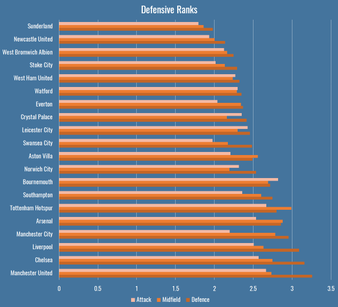
So far we’ve only looked at team’s performances en masse, as measured by PATCH. This is what things look like if we break them down by rank in a team’s formation:

defensive-ranks

There are a few interesting patterns that immediately jump out:

  • Bournemouth’s attacking midfielders and forwards are doing a bunch of defensive work.
  • Manchester City’s less so.
  • Tottenham have the least penetrable midfield of any team in the league.
  • As you might expect, Leicester’s attack and defence are a little more robust than their midfield, reflecting the fact that they press high then retreat low.

Lingering on these numbers a little longer, I thought I’d compare these numbers to someone else’s model for a further sanity check. Mark Thompson of Every Team Needs a Ron is one of my favourite writers, and is devoted to studying defenders in all their forms. He has a system to analyse how teams convert possessions into attacks, and attacks into shots, and how they allow their opponents to do the same. I compared the defensive rank data above with his data to see what the correlations were:

Defence Midfield Attack
Attacks per Possession 0.65 0.47 0.40
Shots per Attack 0.46 0.53 0.38

So, comparing the Attack, Midfield, Defence PATCH values from the graph above to Mark’s Attacks per Possession and Shots per Attack, we can get an idea of how much different parts of a team contribute to breaking up attacks. Defensive PATCH values explain 65% of the variance in opponent attacks per possession, whereas midfield is a much lower 47%. This makes some sense, while a lot of teams would love their midfield to quash potential attacks before they happen, it’s far more common that they make it throught to the last line. What’s interesting is the second row, where midfield performances explain shots pre attack better than defence. Again I wonder if this is bad shot quality – the defence don’t (and often don’t want to) stop low-expectation long shots. However if your midfield are putting in a good screening performance, attackers won’t even get the space for bad shots.

That’s one explanation, anyway. At the very least I’m happy to see a decent correlation with someone else’s model.

Patchwork Defences

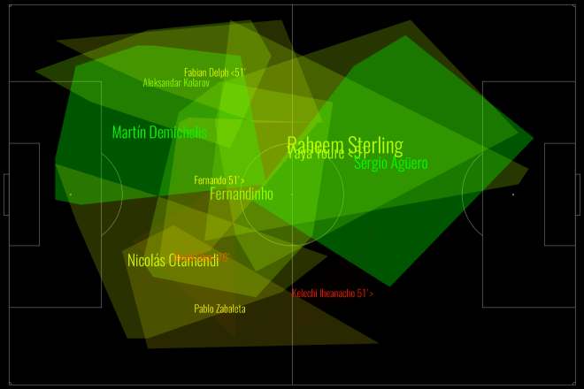
Defences are more than the sum of their parts. There are plenty of games where teams in aggregate can put in a great performance in terms of total or average PATCH values, but still be torn apart on the field. This happens often because of mistakes, which PATCH will probably never be able to account for, but it also happens because of weak links that let down the greater whole. Have a look at Manchester City from this weekend’s absolutely definitive title decider against Leicester:

defensive-areas-1901664770408076

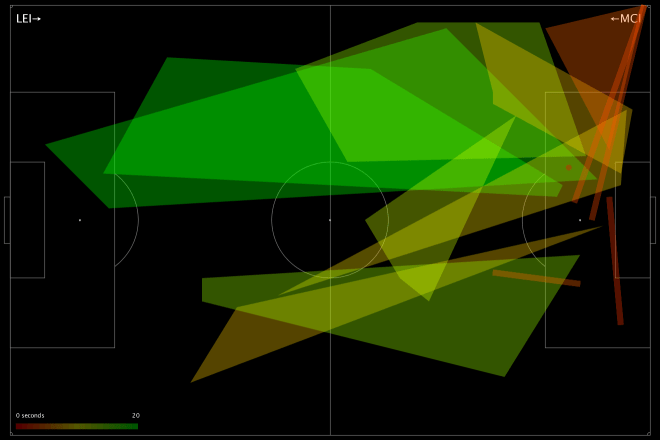
This is a fairly green chart – City policed a lot of territory, and in various parts of the pitch prevented Leicester from making regular gains. But look at their right-hand side: Otamendi didn’t score especially highly, and Zabaleta (who seems to be pushing quite far forward) scored even worse. Teams rightly fear Leicester’s right wing, because that’s where the formidable Mahrez nominally takes the field, but here we saw Mahrez pop up on the left a few times, including for Leicester’s 2nd goal, and Drinkwater also made some penetrative passes. We can see this from Leicester’s attacking chart for the day:

LEI-MCI

Very left leaning, basically nothing on the right. Despite the fact that City conceded twice from set-pieces, you still saw scare after scare from open play. The combination of a weak defensive right-hand side, and players taking higher positions than was perhaps advisable against the league’s fastest counter-attacking team (still 2nd in Europe after Caen), meant that good PATCH scores in many parts of the pitch did not necessarily add up to a good defensive performance.

Weak Links

Given what we saw in the Man City vs Leicester game, perhaps we should judge a defence by its weakest link? After all, if they’re allowing lots of ball progression in their area, that’s obviously where the opposition are attacking, whether or not they’re thinking of that player as exploitable. If we just look at the lowest score for a defender in each game (using just those with 90+ minutes in a game to be safe), this is what teams come out looking like:

Team Mean Weak Link PATCH
Chelsea 2.32
Manchester United 2.06
Arsenal 1.99
Manchester City 1.97
Liverpool 1.78
Aston Villa 1.77
Leicester City 1.74
Tottenham Hotspur 1.74
Southampton 1.74
Bournemouth 1.68
Swansea City 1.62
Norwich City 1.61
Crystal Palace 1.59
West Bromwich Albion 1.58
Watford 1.54
Everton 1.53
West Ham United 1.48
Stoke City 1.48
Newcastle United 1.45
Sunderland 1.45

Nothing radically different here, perhaps I should be a little uncomfortable seeing Villa that high, but they have save percentage and shot creation issues, not necessarily an awful defence. That said, these numbers correlate less well with each of the four measures we compared to earlier, so it seems less representative.

Total Territory

PATCH fundamentally rewards defenders for claiming territory, so lets look into any team characteristics can we pick up from looking at their territory as a whole. Who uses the most space? Who leaves the most gaps?

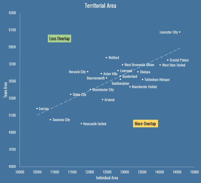
This is total area per game of players’ defensive territory for each team, measured first as the sum of individual areas, then as a merged team area:

Team Total Individual Area Team Area
Arsenal 12375 5286
Aston Villa 12338 5590
Bournemouth 12487 5540
Chelsea 13385 5612
Crystal Palace 14240 5750
Everton 10494 5181
Leicester City 14580 6078
Liverpool 12817 5626
Manchester City 12025 5405
Manchester United 13156 5438
Newcastle United 11767 5003
Norwich City 11949 5614
Southampton 12885 5525
Stoke City 11464 5347
Sunderland 12880 5560
Swansea City 10882 5052
Tottenham Hotspur 13520 5522
Watford 12482 5779
West Bromwich Albion 12943 5694
West Ham United 14022 5693

Which looks like this:

territorial-area

The X axis is the total individual area, which includes overlaps between players. The Y axis is the team shape, the area you get when you merge all the individual territories together and forget overlaps – also worth noting that the lower this value, the more empty spaces the team is leaving on the pitch.

It’s interesting because it reveals teams that are quite expansive in their defensive efforts (to the right are basically the pressers and aggressors, to the left is… Everton, asking very little of its defence). It also shows teams that have an overall compact defensive shape (Newcastle) versus those that are push up more (Leicester, Watford). Above the trend line are teams with less overlap, below are those that are more crowded when defending.

If we apply a similar sort of calculation to PATCH, we can take a team’s area and judge them not by the progression they allow through their territory, but by the progression that happens outside it. If we do that, these are the numbers we see:

Team Outside Territory PATCH
Manchester City 24.09
Liverpool 23.55
Norwich City 22.78
Southampton 22.04
Leicester City 20.77
Watford 20.75
Tottenham Hotspur 20.59
Aston Villa 20.22
West Bromwich Albion 20.19
Crystal Palace 19.37
Bournemouth 19.35
West Ham United 19.26
Chelsea 18.34
Manchester United 17.94
Arsenal 16.98
Swansea City 16.51
Stoke City 16.36
Sunderland 15.96
Everton 13.31
Newcastle United 11.28

So Man City, Liverpool and… Norwich (apparently) allow the least progression outside their territory. Newcastle and Everton leave the biggest gaps for opponents to operate inside.

Getting Goal Side

Above you saw how a lot goes on in empty spaces. The thing that worries me most about PATCH, and particularly the approach I’ve taken to trimming events for territory, is space behind a defender. Perhaps we should leave in all goal side events for a defender? Even more, should we project their territory back to the goal line, or even the goalmouth itself?

Well, you’re going to have to wait to find out. In my next post I’m going to finally get around to looking at some individual player scores, and I’ll experiment with how defenders should be blamed for goal side events then.

PATCHing Teams

Defending your PATCH

Here is Chelsea defending against West Brom in their 2-2 draw this season:

defensive-areas-1840762271078623

If I’m pointing you to this post from Twitter, it’s likely that you’ve asked, with varying degrees of alarm, what the hell you’re looking at with a chart like above. Because I’m terrible at making legends, here you go:

  • This is a chart of how Chelsea defended in the game.
  • Each shape is a player, it represents their defensive ‘territory’ – the part of the pitch they made tackles, interceptions, fouls etc.
  • The player’s name is written in the centre of their territory, and you should be able to see that some names, and their associated shapes, are bigger or smaller, depending on how much a player ranges around the pitch.
  • Each shape has a colour – this represents how much they allowed the opponent to progress through their territory: more green means the player was more of a brick wall, more red means they were more of a sieve.
  • Above, you might see that Oscar put in a ton of work and claimed a large territory – we reward players who claim a lot of territory, which is why he’s more green than some of the players he shared space with, even though he let the same opposition moves through.
  • Terry did not protect his space particularly well. Mikel and Fabregas provided little in the way of screening, and Matic, who replaced Fabregas, sat very deep but also offered little as they defended their lead.

Just as a quick sanity check on what you see above, WBA’s two goals came from a long shot from a huge empty space in front of Chelsea’s defence (left open by their midfield) and a move on Terry’s side of the penalty box:

Those are cherry-picked and don’t prove much, of course. No chart captures the entirety of a game, but hopefully you see that this is at least an interesting conversation starter to examine where Chelsea might have protected their territory better. Over the course of several games, you may notice the same patterns happening over and over again. At the same time, these are a great first stab at looking for weaknesses in an opponent’s lineup.

And that’s what you’re looking at. How does it work?

PATCH

A while back I started looking at defence in terms of how a defender prevents their opponents operating in their territory. This included a metric called PATCH (“Possession Adjusted Territorial Control Held”… yeah), which underwent several changes without me really writing it up, despite publishing all sorts of cryptic charts on Twitter. So, my plan today is to go through the whole methodology as it stands today. There’s still work to do, and it’s by no means a hard and fast measure of good and bad defending, but it’s interesting enough to share and hope for some feedback.

Defensive Territory

PATCH is all about defensive territory – where on the pitch a player is responsible for stopping their opponent. We don’t measure this in an idealised way based on formations or anything like that, all we do is look at where a player is actually defending. We take all their defensive actions and draw a line around them – that’s their territory. In the previous version, we only looked at events in a team’s own half or danger zone, so the system wasn’t great at capturing defensive midfielders, who often defend higher up the pitch. That was a problem, but one we needed to solve without including noise from things like aerial challengers on attacking corners etc. It was also a problem that if a player put in even a single tackle in a weird place (a left back on the right wing etc) then the outline of their territory grew hugely.

There are many ways to solve this, I’ve experimented with a couple. The first was to find the average point of a defender’s defensive actions, and just trim events within 1 standard deviation on the X and Y axes. The advantage of this is that it’s dead simple, very quick to do inside a database query, and the resulting area was still somewhat representative of where the player was on the pitch. But not representative enough: it was possible for players to completely disappear if their defensive actions were all taken in a large ring far enough away from the centre, and it occasionally wrongly accused players of retreating into a tiny territory. Here’s an old version of the Chelsea-WBA chart above, look how tiny everyone is, especially John Terry:

terry-bug

I then experimented with a similar approach using the straight-line distance from the centre within the same sorts of bounds, but really this just gave you a slightly more circular version of the previous box. I finally settled on decent compromise between ease of implementation and realism – I trim events to those within the 70th percentile of distance from the centre. Here’s another example, Tottenham’s 4-1 victory over Sunderland:

defensive-areas-1835048780325164.png

The one drawback over the previous version is that things look far busier, especially where there are overlaps, which is why I’ve started putting them on a black background, and increasing the transparency of lower-scoring players (because, you know, sieves are more see-through than brick walls). Departure from brand, I know, but probably more readable.

Future avenues to look at are algorithms like local convex hulls, or more probabilistic approaches. You can certainly use some sort of kernel density approach, although I appreciate having hard boundaries to territory as it is. I might be willing to sacrifice the ease of visualising territory for a better approach, however, and I’ve been looking at a fairly complex system whereby you look at defensive events and opponent buildup in previous (representative) games, and use a Bayesian system to determine the degree to which we think a player would usually be defensively responsible in that situation. I’d love to hear any other approaches people have tried.

Ball Progression

The original PATCH metric looked at how many opposition touches a defender allowed in their territory to judge how well they were doing, but this didn’t seem ideal. Some teams with a low block are happy for you to play in front of them to your heart’s content, as long as you don’t make any progress towards goal. Then there are some bad defences that just don’t take many touches to break through and score. So I’ve made a fundamental change here – we now measure ball progression through a defender’s territory. Whenever the ball is passed, or dribbled, or whatever combination of on-the-ball events happens, we look at how much progress the opposition have made towards the defending team’s goal. More than that, we look at the pace with which they’ve moved. Any player whose territory is intersected by the line of this progress gets blamed for it.

So now we’re really measuring something directly relevant – a team moving towards your goal is getting into better and better shooting positions, and preventing, disrupting or postponing this is more or less the core of good defensive work. As ever, it’s not a metric based purely on defensive actions – we still use things like tackles to help mark out a player’s territory, and we hope that there are enough of these events to get an accurate picture. But we’re not judging them on those numbers – we’re judging them in far more direct terms, based on protecting their goal.

Scoring

As with the previous metric, players are rewarded for the size of their territory , and then penalised for allowing the opposition into it, in this iteration based on ball progression. But the previous scores left me a little uncomfortable, with PATCH regularly recommending bad defences over good ones. I went back and looked in depth at the variables that went into the calculation, and especially the relationships between them.

The first thing I looked at was the possession factor, which was in there to account for the fact that teams without the ball can’t attack you. To be able to compare individual players from high and low possession teams, I normalised things to 50% possession. However it’s not as simple as that, because you might expect high possession teams to have fewer opportunities to make defensive actions, so they’d on average have smaller territories. Rather than scratch my head over it, I just looked at the numbers. It was quickly obvious was that possession really doesn’t have a reliable affect on a player’s territory. More surprisingly, the correlation with ball progression allowed is also extremely low. So, possession’s out. We’ll retcon the acronym later.

I also worried that players with large territories were being overly rewarded, and looked at a couple of different options like taking the root of the area. In the end, if you look at the data, it’s pretty much a linear relationship, but I’ve made the coefficients a little more accurate at least. I also looked at the degree to which minutes on the pitch affected defensive territory, and again, it’s almost impossible to find a reliable correlation. Therefore, only ball progressions is weighted per 90.

So that’s the algorithm – get the area, divide it by ball progression, which you weight per 90 and by pace. The bigger your territory, the better you protect it, the higher you’ll score. It looks a little like this:

(k * Area) ÷ ((Total Ball Progression ÷ Minutes Played x 90) ÷ Average Progression Duration)

That’s the gist anyway.

Caveats

This is the usual section where I list things I was too lazy to fix, but I promise I’m thinking about them:

  • There are better ways to calculate territory, but not necessarily ones that can run inside an SQL query before I get bored.
  • Players are blamed for ball progression no matter how much their territory is intersected by an opponent event. Even in the case where they hoof the ball way over your head, you still get blamed. Long term, I’d like to handle special cases like this, and assign degrees of blame to different territories.
  • I’m aware that the gaps between territories are interesting – you can defend your territory brilliantly, but still be in the wrong place. Watch this space.
  • Lots of goals, frankly, come from mistakes, which aren’t captured here.
  • Different positions might want different approaches both to territory and scoring.

It’s also worth point out a few other people working in the same space. Sander at @11tegen11 naturally has a version, with scores based on the number of defensive actions:

And David Sumpter of @Soccermatics has similar charts looking at just ball recoveries, which is fascinating to study teams’ pressing approaches:

Happy to hear any other ideas people have!

Defending your PATCH

Gary Neville’s Red Wedding

As an Evertonian, I was fascinated when Moyes went to Real Sociedad. The great Howard Kendall had enjoyed a wonderful spell in the Basque country, and Moyes seemed to start off comfortably enough. In Liverpool he won over the fans with his throwaway “People’s Club” comment, in San Sebastián all he had to do was eat some crisps.

It wasn’t to be a wildly successful stint for Moyes – he beat relegation and little else. But I kept an eye out for his results, if only because it took balls to take a job in Spain (and stay there) when Premier League clubs were calling. When Monday Night Football’s touch-screen savant Gary Neville was offered a Valencia job he had neither earned nor dreamt of, I was similarly impressed that he took the chance, but I felt even more intrigued – how could it be possible to learn on the job at a club of such magnitude?

Last night’s 7-0 massacre at the hands of Barcelona may prove to be Gary Neville’s Red Wedding moment, the young prince crowned too young and unprepared, fatally outmanoeuvred with murderous efficiency by his more experienced enemies. But at least Robb Stark won some battles along the way – what has Neville done? Valencia are winless in the league, and 14 points in 8 games off their results in the same games last season – almost 1.5 points per game lower than their previous pace. Nuno Espírito Santo led them to 10 fewer points in his 13 league fixtures compared to last season, 0.75 points per game off the pace. So you could argue things have got twice as bad under Neville, including elimination from the Champions League, and now the singular bright spot of the Copa del Rey all but extinguished.

Even before last night, it’s been slightly painful to watch at times – Neville wasn’t just an insightful pundit, he was also clear about what kind of football he might want a team under his tutelage to play, and who he hoped to emulate. He has made no secret of his admiration for Mauro Pochettino, and clearly hoped to emulate his high-pressure, high-energy approach. It’s possible there was a mix-up with the tapes though, because watching his first game against Lyon in the Champions League was that his team brought more to mind Pochettino’s predecessor André Villas-Boas – time and again they were caught high, as Lyon countered again and again, carving open the defence of one of England’s most capped defenders.

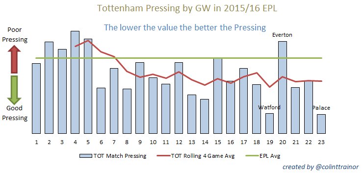
This can be forgiven – a style that relies on pressing high up the pitch takes time to develop, and Pochettino has been given that time at Tottenham. There is no doubt that’s it’s paying dividends, as pointed out by Colin Trainor recently:

But with Neville engaged in six month audition, and Valencia only five points clear of relegation at this stage, has he had any success in moulding his young squad in his image? What are the hallmarks of Neville’s time at Valencia?

  • Is he defending high? Neville’s team are performing defensive actions less than 1% further up the pitch than Nuno’s (35.1% vs 34.4%) a difference which is nullified if you include the 2014 season.
  • Is he pressing more? Valencia have gone from 5.2 passes per defensive action to 5.5 under Neville, indicating less pressing.
  • Is their tempo higher? Attacking pace has gone from about 3.4m/s to 3.6 m/s.
  • Has he perfected the wing play that Valencia want and expect from a Ferguson acolyte? Nope, same number of crosses per game on average (about 23), key passes slightly narrower if anything. He’s added a couple of successful dribbles per game, but having watched them, you’d expect that, as they rarely create any sort of overloads to offer a passing outlet.


I’ve watched them several times, and I’ll admit I am finding it hard to put a finger on what philosophy Neville has actually brought to Valencia. I asked on Twitter and nobody else seemed to have much of a clue either. Euan McTear wrote a decent piece looking at their numbers and some of Neville’s personnel changes, so I’m reluctant to go into much more depth in hope of finding answers, beyond the obvious fact that they’ve been a bit rubbish.

Rubbish but unlucky? On the face of it, expected goals doesn’t help the picture: I have them about -2.25 in expected goal difference during Neville’s stint, -0.95 under Nuno. However, it’s certainly fair to point out that Neville’s Valencia have been singularly unable to carve open a lead in the league, and perhaps this skews everything. To look into this, I ran 10,000 simulations of the shots from each of his games looking at the winner, but also the first scorer:

Home Away Home Score Away Score Home xG Away xG Home Win % Draw % Away Win % Home Scores 1st Away Scores 1st
Valencia CF Sporting de Gijón 0 1 2.07 1.26 56% 25% 19% 76% 23%
Deportivo de La Coruña Valencia CF 1 1 0.62 0.77 36% 38% 26% 38% 39%
Valencia CF Rayo Vallecano 2 2 1.14 1.72 25% 24% 51% 20% 76%
Real Sociedad Valencia CF 2 0 2.88 0.95 79% 13% 8% 62% 36%
Valencia CF Real Madrid 2 2 2.48 1.50 62% 20% 18% 43% 56%
Villarreal Valencia CF 1 0 0.43 0.66 20% 43% 37% 30% 38%
Valencia CF Getafe 2 2 1.04 0.71 42% 34% 24% 58% 27%
Eibar Valencia CF 1 1 2.78 0.53 89% 9% 3% 96% 3%
Valencia CF Lyon 0 2 1.19 1.26 38% 29% 34% 38% 55%

Note: the ‘score 1st’ columns don’t necessarily add up to 100% because of the possibility of nil-nil draws.

They conceded late – twice – to Real Sociedad, but deservedly so. They certainly could have beaten Real Madrid, the Villareal result seems cruel, and perhaps a better result against Getafe was possible. And then last weekend, the game against Sporting Gijón was notable mostly for Negredo’s series of increasingly spectacular misses.

You would have expected them to nip the first goal somewhere along the line here, and it’s possible at that point all sorts of counter-attacking preparation that we’ve never seen, cooked up on Neville’s iPads, would kick in. That not being the case, at the very least you could argue, as Neville has, that Valencia’s performances coming from behind show they still have some fight. They’re third in La Liga for points after trailing, albeit with no wins, but last night’s awful result undoes this entire narrative, barring unimaginable heroics in the second leg.

To me, it looks increasingly like his 6am Spanish lessons are only going to be useful in saying his goodbyes this Summer. Whether this proves to be a learning experience for him as a manager, or a big enough blow to his ego to send him back semi-permanently to punditry remains to be seen.

Gary Neville’s Red Wedding

Mid-Season Goalkeeper Review

Having descended into the quagmire of defensive metrics and never really returned, I thought it was about time to break my 2016 duck and publish something. Given that I occasionally spot people arguing in obscure forums pointing at the last iteration, I thought it was time to update my keeper ratings:

Keeper Mins Shots Saves Goals Save % Expected Saves ± Expected Average Difficulty Rating
Mark Bunn 188 6 5 1 83% 3.87 1.13 35.56 129.32
Fraser Forster 188 1 1 0 100% 0.86 0.14 14.45 116.89
Michel Vorm 94 1 1 0 100% 0.86 0.14 14.06 116.36
Karl Darlow 94 4 3 1 75% 2.62 0.38 34.53 114.56
Paulo Gazzaniga 187 11 8 3 73% 7.07 0.93 35.72 113.14
Alex McCarthy 565 34 29 5 85% 26.28 2.72 22.70 110.34
Sergio Romero 375 9 7 2 78% 6.47 0.53 28.14 108.24
Darren Randolph 286 12 8 4 67% 7.43 0.57 38.08 107.67
Adrián 1790 89 69 20 78% 64.11 4.89 27.96 107.62
Joe Hart 1871 60 46 14 77% 43.38 2.62 27.71 106.05
Hugo Lloris 1963 67 51 16 76% 48.10 2.90 28.20 106.02
Jack Butland 1972 100 78 22 78% 73.66 4.34 26.34 105.89
Declan Rudd 751 40 28 12 70% 26.51 1.49 33.73 105.63
Petr Cech 1967 86 68 18 79% 66.03 1.97 23.22 102.99
Kelvin Davis 95 7 5 2 71% 4.87 0.13 30.43 102.67
David de Gea 1591 64 46 18 72% 44.98 1.02 29.72 102.27
Heurelho Gomes 1948 83 60 23 72% 59.92 0.08 27.80 100.13
Thibaut Courtois 997 52 36 16 69% 35.99 0.01 30.79 100.03
Costel Pantilimon 1599 103 71 32 69% 71.01 -0.01 31.06 99.99
Kasper Schmeichel 2079 86 60 26 70% 60.21 -0.21 29.99 99.66
Artur Boruc 1604 62 38 24 61% 38.25 -0.25 38.31 99.35
Tim Howard 2069 107 75 32 70% 77.08 -2.08 27.96 97.30
John Ruddy 1316 63 38 25 60% 39.45 -1.45 37.37 96.31
Wayne Hennessey 1498 50 33 17 66% 34.45 -1.45 31.11 95.80
Tim Krul 754 49 33 16 67% 34.61 -1.61 29.36 95.34
Lukasz Fabianski 1979 85 56 29 66% 59.45 -3.45 30.06 94.19
Vito Mannone 376 23 15 8 65% 15.94 -0.94 30.69 94.09
Boaz Myhill 2077 92 63 29 68% 66.98 -3.98 27.19 94.05
Simon Mignolet 1889 65 42 23 65% 44.66 -2.66 31.29 94.04
Robert Elliot 1224 63 42 21 67% 44.82 -2.82 28.86 93.72
Willy Caballero 187 17 12 5 71% 12.83 -0.83 24.55 93.55
Asmir Begovic 1079 50 33 17 66% 35.75 -2.75 28.50 92.31
Brad Guzan 1897 99 64 35 65% 71.53 -7.53 27.75 89.48
Maarten Stekelenburg 1599 49 30 19 61% 34.38 -4.38 29.83 87.26
Jordan Pickford 93 11 7 4 64% 8.10 -1.10 26.40 86.47
Adam Federici 422 24 11 13 46% 13.16 -2.16 45.15 83.56
Adam Bogdan 93 5 2 3 40% 2.90 -0.90 42.03 69.00

So many narratives, so little time:

  • If only they’d dropped Guzan sooner – Bunn in his tiny sample has risen to the top of the class. Similarly, Southampton have finally got Forster back again and they too aren’t looking back.
  • Tim Howard isn’t that bad, get over it.
  • Petr Cech isn’t single-handedly winning Arsenal the title, get over it.
  • Jordan Pickford didn’t have the best of times deputising for Costel Pantilimon, the mathematical definition of the average goalkeeper.
  • Artur Boruc has slowly clawed his way back, and Bournemouth are no longer conceding every time their opponents so much as look at the ball.
  • Someone needs to rescue Alex McCarthy, he should have been going to the Euros this Summer.
  • Adrian is a pretty solid number 1 given the minutes under his belt.

Anyway, apologies for the wait. Lots of stuff I can’t talk about is going on behind the scenes, but there will be some cool stuff up here soon enough. Well, hopefully.

Mid-Season Goalkeeper Review

Expected Goals’ Greatest Partnerships

I thought it would be fun to have a look at players that had great chemistry through the years. Specifically: which two players generated the highest average chance quality when one passed to the other to shoot?

Here’s the top 20 producers and consumers (10 shots assisted or more):

Producer Consumer Shots Chance Quality
Luis Suárez Daniel Sturridge 13 0.2253
Gregory Van der Wiel Zlatan Ibrahimovic 11 0.2138
Franck Ribéry Mario Mandzukic 17 0.2026
Luis Suárez Neymar 18 0.2015
Theo Walcott Olivier Giroud 14 0.2009
Pablo Zabaleta Edin Dzeko 11 0.2002
Theo Walcott Robin van Persie 23 0.1998
Lukasz Piszczek Robert Lewandowski 11 0.1975
Vieirinha Bas Dost 12 0.1957
Sofiane Feghouli Paco Alcácer 14 0.1934
Daniel Sturridge Luis Suárez 12 0.1895
Thomas Müller Robert Lewandowski 21 0.1883
Jonathan Biabiany Amauri 14 0.1861
David Alaba Thomas Müller 13 0.1859
Gonzalo Higuaín Cristiano Ronaldo 14 0.1850
Ryan Giggs Javier Hernández 16 0.1846
Marcel Schäfer Bas Dost 11 0.1829
Marcelo Karim Benzema 13 0.1824
Gareth Bale Cristiano Ronaldo 47 0.1821
Alexis Sánchez Lionel Messi 21 0.1816

But this is selfish – what about reciprocal relationships? These are the highest average pairings based on chance quality created for each other:

Partnership Shots Chance Quality
Luis Suárez Daniel Sturridge 25 0.2081
Alexis Sánchez Lionel Messi 35 0.1731
Thomas Müller Mario Mandzukic 22 0.1675
Gareth Bale Cristiano Ronaldo 61 0.1664
Luis Suárez Neymar 34 0.1657
Theo Walcott Robin van Persie 39 0.1607
Luis Suárez Lionel Messi 34 0.1574
Henrikh Mkhitaryan Pierre-Emerick Aubameyang 33 0.1546
De Marcos Aduriz 29 0.1512
Aaron Ramsey Olivier Giroud 27 0.1506
Sergio García Christian Stuani 43 0.1502
Cesc Fàbregas Alexis Sánchez 24 0.1462
Jérémy Menez Zlatan Ibrahimovic 31 0.1447
Lionel Messi Pedro 53 0.1433
Karim Benzema Cristiano Ronaldo 93 0.1418
Juan Mata Fernando Torres 40 0.1414
Gareth Bale Karim Benzema 36 0.1396
Mario Götze Robert Lewandowski 41 0.1394
José Callejón Gonzalo Higuaín 38 0.1385
Raheem Sterling Luis Suárez 38 0.1383

The lesson you should take away from this? Even ignoring the biting and racist abuse, you really want Luis Suárez on your side.

Expected Goals’ Greatest Partnerships

The Case of the Missing Throughball, and Other Mysteries

Ben Torvaney noted last night that the number of throughballs per game looks like it’s been going down. It’s a pretty pronounced trend:

Count Completed Completion %
English Premier League 4450 1717 39%
2012 1655 596 36%
2013 1286 496 39%
2014 1132 460 41%
2015 377 165 44%
French Ligue 1 3738 1534 41%
2012 1605 593 37%
2013 942 378 40%
2014 825 411 50%
2015 366 152 42%
German Bundesliga 2333 1309 56%
2012 1115 550 49%
2013 715 432 60%
2014 401 254 63%
2015 102 73 72%
Italian Serie A 4985 2114 42%
2012 2789 1123 40%
2013 971 478 49%
2014 943 400 42%
2015 282 113 40%
Spanish La Liga 5601 2010 36%
2012 2146 745 35%
2013 1478 549 37%
2014 1559 557 36%
2015 418 159 38%
UEFA Champions League 1913 801 42%
2012 713 270 38%
2013 458 203 44%
2014 479 211 44%
2015 263 117 44%

If you were to take this at face value, it would be a hugely significant result: throughballs create high quality chances, and in the space of three or four years, defences appear to have discovered how to suppress them.

That’s obviously possible, but I strongly suspect that this is an issue with the way the data is being created. This is probably one of those things that you’re not supposed to talk about, and I don’t want to bite the hand that feeds this blog, so I hope the powers that be will consider this a good-faith bug report, and not the whining of an uppity lamprey complaining about the quality of the scraps it feeds off. Either way,  I caution you to look at any conclusions you make about a team or player’s output based on their number of throughballs over the last few years.

Just so we’re all on the same page, here’s the official definition of a throughball, which by all accounts has remained constant:

A throughball is a pass event which splits the defensive line, creating an attacking opportunity.

It’s difficult for us to confirm one way or another that a pass ‘splits the defensive line’ without watching every game. One thing we can notice from the table above is that conversion rates in some leagues seem to be going up. Perhaps that’s our first clue – is the ‘creating an attacking opportunity’ part being more strictly enforced? Perhaps failed throughballs are less likely to be throughballs.

Another clue is if you look at the next match event after a pass tagged as a throughball:

Season Clearance Interception Keeper Pass Shot
2012 10.13% 14.64% 22.58% 23.06% 13.81%
2013 7.79% 12.37% 26.83% 19.76% 17.25%
2014 8.71% 12.72% 27.17% 18.05% 18.20%
2015 6.80% 13.77% 27.27% 17.87% 20.13%

I’ve included only the types of events that seem to show a change. There are some interesting trends here:

  • Clearances have dropped as a proportion of next events. This backs up the theory that unsuccessful throughballs aren’t as likely to be tagged as such.
  • That said, interceptions have remained steady as a next event, however.
  • Balls that make it through to the keeper have increased somewhat as a proportion, up 5 percentage points from 2012-2014.
  • Throughballs that then set up a another pass have seen a big decline. Perhaps the interpretation of ‘creating an attacking opportunity’ doesn’t cover moves that aren’t as direct.
  • Shots have seen the biggest proportional rise from 2012-2014, which backs up the previous statement – the definition of throughballs seems to be increasingly focused on direct attacks.

There are possible footballing explanations for each of these trends. Maybe the Manuel Neuer effect has taken hold on goalkeeping across the leagues, keepers are pushing up and claiming the ball more, and that explains the increase in keeper touches after throughballs, for example. But overall, taking the absolute numbers, and examining some of the wider context, I’m suspicious.

If anyone can shed any light on the numbers, or has a genuinely persuasive argument that tactics have changed over the last few years, I’m all ears.

The Case of the Missing Throughball, and Other Mysteries

EGMAYO, An Injury Impact Metric

Different injuries have different impacts. In this article I am going to look at how historical injuries have affected teams from the perspective of expected goals. Given each squad member’s xG per 90, and the number of games they missed, what’s the total amount of xG that was sidelined in a season?

I call this metric EGMAYOExpected Goals Missed due to the Absence of Your Offence. Here are the top 10 EPL seasons by EGMAYO:

Season Team EGMAYO
2014 Arsenal 26.9
2010 Arsenal 23.3
2013 Arsenal 22.9
2012 Manchester City 19.4
2014 Liverpool 17.7
2013 Manchester City 17.4
2014 Manchester City 17.2
2014 Newcastle United 15.0
2011 Manchester United 14.8
2012 Manchester United 14.2

This indicates it’s not necessarily overly dramatic to point out that Arsenal’s injuries have had a big impact. Their lowest EGMAYO season was 2012, scoring 7.1, against an overall EPL average since 2010 of 6.7. Man City were title runners-up in their worst EGMAYO season:

Season Team Player Games Chance Quality per 90 Chance Quality missed
2012 Manchester City Jack Rodwell 18 0.36 6.42
2012 Manchester City Sergio Agüero 7 0.45 3.18
2012 Manchester City Micah Richards 22 0.12 2.67
2012 Manchester City Maicon 16 0.15 2.43
2012 Manchester City Mario Balotelli 4 0.53 2.12
2012 Manchester City David Silva 3 0.23 0.69
2012 Manchester City Aleksandar Kolarov 6 0.10 0.57
2012 Manchester City Vincent Kompany 7 0.06 0.42
2012 Manchester City Samir Nasri 2 0.16 0.32
2012 Manchester City Javi García 3 0.09 0.28
2012 Manchester City James Milner 2 0.12 0.23
2012 Manchester City Pablo Zabaleta 1 0.08 0.08
2012 Manchester City Joleon Lescott 2 0.02 0.03

Obviously it’d be far more interesting if we could better capture Vincent Kompany’s 7 game absence from City’s back line, or David Silva’s expected assists missed in his 3 games, but we’re not there yet, which brings me to:

Caveats

Sometimes my kids go up to a box of toys and just empty it onto the floor, play briefly with a couple of things, and then bog off to let mummy and daddy deal with it. Perhaps I haven’t made this abundantly clear, but this is very much my approach to football stats. I enjoy cutting data up, throwing it haphazardly on the floor, and seeing what it looks like, especially to other people. I intend to return to this later to clean up, but I’d like to make a few things clear:

  • This metric takes no account of the squad members that come in and replace injured players. Obviously these replacements have their own output in terms of xG, which may even exceed the injured player. Ideally, we would capture all of this in a similar way to Chad Murphy’s model, or even in more detail to capture the strength of schedule faced during each injury.
  • It takes no account of the importance of midfielders, defenders or goalkeepers. It’s only interested in the xG per 90 of a injured players, and therefore is weighted heavily in favour of strikers. I’m merely using it as one way to look beyond raw injury stats, I’m not saying it’s the final destination.
  • The EGMAYO calculation uses the same season as the injury for xG per 90, so players injured early on, or starting the season injured, aren’t measured particularly accurately.

So, I know all that, don’t point it out – I’m working on it. I just want to get this up for discussion’s sake, because it adds more context to articles like this in the Telegraph today. Comments welcome here, or on Twitter.

EGMAYO, An Injury Impact Metric

101 Weird Injury Stats

Everybody likes lists, and I’ve become interested in injury data, so today I’m going to attempt to give you ONE-HUNDRED AND ONE FORTY-THREE unbelievable and fascinating injury stats!

Some caveats before we begin: I only have access to data that’s public on the web, there’s a lot of junk so in some cases I’ve disregarded data that doesn’t seem to add up, and I’ve avoided including career-ending (or indeed life-ending) injuries and illnesses in individual stats, although they will show up in aggregate stats.

I should also point out that I am not a doctor, so I am not going to attempt to group injuries together in sensible ways beyond what’s absolutely obvious. I literally do not know what the knee bone is connected to. Do knees even have bones? What are bones? I don’t know, I only have data and find the human body disgusting. Let’s move on:

  1. Most injuries suffered by a player: 41, Franck Ribéry
  2. Most injuries suffered by a team: 409, Werder Bremen
  3. Longest individual injury: 1064 days, Shaun Barker
  4. Most days spent injured: 1568, Tufan Tosunoğlu
  5. Most days lost by a team to injuries: 15482, Werder Bremen
  6. Most injured body part: Knee, 2694+
  7. Shortest average injury: contused laceration, 4 days
  8. Longest average injury: fractured tibia and fibula, 246 days
  9. Shortest recovery time from fractured tibia and fibula: 44 days, Jan Fitschen
  10. Shortest recovery time from fractured tibia and fibula that I can check by Googling: 128 days, Neil McCann
  11. Longest recovery time from fractured tibia and fibula: 807 days, Christian Muller
  12. Most games lost in total across all leagues to an injury: 34366, Cruciate ligament rupture
  13. Most recurrences of same injury: 10, Tim Petersen, Knee injury
  14. Most different types of injury suffered: 33, Sven Bender
  15. Number of times I’ve got worried I’m not going to get to 101: 1
  16. Most injuries by league since 2012/13: 1081, German Bundesliga
  17. Least injuries by league: 231, French Ligue 1
  18. Most games lost to injury by league: 8954, English Premier League
  19. Least games lost to injury by league: 1569, French Ligue 1
  20. Most days lost to injury by league: 58457, English Premier League
  21. Least days lost to injury by league: 10201, French Ligue 1
  22. Most injuries suffered by a team in a single season: 79, Werder Bremen, 2008/9
  23. Most games lost to injury by a team in a single season: 294, Werder Bremen, 2008/9
  24. Least games lost to injury by a team in a single season: 6, Montpellier, 2011 (not entirely sure I trust the data)
  25. Most injuries suffered by an EPL team: 266, Arsenal
  26. Most games lost to injury by an EPL team: 2184, Arsenal
  27. Most games missed by an EPL player: 250, Abou Diaby
  28. Most different players injured: 85, Arminia Bielefeld
  29. Most different players injured in a single season: 30, AC Milan, 2011/12
  30. Most different players suffering same injury: 28, Austria Vienna, Illness
  31. Biggest outbreak of illness or flu at a club: 11 players, Austria Vienna, 2009
  32. Most different players suffering same injury in a single season: 13, Dundee Utd, Knee injury, 2014/15
  33. Most seasons a team has experienced the same injury: 10, Arsenal, Thigh problems
  34. Number of players relapsing within 1 game: 32, e.g. Vincent Kompany
  35. Longest time between relapses: 2732 days, Leighton Baines, Malleolar injury, 2007 & 2015
  36. Number of people who believed I would actually be able to come up with 101 of these: 0
  37. Fewest games missed for a title-winner: 6, Manchester City, 2011/12
  38. Most games missed for a title-winner: 351, Bayern Munich, 2014/15
  39. Most games missed or a relegated team: 318, Queens Park Rangers, 2014/15
  40. Fewest games missed for a relegated team: 40, Blackburn rovers, 2011/12
  41. Highest coefficient of variation among injury layoffs (10 or more incidences): 302.5%, Pneumonia
  42. Lowest coefficient of variation among injury layoffs:  37.8%, Cruciate ligament surgery
  43. R2 of career games missed to challenges (tackles, aerials, take ons): 0.0128

Okay, so, ran out of steam a bit and I think I’ve tweaked my anterior SQL ligament. If you are not satiated and have any particular stat requests, just ask on Twitter. I will of course be attempting to do some more serious work with this stuff in the coming weeks, but I just wanted to see what the data look like.

In the meantime, sort yourselves out Arsenal and Werder Bremen, you need to learn what serious pain is.

101 Weird Injury Stats

Arsenal’s Injury Woes: Changing Directions

An interesting conversation broke out on Twitter tonight about the timeless mystery of Arsenal’s injury record. Personally, I’m with Raymond Verheijen – Arsene Wenger should stop holding Running Man style training sessions with chainsaws and stuff, that’s just common sense. But what other factors might be at play?

Naveen Maliakkal wondered if something about Arsenal’s style might contribute:

I’d love to see how much recover sprinting arsenal have to do since they don’t rely enough on stopping counters high up the pitch and instead trying to recover into deep positions then from rather deep positions they attempt to counter. Essentially it seems like then play a style that relies a lot on covering large distances quickly.

This piqued my interest, and I wondered if all this running backwards and forwards might be quantifiable. So I came up with a simple approach:

  1. For every player, take the list of their touches in a game.
  2. Split them into sets of three – (1) where the player was, (2) where they currently are and (3) where they will be next.
  3. Draw a line between 1 and 2, and 2 and 3.
  4. Calculate the difference in angle between these two lines, i.e. how much the player has to turn.
  5. Sum all of this for each team in each season.

Picture some examples:

total-angle

So, three touches, all going forwards in a straight line is an angle of zero – the player hasn’t turned at all. Turning either direction, left or right, is measured the same, and of course the maximum angle is 180° if the player makes a forward touch and then goes directly backwards to make another. The numbers below are actually done in radians, but I didn’t want to frighten anyone.

Whether or not that makes sense, what it roughly measures is how much back and forth in total each team’s bodies have had to go through. Guess who put in five out of the top ten EPL seasons?

Season Team Total Angle Turned
2014 Manchester City 117061
2013 Arsenal 114293
2012 Arsenal 112857
2014 Arsenal 112388
2013 Swansea City 112267
2011 Arsenal 111055
2014 Manchester United 110062
2011 Manchester City 110017
2010 Arsenal 109965
2010 Chelsea 109663

Arsenal appear five times in the top ten – year after year, their players are changing direction more than pretty much any other team.

Now, let me throw some caution on this approach:

  • I don’t take timestamps into account, so you don’t know if there’s a second or five minutes between touches, but this is the same for all teams and is hopefully evened out in the aggregate.
  • This doesn’t capture how players actually move, as they can run sideways and backwards.
  • Arsenal would necessarily appear at the top, because they are a dominant, attacking team that has lots of possession and moves the ball around a lot (like the Manchesters and Chelseas you see up there). This is also true, but maybe playing well hurts.
  • I haven’t checked the correlation between these numbers and historical injury data. For example Newcastle don’t place highly here but are having a nightmare this season, with 10 players out. I’ll attempt to gather some data tomorrow to see what correlation exists.

But at the very least, the fact that Arsenal hover near the top of the list every single year is intriguing, and I must thank Naveen again for pointing this out.

Arsenal’s Injury Woes: Changing Directions