Stats
Time-to-Shot from Goal Kicks & Throw Ins
A while back, I talked about a simple, flexible metric called Time-to-Shot:
TTS looks at a particular game state and simply calculates the time – in seconds – until the team in possession makes a shot (Time To Shot For, or TTSF) and the time until their opponents make a shot (Time To Shot Against, or TTSA). The lower this time, the more dangerous the situation for one team or the other, the higher the time, the safer.
I was uncomfortable about it then, and to an extent I still am, it certainly doesn’t have that New Analytics smell we’ve all come to expect. But as long as you don’t treat it as a source of absolute truth, and just a tool to give you a rough glance at tactical trends, teams and players, it’s an absolutely wonderful time-saver. So, I thought I’d show a couple more quick examples of ways to use it in anger.
Goal Kicks
Jared Young wrote a great piece on Analysis Evolved recently about goal kicks, pointing out that long goal kicks past the halfway line have negative expected value, and shorter kicks have positive EV. Jared does this by looking at the probability of scoring from the second or third possessions after the initial challenge for the ball from a goal kick to see what happens next. And what happens next is exactly TTS’s wheelhouse, let’s see if we can confirm his result.
This is a chart of the average TTSA minus TTSF (TTSD, as I like to call it) in various zones of the pitch when a goal kick is aimed there, taken from the big 5 European leagues from 2010/11 onward:
| 46 | 33 | -39 | -51 | -44 | -13 |
| 77 | 61 | -1 | -41 | -27 | -67 |
| 81 | 3 | -39 | -23 | -19 | |
| -6 | 65 | -6 | -44 | -38 | 5 |
| 21 | 48 | -30 | -54 | -22 | 61 |
The first two-thirds of your half, as you can see, are positive values – you’re closer to a shot for than against. Most of the rest of the field is negative – putting the ball there means, on average, your opponent is going to get a shot away first. You should note that some of these buckets get quite small – the area around your own goal, obviously, as there’s only a tiny sliver of space in front of the box to pass to in that zone, and the very furthest zones (but by all means experiment trying to get it to that top-right corner). But that caveat aside, we can quickly check a result, and delve deeper with other metrics if we want to follow up.
Throw-ins
We can perform the same sort of calculation for anything we like, for example: where should you be aiming our throw-ins? These charts show throw-ins from various parts of the pitch (marked with a dotted border), with average TTSD values in each zone with more than 50 throws in the dataset:
| 0 | |||||
| -9 | 69 | 123 | |||
| 66 | 70 | 28 | -4 | 79 | |
| 61 | 11 | -33 | -36 | -3 |
| 82 | 103 | 217 | -32 | ||
| 136 | 105 | 77 | 33 | -17 | -72 |
| 98 | 57 | 28 | -16 | 24 | 17 |
| 115 | 116 | 107 | 27 | ||
| 56 | 94 | 84 | 75 | 88 | |
| 25 | 75 | 47 | 25 | 33 |
| 105 | 251 | 121 | |||
| 144 | 111 | 92 | 92 | ||
| 80 | 111 | 82 | 63 |
What does this show? Long throws aren’t just a attacking routine you should be working on near the box, they actually seem to be a reasonable default. In basically every case, teams are better off (i.e. closer to their own shot or further away from an opponent’s shot) if they forget about progressing the ball down the wing off a throw in, and instead focus on getting the ball into the centre of the pitch.
Now, once again: TTS is just a bunch of numbers munged together as averages, and the zones above are pretty broad. You’re not going to take these numbers straight to the training pitch. But I do think it’s simple and flexible enough that we’ve quickly found something intriguing, and this result merits a deeper look into the data at some point. I will work on that soon, and see if we can confirm that the inferences we get out of TTS very quickly can be backed up more rigorously.
State of the Stats 2016 Results
Over the past couple of weeks, the 2016 State of the Stats survey gathered responses from more than 200 people involved in football analytics, either professionally or as a fan. This is the second year I’ve run the survey, and like last year, it’s about who we are as a community, our hopes and dreams, and the problems we face in our work. My hope is that it provides inspiration, tempers expectations, and exposes issues and opportunities for the coming year. At the very least, it’s got some big-ass pie charts in it, and that’s about as analytics as you can get, as I right?
Who Are We?
Affiliations
First up, it’s great to see that nearly half the people filling out the survey don’t necessarily identify as stats-first people:
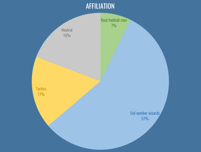
The first major issue I’d like to address here is that tactics people need to choose an appropriate epithet to describe them, along with ‘evil number wizards’ and ‘real football men’. I propose ‘The Pep Squad’, but I’m open to ideas. Nevertheless, this year has seen an interesting combination of cross-pollination and beef across the dividing lines of stats and tactics. Real football men hate laptops and Pep equally, so in a way provide us with some common ground, and the ascendancy of RB Leipzig has been a major driver in this regard: finally tactics and analytics people are united behind the common cause of destroying footballing traditions. Of course, stats people were trying to sign Naby Keita two years before you’d even created your first WordPress draft profiling him, but I wouldn’t know anything about that.
It is still the case that most analytics people view tactics writing as riddled with confirmation bias and small sample sizes, and tactics people view analytics people as missing almost everything interesting about football (e.g. basically every aspect of positional play, which is absolutely true). I maintain that the tactics community on Twitter and in the blogosphere is the single most unexploited resource for statsfolk. You have a group of smart people with fantastic intuition, who can help guide you to footballing truths and interesting patterns, and in return you can help add rigour and context to those intuitions. As an amateur analytics writer, you’re not going to get a better proxy for a manager or coach to drive your work. I hope to see more collaborations between the communities in 2017.
Ages
Once again, I neglected add in a question about the gender makeup of the analytics community, because I’m an arsehole, especially given this was pointed out last year. We go again. What we do have again this year is the age composition both inside and outside clubs:
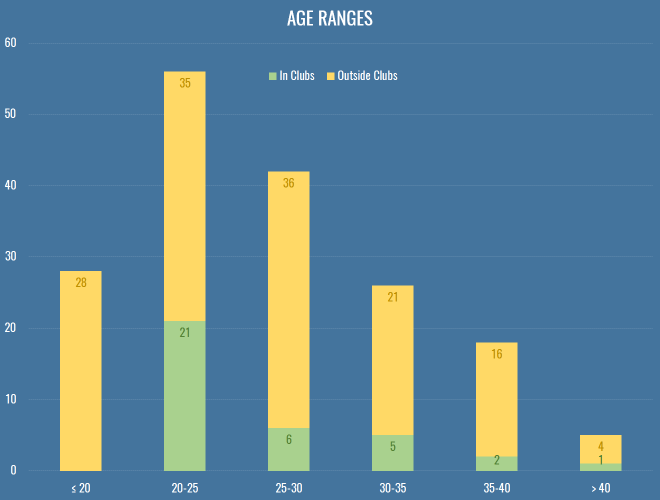
This is still very much skewed to the left, even more so for people at clubs or working as consultants. Without wanting to sound patronizing to my younger compatriots, a lot of this is that clubs have horrible pay structures (for all sorts of back room staff, forget about just stats). If you look at any of the analytics positions that get advertised publicly, you can sort of understand what someone with a mortgage and kids might not want to work the equivalent of two jobs for £20k, just because IT’S FOOTBALL! and IT’S A DREAM JOB! I was heartened to hear that the magnificent Christopher Long is soon to be entrusted with building the analytics team at an English club, and has stressed that he’s looking to pay market rate for technical positions. Hopefully that’s a sign of things to come.
Education
This is how we look in terms of education, comparing maths to sports science:
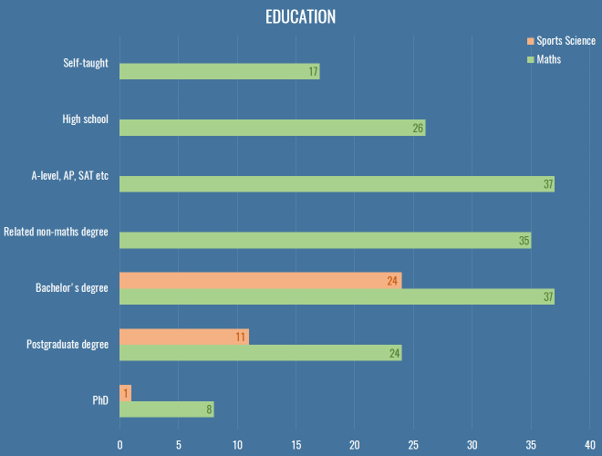
Of the roughly 40 respondents that work in clubs or as professional consultants, only two got there without at least a bachelor’s degree either in a mathsy or sports science subject.
We had about 40 respondents with a formal coaching qualification, including 3 UEFA A Licencees. What made me especially happy was to see these people reporting skills with R and Python, and beyond, making it clear that there’s an increasing expectation of data skills even in the traditional roles in the sport.
What do we do?
In case you’re looking for a niche to fill, here are the stats for different types of work people were engaged in in 2016:
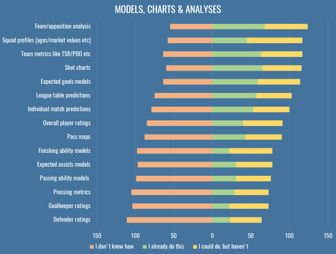
Once more, we find all the grubby stuff that has nothing to do with attacking at the bottom, which isn’t much of a surprise. If you’re working on attacking metrics in 2017, perhaps you might want to take a step back and see if your efforts could be better spent elsewhere. And if none of the above interest you, let’s have a trawl through the varied responses to the ‘Other’ option from this question:
- Evaluating crosses
- Evaluating counter-attacks
- Various time-in-possession measures
- Stability of possession
- Multitudes of non-shot models
- Measuring decision making
- Some version of WAR for football
- Cloning IMPECT/Packing
Here’s what people suggested you should work on in 2017:
- Simplifying and making actionable all your output
- Set piece analysis
- Treating events as sequences/networks
- Better GK metrics
- Studying transitions, identifying styles, the good, the bad
- A standardised definition of ‘possession’ for everybody to share and work from
- Measuring decision making
- Youth development
- Quantifying stats in monetary terms (e.g. for contract negotiations)
- Dribbling metrics
- Defence, goalkeepers, dear God anything but shots and xG
- Whatever increases a causal understanding of the sport
So, you can take all that to the bank.
Tools & Platforms
Here’s how we do what we do:
The geek in me wanted to get a bit more detailed this year, and find out who’s using GLMs versus random forests and stuff, but let’s be honest: a lot of analytics really is just swapping CSVs and scrolling around in Excel, which really explains why Tableau comes second here, being a slightly less painful version of that. People regularly ask me how to choose between R and Python, which annoys me because I had hoped Clojure would one day win, but its numerical computing suite (Incanter) has long since died. You should learn Python, all things being equal. R is great, and very productive in the first instance, with an enormous suite of maddeningly inconsistent libraries for almost anything you could stumble across on Wikipedia. You will have a long and happy career going from data, to slightly cleaner data, to ggplot2. But R is an atrocious general purpose language and runtime, has terrible error messages and documentation, and doesn’t have the depth of community that Python has in the wild. On top of that, distributed, GPU-based computing is going thriving more on Python than R, and as much football analytics is probably already going through the throes of well-reasoned-statistical-models versus wtf-black-box-deep-learning, the skills involved in the latter are going to prove hugely more valuable in industry over the next 10-20 years, and the bindings will appear on Python first, almost every time.
All that said, develop a brain and an eye for football first. There are people out there doing better work in Excel than you with your $20,000 of Amazon Web Services credit because they fundamentally know where to look better than you do.
In addition to these fundamental tools, almost a third of respondents used a video platform like WyScout or InStat. Not only are these essential parts of your recruitment and analysis pipelines within a club, they’re also hugely useful to confirm that things you’re seeing the data are actually real, or to find weird obscure bugs where possession chains last for ten minutes because someone had a head injury followed by a drop-ball.
What do we want?
Experience & Interests
We’re a disparate bunch, and it fills me with glee that something as simple as a bunch of spreadsheets can lead to so many different dreams and careers. Most of us are into stats because we feel it helps us understand the game better, but beyond that, we’re putting content out with the hope of one day getting paid, inside or outside the game.
I added a couple of options this time just based on the different people I’ve met and chatted to over the last year, but it turns out not many people are interested in gambling or the intermediary business. I’ll let you all chase those £20k analytics jobs and £25-an-article writing gigs for a couple of years and then you can maybe re-examine the parts of the sports industry where the real money is, and where the edges really make a difference. ¯\_(ツ)_/¯
Feedback
An issue that bubbles up again and again on Twitter is how best to give feedback. It is an incredibly difficult and delicate issue, but here is how you responded:
I put this in for a variety of reasons, some of them personal. I must admit, when I first got into analytics (a little over a year ago, publicly), I produce some absolute dross. Misleading, badly thought out, dead-end crap. I got likes and retweets… precious #numbers on Twitter for those polygonal attacking charts, and numbers are the mind killer. You get addicted to the numbers. You feel validated by the numbers. Those charts were borne out of studying attacking buildup (possession chains, as the good doctor would have us call them). I truly believe the use of space and speed are absolutely central to attacking play, and they were one exploration of that, both on a football level of just seeing what different teams looked like, but on a technical level, of working out possession chains, and calculating convex hulls of possessions given their coordinates. These are incredibly valuable things for me, and I was incredibly grateful for both the kind words and the feedback I received. But let me be absolutely clear about those charts: they will never ever win anyone a football game. This dawned on me, and was also pointed out to me by people in the game, and I moved on (to other stuff that is also probably of dubious worth, but hey, it’s a process).
This is how the system should work, more or less efficiently. People need space to experiment with data, develop ideas, learn about the game, and test the waters of people’s interest inside and outside the professional game. And I’ll also point out here that stats as entertainment is also completely valid. Not everything needs to be aimed at professional clubs, or even winning statistical arguments. But I think as a community, we need to learn to draw that line extremely clearly. Because there is abysmal and colourful work out there that reveals nothing but the fact that its creator had some data and wanted to do something with it. There’s work that gets widely retweeted, that leads to more of the same, on a schedule, for every club and every game, and the numbers increase, but the ideas underlying the work stagnate. Nothing new is added, no assumptions are invalidated, nothing is tested against real games. One example this week of avoiding this cycle was Sander exploring some centrality measures from graph theory in his passing charts (already the most controversial visualisation in football analytics). I know some people haven’t worked out the mute buttons on their Twitter clients and post game viz can clog their timeline, but I’m at least impressed that he’s not just taking the retweets and sitting here. I hope we’ll all experiment with new metrics while still trying to relate them back to fundamental theories about the game of football.
At the same time, we have terrible communal memory about what’s been tried and found unhelpful before. Part of this is that we, grumpy and defensive about our work as we are, have managed to drive elder statesmen of the field like Dan Altman away (and he seems to be doing okay without Twitter). Dan’s intentions could be hard to fathom, he would judge other people’s work despite the details of his own being proprietary secrets, which often felt inequitable. But we should also be honest – all the people that responded above that they wanted to work professionally in clubs with analytics, every single one is competing with each other. For recognition, for prominence, so they can one day get one of those sweet £20k a year jobs. Despite all of that, most feedback, however vicious it might seem via the tone-deaf medium of Twitter, is coming from a place of statistical truth or practical football experience. Some of it is foul-mouthed, but I believe these people would still buy you a pint at the Opta Pro Forum.
If the above chart tells you anything, it’s that people want feedback on their work. They may not want the savage but artful trollistry of an anonymous coconut, but they want to learn, and get better. Sure, they want numbers too, and they need space to experiment, but I don’t believe were killing promising ideas in their cribs by pointing out flaws in nascent work.
Impediments
So, what’s stopping us doing better work? This is what people thought:
Everybody wants data. More data, better data. I was a bit sad to see ‘lack of scientific rigour’ down there, because it just means when we get all this data we’ll make a massive mess of it, thus Dr Marek Kwiatkowski’s seminal piece. But I stand by my comments that we need to play and explore before we make much progress.
THE BIT WHERE I GET YOU SOME FREE DATA
And so I bring good tidings: the nice people at Stratagem have a standing offer to anyone with a blog that wants to write about sports data:
As a company we are simply looking to increase the awareness of our unique dataset through partnerships with prolific and respected members of the analytics community. We have a team of over 50 performance analysts who have collected data on over 10,000 matches from 22 professional football competitions to date, with specific focus put upon on chance quality. We break scoring chances down into six categories and collect granular details such as number of players between the ball and goal, defensive pressure and shot quality. All matches since June 2016 come complete with XY coordinates on key events such as goals, chances and assists.
If you’d like some data to write an article and you’re happy attributing the source, you can contact Dave Willoughby directly, or head over to the Stratagem website to find out more about what they do.
On top of that, you can also join the efforts over at WoSo Stats, a community that gathers and analyses data about women’s soccer. I suspect they are always on the lookout for anyone who can help keep their hand-coded data up-to-date.
So, that is a step in the right direction, and nobody even mentioned the dark lord’s name. Aside from data, you’ll note that the option about club wages scored highly, whereas very few people chose the two ‘aggro’ options near the bottom – indicating once more that people really are looking for healthy debate and robust feedback of their work. I put in the question about copying work because it’s something I often hear grumbles about, but generally I think it’s entirely healthy for people to clone and (preferably) elaborate on others’ work, as long as some minimum amount of credit is given. If anything, I think we should be making it vastly easier to copy and replicate our work, which can only have a positive effect on the robustness of our conclusions.
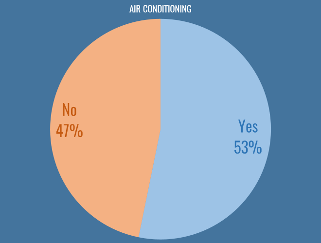
Air Conditioning
Possibly the most fundamental philosophical question facing us as football analysts today is whether or not you work in an air conditioned office. I am glad to say that the scales are tipping in favour of climate control, and I hope clubs continue to invest in this essential technology:
Conclusions
It’s been a funny year. With SmartOdds canning their analytics department it felt like the one organisation that really shouted about their use of stats had stepped back, damaging the field. As I hope some of these results show, the work still goes on elsewhere, just slightly more quietly.
For a while it seemed like there was a dearth of new work in the fanalytics community, with a lot of people having moved on from Twitter for professional or personal reasons. But towards the end of the year, there’s been a fantastic influx of new stuff. I don’t really want this to turn into a roundup of the best work in 2016, and I also don’t want to risk missing anybody out, but I feel going into the new year that there’s a strong cohort of active, prolific people shining a light in exactly the right areas.
Anyway, I promised myself I’d get this out in 2016, so if you’re looking for a rousing conclusion you’re out of luck. All I’ll say is that if you do even semi-good work in public, good things will happen to you, no matter how many crappy Sherwood memes you tweet to try and make yourself unemployable.
State of the Stats 2016
Time to Tiki-Taka
Speaking to Bild this week, Giovanni Trapattoni is quoted criticising Pep’s style at Bayern Munich:
For me there’s too much possession. Tick, tack, tick, tack. Tuck, tuck, tuck. To and fro. With too little return. And after 27 minutes they shoot on the goal for the first time – that’s inefficient.
Tobi (@redrobbery on Twitter) posted some passes-per-shot numbers dispelling this myth, showing that FCB are actually pretty decent at getting regular shots on target:
Trapattoni says Bayern pass too much without taking shots. Here’s this season’s Champions League data. pic.twitter.com/g0Aac6Eo2s
— tobi (#14) (@redrobbery) 7 April 2016
I thought I’d add to this with some time-to-shot-for numbers because they are even more pronounced. Here’s the median TTSF for each team’s passing in the Champions League, that is, the average number of seconds it takes between a pass and a shot:
| Team | TTSF |
|---|---|
| Real Madrid | 119 |
| Bayer 04 Leverkusen | 146 |
| FC Bayern München | 148 |
| Atlético de Madrid | 150 |
| Juventus | 167 |
| Lyon | 173 |
| Galatasaray | 174 |
| Roma | 175 |
| Manchester City | 181 |
| Barcelona | 188 |
| Paris Saint-Germain | 192 |
| Olympiakos | 193 |
| Manchester United | 199 |
| VfL Wolfsburg | 199 |
| Benfica | 201 |
| FC Astana | 210 |
| Chelsea | 220 |
| Arsenal | 222 |
| FC Porto | 223 |
| Sevilla | 224 |
| Valencia CF | 227 |
| Borussia Mönchengladbach | 237 |
| Dinamo Zagreb | 238 |
| Shakhtar Donetsk | 238 |
| Dynamo Kyiv | 253 |
| KAA Gent | 261 |
| Zenit St Petersburg | 267 |
| CSKA Moscow | 277 |
| Maccabi Tel Aviv | 284 |
| PSV | 315 |
| Malmö FF | 399 |
| BATE Borisov | 510 |
Borisov messing with my colour scheme there, but still – there you go: 2 minutes, 28 seconds, a mere factor of 10 out for Trapattoni. It’s a pretty reliable number for Bayern too, if you look here at the distributions of each team’s TTSF values for passes:
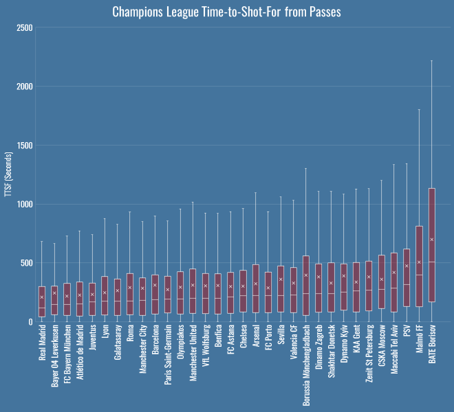
Even at their absolute slowest, Pep’s team have only been about 750 seconds from tick, to tack, to shot.
Time-To-Shot
Expected goals, in all its forms, lets us measure the danger of a shot. There are increasingly many non-shots expected goals models that go beyond this, measuring the danger of the attacks that build up to shots, or beyond, to cover all the different situations that can occur in a game. In fact here’s Sarah Rudd, now of StatDNA, talking about a model using Markov Chains all the way back in 2011. In the ideal world what we want is to be able to show a computer a game state – as if we’d been watching the game on TV and hit the pause button – and ask, how good or bad is this situation for each team?
Today I’m going to introduce an extremely simple (really, overly simple) approach to answering that question, called Time to Shot, or TTS. TTS looks at a particular game state and simply calculates the time – in seconds – until the team in possession makes a shot (Time To Shot For, or TTSF) and the time until their opponents make a shot (Time To Shot Against, or TTSA). The lower this time, the more dangerous the situation for one team or the other, the higher the time, the safer. Obviously this isn’t taking into account the quality of the shot, and that’s a pity, but it has the advantage that it’s enormously simple to implement.
In this post, we’ll use raw, real-world values for TTS, looking at team averages for a bunch of interesting situations. Then, over the next few days and weeks we’ll also see if we can build a predictive model that’s any better than just taking the average, so that we can ask more complicated questions. For example, which players reduce expected TTSF or increase expected TTSA the most? Which teams *cough* Leicester *cough* seem to be able to pull shots out of nowhere in contrast to their expected TTSF?
My hope is that ‘time to shot’ outputs are much easier to communicate, especially in neutral situations, than tiny probabilities. An xG from some possession far from the goal of about 1 in 1000 for and 1 in 3000 against is pretty hard to visualise. But if I tell you a specific game state is on average 120 seconds away from a shot for and 360 seconds away from a shot against, it’s a bit more grounded in reality.
It’s also easy to wrap your head around for particular short-term strategies:
- Most of the time you’re looking to decrease your TTSF (to zero, hopefully) without drastically decreasing your TTSA.
- If you are a counter-attacking team, you might allow a team to decrease their TTSF, as long as your TTSF is also coming down.
- If you’re trailing towards the end of the game, you might risk reducing your TTSA for a decrease in your TTSF.
- If you’re ahead in the dying minutes of a game, you’re probably more concerned with increasing you TTSA at the expense of everything else.
Okay, I said it was easier to communicate and then used a bunch of abbreviations to make it sound complicated, but seriously, I just think it’s easier to visualise as a concept. And just so you know – if you have the ball, then on average you’re 4 minutes 3 seconds away from having a shot, and 4 minutes 57 seconds away from conceding one. This dearth of action presumably explains much of the defending we see in the MLS.
League Table
Here’s the TTS league table – TTS (F)or, (A)gainst and (D)ifference, the latter calculated as TTSA minus TTSF:
| Team | TTSF | TTSA | TTSD |
|---|---|---|---|
| Manchester City | 185 | 395 | 210 |
| Tottenham Hotspur | 187 | 386 | 199 |
| Liverpool | 187 | 365 | 178 |
| Arsenal | 204 | 312 | 108 |
| Manchester United | 253 | 354 | 101 |
| Chelsea | 217 | 301 | 84 |
| Bournemouth | 255 | 334 | 79 |
| Southampton | 232 | 305 | 73 |
| Leicester City | 238 | 280 | 42 |
| Everton | 244 | 280 | 36 |
| Stoke City | 267 | 288 | 21 |
| Aston Villa | 282 | 287 | 5 |
| West Ham United | 245 | 249 | 4 |
| Norwich City | 284 | 280 | -4 |
| Swansea City | 281 | 275 | -6 |
| Watford | 278 | 266 | -12 |
| Newcastle United | 269 | 256 | -13 |
| Crystal Palace | 291 | 248 | -43 |
| Sunderland | 289 | 236 | -53 |
| West Bromwich Albion | 305 | 251 | -54 |
On average, you’re 185 seconds away from a Man City shot, whereas millions of mayflies hatch into their adult form, only to die never having seen West Brom shoot. City are making history with their shots conceded numbers, and they win the TTSA battle here as you’d expect. Now, remember that TTSF and TTSA are values for the team in possession, so the average TTSA will be higher, as the opponent would need to first win the ball back before they can eventually make a shot.
Overall these numbers aren’t very interesting, nor are they news – we already have shot totals and per 90s, so what’s the point?
Pressing & Counterpressing
The point is, we can do things like this, splitting team’s values up by different event types:
| Team | Ball Recovery | Dispossessed | Interception | Tackle |
|---|---|---|---|---|
| Tottenham Hotspur | 184 | 211 | 211 | 212 |
| Manchester City | 186 | 196 | 206 | 222 |
| Liverpool | 196 | 253 | 199 | 222 |
| Chelsea | 206 | 215 | 250 | 247 |
| Arsenal | 212 | 221 | 242 | 237 |
| Leicester City | 246 | 227 | 283 | 280 |
| Everton | 247 | 224 | 302 | 310 |
| Southampton | 252 | 258 | 276 | 276 |
| West Ham United | 256 | 230 | 306 | 331 |
| Manchester United | 257 | 285 | 291 | 287 |
| Bournemouth | 259 | 309 | 272 | 308 |
| Newcastle United | 273 | 264 | 276 | 325 |
| Stoke City | 273 | 292 | 275 | 319 |
| Norwich City | 285 | 265 | 356 | 355 |
| Watford | 286 | 325 | 310 | 311 |
| Aston Villa | 289 | 316 | 336 | 345 |
| Sunderland | 290 | 323 | 315 | 333 |
| West Bromwich Albion | 294 | 329 | 367 | 345 |
| Swansea City | 301 | 329 | 298 | 291 |
| Crystal Palace | 306 | 322 | 348 | 300 |
These are the median TTSF values for a variety of actions related to pressing – note that Pochettino’s Tottenham are the quickest team on average to take a shot after a ball recovery. Liverpool aren’t far behind – under Rodgers this numbers was 217 seconds, with Klopp it’s been 191 on average, and indeed they lead the league on TTSF from interceptions. Look at Liverpool’s TTSF off dispossessions though – it seems low, implying that they’re not generating many shots from counterpressing opportunities.
These absolute numbers don’t necessarily tell us anything about team style – better teams get shots off more quickly no matter the situation. Let’s make sure we’re actually measuring a real pattern here, and look at the TTSF values as a percentage of the team’s average.
| Team | Ball Recovery | Dispossessed | Interception | Tackle |
|---|---|---|---|---|
| West Bromwich Albion | 83% | 93% | 103% | 97% |
| Manchester City | 83% | 87% | 92% | 99% |
| Tottenham Hotspur | 83% | 95% | 95% | 96% |
| West Ham United | 84% | 76% | 101% | 109% |
| Bournemouth | 85% | 101% | 89% | 101% |
| Chelsea | 85% | 89% | 103% | 102% |
| Norwich City | 86% | 80% | 107% | 107% |
| Liverpool | 86% | 112% | 88% | 98% |
| Manchester United | 87% | 96% | 98% | 97% |
| Everton | 88% | 80% | 108% | 110% |
| Watford | 88% | 100% | 96% | 96% |
| Aston Villa | 88% | 97% | 103% | 106% |
| Leicester City | 88% | 82% | 102% | 101% |
| Arsenal | 89% | 92% | 101% | 99% |
| Newcastle United | 90% | 87% | 91% | 107% |
| Sunderland | 90% | 100% | 98% | 104% |
| Stoke City | 95% | 102% | 96% | 111% |
| Southampton | 96% | 98% | 105% | 105% |
| Crystal Palace | 100% | 105% | 113% | 98% |
| Swansea City | 100% | 109% | 99% | 97% |
That dispossession number really sticks out now – as a percentage of their average, Liverpool’s TTSF off dispossessions is the worst in the league. Their pressing is certainly affording them some control, as detailed by Dustin Ward in his recent excellent piece on Liverpool, but they’re either unable or unwilling to create scoring opportunities from counterpressing.
Forget the minutiae of pressing for a moment, what I’m trying to show you is this: we have a metric we can employ for every team, anywhere on the pitch, for any type of event.
Defensive Areas
Part of the motivation for a metric like this is experimenting with replacements for ball progression in PATCH. Different teams allow ball progression in different areas, because they’re set up to deal with it. A famous example this year is Leicester, who often allow opponents to penetrate down the wings, because their low block is often able to mop up afterwards. These tables represent a football pitch split into a 10×10 grid, with the defending goal in the middle on the left. The percentages are the ratio of the opponent’s TTSF in that grid square, compared to the global average. So, high, green values are safer spaces – areas where the opponent is usually further away from a shot. Low, red values are areas in which opponents are closer to a shot on average. Here’s Leicester:
| Area | 0-10 | 10-20 | 20-30 | 30-40 | 40-50 | 50-60 | 60-70 | 70-80 | 80-90 | 90-100 |
|---|---|---|---|---|---|---|---|---|---|---|
| 0-10 | 95% | 143% | 108% | 142% | 97% | 137% | 87% | 135% | 82% | 74% |
| 10-20 | 178% | 59% | 71% | 86% | 77% | 96% | 121% | 62% | 13% | 75% |
| 20-30 | 56% | 18% | 93% | 79% | 110% | 88% | 99% | 115% | 172% | 93% |
| 30-40 | 66% | 24% | 60% | 123% | 144% | 92% | 121% | 89% | 111% | 105% |
| 40-50 | 1% | 34% | 86% | 146% | 53% | 115% | 75% | 196% | 164% | 80% |
| 50-60 | 196% | 120% | 44% | 93% | 104% | 42% | 90% | 124% | 108% | 113% |
| 60-70 | 67% | 63% | 76% | 50% | 85% | 101% | 154% | 129% | 50% | |
| 70-80 | 149% | 6% | 108% | 115% | 170% | 104% | 104% | 132% | 164% | 144% |
| 80-90 | 86% | 20% | 98% | 89% | 118% | 49% | 233% | 130% | 99% | 86% |
| 90-100 | 93% | 102% | 116% | 107% | 75% | 115% | 93% | 109% | 81% | 51% |
You can see that in their own half, down the flanks, Leicester keep their opponents to an above average TTSF. Compare and contrast to Everton:
| Area | 0-10 | 10-20 | 20-30 | 30-40 | 40-50 | 50-60 | 60-70 | 70-80 | 80-90 | 90-100 |
|---|---|---|---|---|---|---|---|---|---|---|
| 0-10 | 74% | 63% | 68% | 76% | 93% | 105% | 55% | 135% | 113% | 82% |
| 10-20 | 23% | 89% | 98% | 74% | 76% | 137% | 132% | 76% | 110% | 42% |
| 20-30 | 16% | 29% | 112% | 115% | 95% | 55% | 61% | 94% | 189% | |
| 30-40 | 1% | 137% | 67% | 71% | 120% | 77% | 58% | 42% | 106% | 102% |
| 40-50 | 86% | 10% | 105% | 52% | 99% | 62% | 80% | 93% | 101% | 125% |
| 50-60 | 122% | 35% | 116% | 52% | 125% | 85% | 87% | 129% | 62% | 124% |
| 60-70 | 149% | 73% | 36% | 53% | 119% | 98% | 88% | 81% | 95% | 102% |
| 70-80 | 15% | 12% | 74% | 97% | 83% | 127% | 125% | 122% | 92% | 37% |
| 80-90 | 35% | 35% | 61% | 28% | 61% | 120% | 93% | 103% | 51% | 333% |
| 90-100 | 31% | 37% | 59% | 97% | 111% | 175% | 91% | 120% | 89% | 94% |
Everton seem pretty weak down the flanks in comparison. You can imagine plugging this into PATCH – look at each opponent’s attacking moves, observe the average opponent’s TTSF values, and instead of judging a defender by the ball progression, judge them by how much closer we think the opponent is to a shot having been allowed to move through that defender’s territory.
Again, there’s no magic here, I’m just hoping to convince you that this is a flexible little metric that we can apply to all sorts of situations.
Time Wasting
Another simple application is time wasting. Which teams are best at keeping their TTSA up when they’re leading? This table shows TTSA at +1 goal difference as a ratio of the team’s TTSA when tied, all limited to 80 mins plus, when we’re reasonably sure a team ought to be protecting their lead:
| Team | Ratio | Games |
|---|---|---|
| Liverpool | 291% | 12 |
| Sunderland | 196% | 7 |
| Norwich City | 188% | 6 |
| Watford | 139% | 8 |
| Aston Villa | 127% | 3 |
| Crystal Palace | 104% | 9 |
| Newcastle United | 101% | 6 |
| West Bromwich Albion | 97% | 11 |
| West Ham United | 97% | 10 |
| Bournemouth | 96% | 8 |
| Stoke City | 87% | 9 |
| Chelsea | 86% | 8 |
| Manchester City | 85% | 6 |
| Southampton | 77% | 7 |
| Swansea City | 66% | 9 |
| Manchester United | 65% | 13 |
| Arsenal | 62% | 9 |
| Tottenham Hotspur | 57% | 10 |
| Everton | 56% | 6 |
| Leicester City | 45% | 13 |
We can probably ignore Villa as it’s such a small sample size, but Liverpool are the kings of sitting on a 1 goal lead with safe possession. This is slightly odd as their collapse against Southampton is fairly fresh in the mind, but it’s true – one goal up after 80+ minutes their shot suppression numbers are good in absolute terms, but even better compared to tied game states. Also riding high are Sunderland, helmed by Sam Allardyce, who rates well in an analysis by Daniel Altman about teams camping out in the corner when ahead at the end of the game.
At the other end, Leicester, who have recently extended their run to five 1-0 victories in six matches… what’s up with that? Well, obviously they’re up 1-0 a lot, but that doesn’t explain why this relative value is so bad – but it’s real. They really are losing the ball and conceding shots more than twice as quickly when defending a lead than when tied. I suppose this is their “bend, don’t break” defence in action, i.e. do all the things a bad defence would do, short of losing. ¯\_(ツ)_/¯
Substitute Effects
Let’s have a look at how substitutes affect teams’ TTS numbers. There are certainly some interesting outliers:
| Team | TTSF | TTSA |
|---|---|---|
| Tottenham Hotspur | 100% | 81% |
| Southampton | 87% | 91% |
| West Ham United | 80% | 96% |
| Everton | 112% | 101% |
| Chelsea | 115% | 102% |
| Newcastle United | 114% | 111% |
| Manchester City | 114% | 114% |
| Watford | 113% | 118% |
| West Bromwich Albion | 61% | 125% |
| Sunderland | 105% | 127% |
| Swansea City | 87% | 127% |
| Stoke City | 97% | 128% |
| Leicester City | 109% | 128% |
| Norwich City | 127% | 130% |
| Liverpool | 81% | 131% |
| Aston Villa | 88% | 133% |
| Bournemouth | 98% | 136% |
| Crystal Palace | 115% | 138% |
| Arsenal | 97% | 139% |
| Manchester United | 97% | 149% |
When Pulis sends a man on, a shot will surely follow. Now that’s probably not a huge surprise, if perhaps he only makes substitutions before corners – for my sins I didn’t check, because look at that other number sticking out like a sore thumb: when Tottenham make a substitution, their TTSA falls to 81% of its usual value! I asked a few people about this possible pattern on Twitter, and a few pointed the finger at the looming presence of Ryan Mason. More generally, it seems possible that either Pochettino’s system requires a degree of concentration that can be disrupted by substitutions, or perhaps Tottenham’s squad depth is lacking and the subs are just plain bad. Or maybe he just sends people on before defending corners. Either way, an interesting one to follow up later.
John Stones
One final one, just because I thought it was too cute not to share. John Stones, as we know, likes to bring the ball forward at his feet. We’ve seen his Cruyff turns, but what do they contribute? Well, the time-to-shot-for from a John Stones take on is 258 seconds. The time-to-shot-against? 258 seconds. That’s right, every time you see him dribble, you will know that we stand delicately positioned at the nexus of possibilities, a cosmic coin-flip deciding whether Stones is to be the hero or the villain.
Conclusions
So, there you have it, Time-to-Shot, a dead simple metric for measuring all sorts of stuff. Given that some of the results above are a little surprising, we ought to poke deeper and make sure we’re not missing anything important. There are certainly some caveats:
- Events occurring when there is no shot for the rest of the half don’t get a TTS value, so this generally skews the values lower than they should be. One way around this is giving missing values a static, high value for TTSF and TTSA, but that’s a bit arbitrary.
- Sample sizes for calculating averages drop the more criteria you add, increasing the uncertainty.
- We don’t include any measure of shot quality. This is another model that reflects Liverpool’s good work at reducing the number of shots they concede, but ignores the quality of chances they conceded, which has at various points undone all that work.
Next stop is the almost impossible task of creating a predictive model to estimate TTS values for events. It’s unlikely we’ll get close to the average (still pretty bad) accuracy of an xG model, but being able to compare player’s actual TTS values to even a vaguely sensible estimate will hopefully give us some interesting results in the aggregate.
I hope you don’t think this metric is just complete junk, though I’ll admit I’ve been back and forth about it for a long while. It is certainly not as powerful as a decent non-shots xG model, but the fact that it can be applied to so many different situations with such ease is hugely attractive to me. If a predictive model is at all possible I think it’ll yield some useful results. Either way, happy to take the abuse here or on Twitter if you think it’s not worth pursuing. Alternatively, if there are any interesting teams or situations you’d like to see measured with this approach, get in touch.
I’m also looking for feedback on these new slightly garish colour-scale tables. I’ve gone with a design that I think is clearest at a glance, but it might be too much for people. Other designs are available.
Idle Hands
“He’s had nothing to do all game,” we hear, every single week on Match of the Day, as if we’ve just cut to images of Hugo Lloris in a deck chair with a dog-eared copy of War and Peace, startled as a striker thunders by spilling his mojito.
Do keepers really switch off when they’ve had nothing to do? I thought it would be simple enough to check, so I looked at all the shots I have on record in terms of my save difficulty metric.
Methodology
By working out the time between every shot on target faced and the previous goalkeeper event (be it another save, or a goal kick or whatever to wake the keeper out of their trance), you have the number of seconds the keeper has been idle before that shot. I limited the data to shots from open play, as you won’t have the element of surprise from dead-ball situations, and reset the clock at half time, so the maximum time a keeper can be idle is a little north of 45 * 60 = 2700 seconds.
Then to measure keeper over- or under-performance, you can work out the saves above expected for that shot: if a shot has a save difficulty of 70%, we expect a statistically average keeper to only save it 30% of the time. So if they do save it, we’ll score that as 0.7 saves above expected – they got 1 whole save, we expected 0.3 saves (which obviously isn’t actually possible on a single shot, but you get the picture), so they got a profit of 0.7. If they don’t save it, they got a big fat zero saves, and we score it as -0.3.
So, we know for every shot whether the keeper over or under performed when attempting a save (to the extent you believe the outputs of an expected saves model, obviously), and we know how long they’ve been idle. Is there any interesting correlation here? Do higher numbers for idleness result in saves under the expected value?
Results
There is no overall correlation between idleness and shot stopping. I looked at the measure above, along with raw save percentage, with saves grouped into buckets by various lengths of idleness. The chart below shows the save percentage as the green area, and the saves above expected as the line.
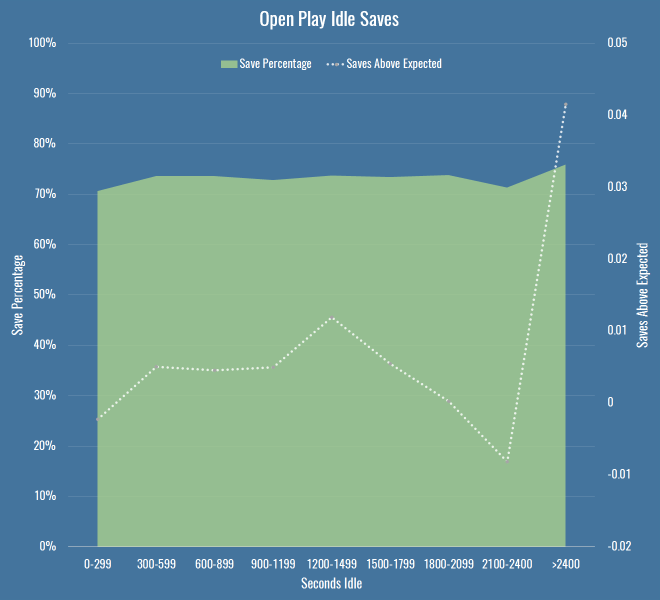
This shows basically nothing – the saves above expected values are tiny, and dwarfed by the error of any particular xG model you choose to use. You can also safely ignore the big jump towards the end of the half – the sample size is miniscule. So, keepers can rest easy against their goalposts?
On a hunch I filtered the data down to what Opta deem as ‘fast breaks’. If you’re going to catch an idle keeper off guard, maybe you just need to be quick about it. It’s a smallish dataset (just over 4000 shots) but behold this trend:
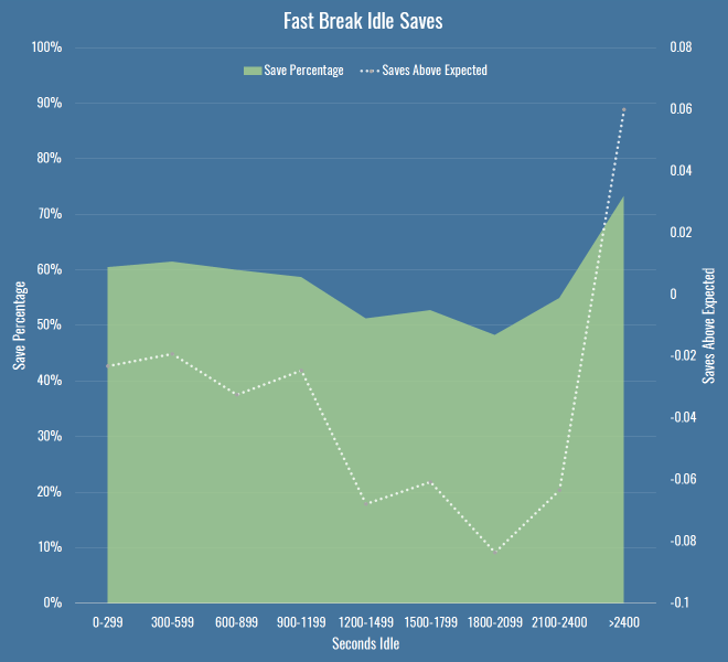
So there you go, have we found something? By the time we’re in that 1200-1499 second bucket, we’re talking 117 shots, with 72 in the next bucket, so again, small sample. I’ve also chosen the bucket size fairly arbitrarily – at 150 seconds per bucket, things are far more chaotic, and we should be wary of Simpson’s paradox when aggregating data. But it does seem to be a hint that maybe something’s going on. There’s at least a 10 percentage point drop in save percentage as idle time increases, and keepers are also saving fewer shots than we expect, which should account for any shot quality issues above and beyond raw save percentage.
Are we sure we have the right cause though? I checked if it was just that teams create better quality chances later into a half (encouraging teams on to them for the first half hour to create counter attacks, or probing and finding weaknesses, I dunno) but saw no real differences per minutes of the half. Then I thought that perhaps it’s nothing to do with keepers at all, maybe defences are the problem. So I created this chart – it shows the same save percentage area as above, but instead of saves over/under expected, I just put the average chance quality and the average save difficulty. This tells us how good the oppositions chances were, and how hard they were to save, regardless of how the keeper dealt with them.
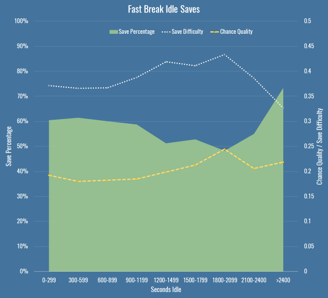 The important thing to note here is that my chance quality model includes almost nothing about the actual shot as taken by a striker – it’s mostly about the position of the shot, and the buildup to it. For that metric to be going up (again only slightly, and again with a small sample size) it’s entirely possible that the fault doesn’t only lie with idle keepers, but with idle defences too, for allowing better chances. It’s also possible that the under-performance of keepers in terms of expected saves (to the extent we believe it exists) is because we have no measure for defensive pressure.
So what do we know? If there is a decline in performance due to idleness, it’s small, hard to prove with confidence, and may in fact be due to defences and not keepers. Not very convincing, I’m sure you’ll agree, but I was recently reminded how important it was to publish low-significance and null results along with everything else (if only to ease the pressure on the wasteland that is my drafts folder). I also googled around a bit and found nothing mentioning this, so I thought it would be good to get it out there for posterity. At the very least, every time you hear the old cliché in commentary, you’ll know there’s probably little reason to worry that keepers who have been idle will suddenly forget to stop shots.
Caveats
A few notes and avenues for future work if you’re bothered:
- By all means replicate this any way you like, it’s simple enough even if you have public shot data derived from the StatsZone app or BBC live text commentary. I’d be fascinated to hear if you find any patterns I’ve missed.
- I’ve not looked at individual keepers – it’s possible there are some particular keepers that switch off, although I doubt it, and it’ll be a small sample size.
- I didn’t include periods of extra time, just because I wanted to make sure that we were always comparing apple-shaped things.
- I wasn’t strictly measuring idleness as time between saves, I was assuming that a catch or a goal kick was enough to wake a keeper up, but perhaps that’s an assumption to test.
- I’m only looking at shot stopping, so I can’t rule out that idle keepers underperform on interceptions or catches in some way.
- There are other measures one could use for fast breaks, or indeed counters, that may increase the sample size.
Evaluating Defenders With PATCH
Today we’ll look at players in Europe through the lens of my PATCH defensive metric. If you can’t be bothered trawling through an entire post to understand the method, you only really need to know this: PATCH measures how much a defender prevents their opponents from advancing the ball through their territory. Clearly that leaves lots of information about defenders and defences in general on the table, but you’ll have enough information by the end of this post to bash me over the head with specific examples of players you think it’s misjudging. In fact, I’ll even help you out along the way and spell out all my worries about the metric, and the things I think it ought to do in the future.
That said, in PATCH’s defence, it has some nice characteristics:
- A team’s medianish PATCH score correlates pretty well with shot numbers conceded by a team over a season, at around 0.7.
- It correlates slightly better with xG conceded by teams, at around 0.75.
- It persists year-on-year for teams, correlated at around 0.6.
- A player’s median PATCH persists year-on-year at around 0.3.
But putting numbers aside, let’s see how you feel about some individual player values. If you look at the standard deviation of median PATCH values by minutes played, you can see things settle down at around 600 minutes:

That’s because at very low values you get some weird outlying games, where players haven’t had any opponents in their territory and so score very highly. Just to be safe, we’ll set a cutoff a little higher, so here are the top European centre-backs with more than 900 minutes this season:
| Competition | Team | Player | PATCH |
|---|---|---|---|
| Italian Serie A | Fiorentina | Gonzalo Rodríguez | 6.27 |
| French Ligue 1 | Lyon | Samuel Umtiti | 5.79 |
| Spanish La Liga | Real Madrid | Pepe | 5.52 |
| Spanish La Liga | Barcelona | Gerard Piqué | 5.24 |
| German Bundesliga | FC Bayern München | Jerome Boateng | 5.20 |
| Spanish La Liga | Barcelona | Javier Mascherano | 5.20 |
| Spanish La Liga | Málaga | Raúl Albentosa | 5.19 |
| Italian Serie A | Roma | Kostas Manolas | 5.06 |
| Italian Serie A | Lazio | Wesley Hoedt | 4.99 |
| German Bundesliga | Borussia Dortmund | Sokratis | 4.94 |
| Italian Serie A | Fiorentina | Davide Astori | 4.91 |
| French Ligue 1 | Paris Saint-Germain | Thiago Silva | 4.86 |
| English Premier League | Liverpool | Martin Skrtel | 4.72 |
| English Premier League | Liverpool | Mamadou Sakho | 4.72 |
| Italian Serie A | Internazionale | Jeison Murillo | 4.71 |
| Italian Serie A | Milan | Alex | 4.66 |
| Italian Serie A | Juventus | Andrea Barzagli | 4.63 |
| French Ligue 1 | St Etienne | Loic Perrin | 4.59 |
| French Ligue 1 | GFC Ajaccio | Roderic Filippi | 4.57 |
| Italian Serie A | Juventus | Leonardo Bonucci | 4.49 |
There are some clumps of teams here, so we should immediately be suspicious that we’re measuring team effects as much as player effects – PATCH currently doesn’t adjust for teams average scores, and for that matter nor does it score leagues differently. But these numbers are mostly defensible. It’s fun to note that Raúl Albentosa was a Derby County signing during Steve McClaren’s reign, and he’s recently been targeting Samuel Umtiti at Newcastle, so it’s nice to know I’ve built the perfect metric for him, even if you don’t buy it.
The same metric works for defensive and centre midfielders too:
| Competition | Team | Player | PATCH |
|---|---|---|---|
| Spanish La Liga | Barcelona | Sergio Busquets | 5.66 |
| French Ligue 1 | Lyon | Maxime Gonalons | 5.50 |
| Spanish La Liga | Barcelona | Ivan Rakitic | 5.21 |
| Italian Serie A | Fiorentina | Milan Badelj | 5.19 |
| Italian Serie A | Roma | Daniele De Rossi | 4.84 |
| French Ligue 1 | Lyon | Corentin Tolisso | 4.81 |
| Italian Serie A | Fiorentina | Borja Valero | 4.60 |
| Italian Serie A | Fiorentina | Matias Vecino | 4.48 |
| Spanish La Liga | Sevilla | Grzegorz Krychowiak | 4.45 |
| Italian Serie A | Lazio | Lucas Biglia | 4.31 |
| Italian Serie A | Internazionale | Felipe Melo | 4.30 |
| Spanish La Liga | Las Palmas | Vicente Gómez | 4.28 |
| English Premier League | Liverpool | Emre Can | 4.26 |
| Spanish La Liga | Sevilla | Steven N’Zonzi | 4.26 |
| German Bundesliga | Borussia Dortmund | Ilkay Gündogan | 4.26 |
| Italian Serie A | Roma | Radja Nainggolan | 4.25 |
| German Bundesliga | FC Bayern München | Xabi Alonso | 4.24 |
| German Bundesliga | FC Bayern München | Arturo Vidal | 4.11 |
| Spanish La Liga | Rayo Vallecano | Raúl Baena | 4.10 |
| English Premier League | Liverpool | Jordan Henderson | 4.09 |
Busquets on top, all is right in the world.
Prospects
We can already see some talented youngsters in the tables above, so let’s focus purely on players that were 23 or under at the start of this season. I’ve relaxed the minutes to 600, here’s the top 30, taken from all midfielders and defenders:
| Competition | Team | Player | Date of Birth | Minutes | PATCH |
|---|---|---|---|---|---|
| French Ligue 1 | Lyon | Samuel Umtiti | 14/11/1993 | 1852 | 5.79 |
| Italian Serie A | Lazio | Wesley Hoedt | 06/03/1994 | 1507 | 4.99 |
| French Ligue 1 | Lyon | Corentin Tolisso | 03/08/1994 | 2188 | 4.63 |
| German Bundesliga | FC Bayern München | Joshua Kimmich | 08/02/1995 | 727 | 4.54 |
| English Premier League | Liverpool | Emre Can | 12/01/1994 | 2054 | 4.44 |
| German Bundesliga | VfB Stuttgart | Timo Baumgartl | 04/03/1996 | 1287 | 4.30 |
| German Bundesliga | Bayer 04 Leverkusen | Jonathan Tah | 11/02/1996 | 2076 | 4.27 |
| French Ligue 1 | Lyon | Sergi Darder | 22/12/1993 | 696 | 4.15 |
| German Bundesliga | VfL Wolfsburg | Maximilian Arnold | 27/05/1994 | 877 | 4.10 |
| German Bundesliga | FC Bayern München | Kingsley Coman | 13/06/1996 | 895 | 3.98 |
| Spanish La Liga | Rayo Vallecano | Diego Llorente | 16/08/1993 | 2228 | 3.97 |
| French Ligue 1 | Paris Saint-Germain | Marquinhos | 14/05/1994 | 988 | 3.95 |
| Italian Serie A | Empoli | Federico Barba | 01/09/1993 | 927 | 3.93 |
| English Premier League | Tottenham Hotspur | Dele Alli | 11/04/1996 | 730 | 3.93 |
| English Premier League | Tottenham Hotspur | Eric Dier | 15/01/1994 | 2375 | 3.79 |
| English Premier League | Arsenal | Héctor Bellerín | 19/03/1995 | 2346 | 3.79 |
| Spanish La Liga | Real Sociedad | Aritz Elustondo | 11/01/1994 | 1643 | 3.68 |
| Spanish La Liga | Atlético de Madrid | Saúl Ñíguez | 21/11/1994 | 1337 | 3.66 |
| Italian Serie A | Lazio | Sergej Milinkovic-Savic | 27/02/1995 | 715 | 3.65 |
| French Ligue 1 | Monaco | Wallace | 14/10/1994 | 1654 | 3.63 |
| German Bundesliga | Borussia Dortmund | Matthias Ginter | 19/01/1994 | 1414 | 3.62 |
| Italian Serie A | Milan | Alessio Romagnoli | 12/01/1995 | 2102 | 3.62 |
| German Bundesliga | Borussia Dortmund | Julian Weigl | 08/09/1995 | 1575 | 3.59 |
| Italian Serie A | Lazio | Danilo Cataldi | 06/08/1994 | 1024 | 3.55 |
| Italian Serie A | Napoli | Elseid Hysaj | 02/02/1994 | 2279 | 3.52 |
| Spanish La Liga | Sevilla | Sebastián Cristóforo | 23/08/1993 | 614 | 3.51 |
| English Premier League | Chelsea | Kurt Zouma | 27/10/1994 | 1949 | 3.51 |
| French Ligue 1 | Nice | Olivier Boscagli | 18/11/1997 | 792 | 3.48 |
| Spanish La Liga | Getafe | Emiliano Velázquez | 30/04/1994 | 745 | 3.44 |
| Italian Serie A | Sampdoria | David Ivan | 26/02/1995 | 785 | 3.41 |
Note: the tables above filter to performances at centre-back or in midfield, if the values differ in this last table it’s because it considers their performances in a wider variety of positions.
So, cheer up Timo Baumgartl, PATCH doesn’t count mistakes. You’ll note again big clumps of players from the same teams (kudos, Lyon) – we know by now we’re probably measuring some systematic effects here. It’s also worth pointing out that if a young player is getting this level of minutes, in the big 5 leagues, they’re probably at a certain level without even looking at their numbers. But again, at first glance, this is a decent list.
Liverpool’s First Choice Centre-Backs
At the Opta Pro Forum I blurted out to the Liverpool contingent that my pet defensive metric quite liked their defending, to which they replied “ours doesn’t.” So I was a little crestfallen, but I’ll continue to talk myself out of a job here: Liverpool concede the second fewest shots in the league, so I’m right. They also have the worst save percentage in the league but nevertheless renewed Mignolet’s contract, so they’re wrong. QED. Let’s look more closely:
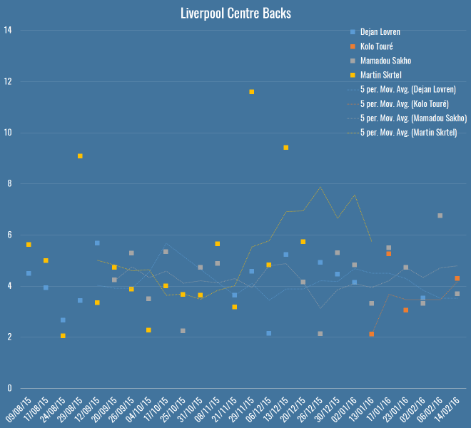
Here you’ve got all Liverpool’s games this season – Rodgers up to the fateful Merseryside derby on the 4th October, Klopp soon after. The markers show individual PATCH performances, and the lines are five-game moving averages (although Touré isn’t quite there yet). The average PATCH for EPL centre-backs is around 3.3, and you’ll note that Liverpool are regularly exceeding that. You can also see that Skrtel had some insane outliers, but maintained pretty good form for Klopp until his injury (which – if you’re to believe renowned fitness troll Raymond Verheijen – was inevitable). The fight for second place is closer, but even taking Lovren and Sakho side-by-side, I don’t believe you’re left with a terrible pairing.
So, I don’t believe Liverpool’s defence is terrible and I think they have a solid foundation both in defence and midfield for Klopp to build on over the next season. I do believe they’ve been unlucky, as James Yorke points out in this article on Statsbomb. It’s funny to compare Everton and Liverpool’s defences this season – they both sit on 36 goals conceded in the league. Tim Howard has taken a lot of heat this year for his performances, all while facing 4.7 shots on target a game – the fourth worst in the league. Mignolet’s been facing 3.3 – the second least. While Howard has now been unceremoniously dropped and is soon to be shipped off to the MLS, Mignolet gets his contract renewed. Sure, some of of this is luck and not entirely his fault, but I genuinely believe you should not lay the blame on Liverpool’s defence, there’s not a lot more they could do to make Mignolet’s life quieter.
Arsenal’s Midfield
Through injuries, sentimentality or pure stubbornness, it’s hard to tell if Wenger knows his best midfield this season. I asked on Twitter and a lively debate ensued, but excluding the lamentation of Wilshere believers, the most common answer was Coquelin & Cazorla, with some pondering ways to insert Ramsey into the mix. What does PATCH think, purely defensively, of their appearances in the centre of the field?

Okay, well, first thoughts are that this is a graph format looking to get retired early, but here you have the four players who have put reasonable minutes into Arsenal’s central midfield, with the markers again showing their PATCH values in each game week, and the lines again showing a five game moving average. The average PATCH for a midfielder in the EPL is basically the same as a defender, around 3.3. This graph seems to imply that Cazorla has very good and very average games, and similar could be said for Flamini. Ramsey doesn’t seem like anything special, but is pretty low-variance. Coquelin seemed to start the season very strongly, but was fairly average in the lead-up to his injury.
Let’s break it down more simply, here are the averages:
| Player | PATCH |
|---|---|
| Santiago Cazorla | 4.17 |
| Francis Coquelin | 3.83 |
| Mathieu Flamini | 3.79 |
| Aaron Ramsey | 3.60 |
So in black and white, we seem to more or less agree with Arsenal fans’ instincts.
N’Golo Kanté
What of players whose defending we rave about but who don’t make an appearance high up the PATCH ratings? N’Golo Kanté is way down the list, with a very middling 3.12. What’s happened there? Well, let me reiterate that PATCH measures territory and ball progression, nothing else. As I mentioned on the Analytics FC podcast recently, not all ball progression is bad. Much has been made of Leicester’s “bend, don’t break” defensive scheme this season – they give up territory but their low block often makes up for it, this means their midfield isn’t likely to score highly for repelling the opponent. Kanté himself regularly relies on pace and last ditch tackles (and he is an excellent tackler) to retrieve the ball once it’s in his territory, but if a pass has been completed in that territory, PATCH has already given him a demerit.
So… PATCH is useless because it misses demonstrably good players? Well, I’m not sure I’d go as far as calling Leicester’s defence bad, but it’s certainly well below par for a league leader, as Tim at 7amkickoff recently analysed. That said, I’ll admit I’m a little uncomfortable. I’ve said elsewhere, the essence of PATCH, or really any defensive metric, is this:
- Whose fault is it?
- How bad is it?
In PATCH, the whose fault part is calculated by territory (and there are lots of ways to do this better) and the how bad bit is done through ball progression. Alternatives to the second might pick Kanté up better – how many moves enter his territory, but never leave? That would be an interesting one to look at, and something I’ll explore soon.
For now, let’s just say that he’s valuable for Leicester inasmuch as his defensive skills turn into attacks very effectively, because it’s Leicester’s attack (and let’s face it, their luck) that is powering their title challenge, and not necessarily their defence. And that, dear reader, is another thing that PATCH doesn’t measure in defenders.
Conclusion
Hopefully if you’ve got this far, you believe there’s value in something like PATCH as a way of measuring defenders. It’s certainly entangled with teams’ systematic effects, and we suspect it has some false negatives. I don’t think looking at these outputs that there are tons of false positives however, but then Flamini rears his head so who knows.
I’m constantly working on PATCH, so I’d love to hear your ideas for places it might fall down, or things you’d like to see it applied to. To that end, I’ve bunged PATCH values for all EPL performances this season on Github. This file contains:
- Team
- Opposition
- Match date
- Player
- Date of Birth
- Nationality
- Starting lineup X position
- Starting lineup Y position
- Minutes played
- PATCH
Play, critique, ignore, do what you will. I’ll see if I can get to the point where these are updated for a all players in a bunch of leagues every week, but right now I can’t guarantee the scoring is going to be at all stable with all the changes I’m making.
PATCHing Teams
I explained the current PATCH methodology in my previous post. Today I’m going to do a deep dive into how PATCH views the current teams in the EPL. Here’s what the table looks like (pre-Southampton on Saturday):
| Team | PATCH |
|---|---|
| Chelsea | 2.84 |
| Manchester United | 2.79 |
| Liverpool | 2.73 |
| Tottenham Hotspur | 2.70 |
| Manchester City | 2.68 |
| Bournemouth | 2.64 |
| Arsenal | 2.61 |
| Southampton | 2.45 |
| Leicester City | 2.38 |
| Aston Villa | 2.34 |
| Norwich City | 2.28 |
| Watford | 2.27 |
| Palace | 2.27 |
| West Ham United | 2.27 |
| Everton | 2.22 |
| Swansea City | 2.18 |
| Stoke City | 2.13 |
| West Bromwich Albion | 2.11 |
| Newcastle United | 1.97 |
| Sunderland | 1.88 |
The values for PATCH are the 60th percentile of all performances for each team. You could, if you were highly motivated, work out the actual units for PATCH, but treat it as abstract. 2 is around average, somewhere just under 4 is the 90th percentile amongst player performances and 5+ would be outstanding. Given that, I am reasonably happy with how this shapes up.
PATCH Correlations
At first glance the numbers above don’t look bonkers, but how does the metric correlate with other team defensive stats? Let’s have a look:
| Percentile | GA | xGA | Shots Against | SoT Against |
|---|---|---|---|---|
| 10th | 0.06 | 0.10 | 0.08 | 0.06 |
| 20th | 0.22 | 0.30 | 0.20 | 0.15 |
| 30th | 0.28 | 0.44 | 0.38 | 0.30 |
| 40th | 0.29 | 0.56 | 0.54 | 0.44 |
| 50th | 0.27 | 0.61 | 0.63 | 0.45 |
| 60th | 0.27 | 0.71 | 0.76 | 0.55 |
| 70th | 0.19 | 0.65 | 0.71 | 0.48 |
| 80th | 0.16 | 0.60 | 0.62 | 0.38 |
| 90th | 0.10 | 0.47 | 0.50 | 0.29 |
Those are the R2 values each team’s PATCH values at a certain percentile (10th being the lowest 10%, i.e. worst defensive performances), compared to some traditional measures. It’s great to see that we’re nicely correlated with expected goals against and shots, though I should point out that shots do directly go into the calculation – if you allow a shot through your territory, it’s marked against you. However, that’s only a small proportion of the gains measured. I tested with shots removed from the ball progression metric just to be sure and the correlations barely went down.
Defensive Ranks
So far we’ve only looked at team’s performances en masse, as measured by PATCH. This is what things look like if we break them down by rank in a team’s formation:
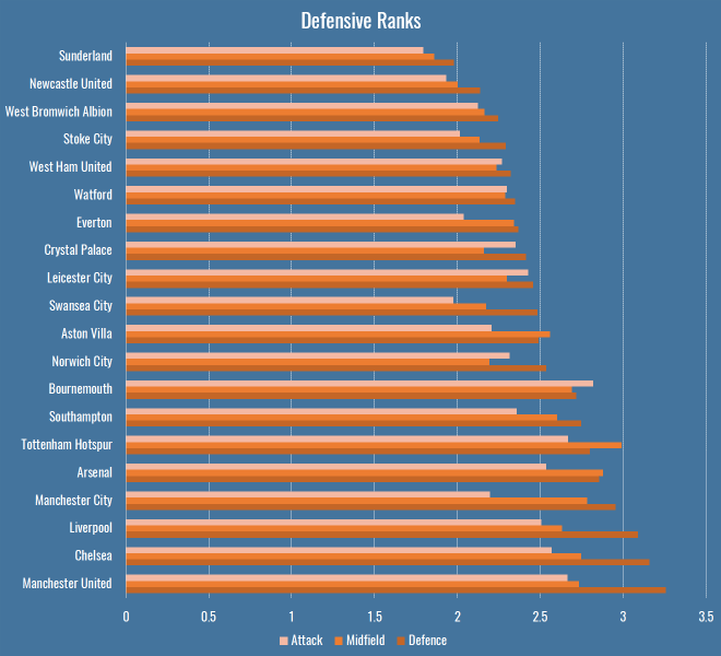
There are a few interesting patterns that immediately jump out:
- Bournemouth’s attacking midfielders and forwards are doing a bunch of defensive work.
- Manchester City’s less so.
- Tottenham have the least penetrable midfield of any team in the league.
- As you might expect, Leicester’s attack and defence are a little more robust than their midfield, reflecting the fact that they press high then retreat low.
Lingering on these numbers a little longer, I thought I’d compare these numbers to someone else’s model for a further sanity check. Mark Thompson of Every Team Needs a Ron is one of my favourite writers, and is devoted to studying defenders in all their forms. He has a system to analyse how teams convert possessions into attacks, and attacks into shots, and how they allow their opponents to do the same. I compared the defensive rank data above with his data to see what the correlations were:
| Defence | Midfield | Attack | |
|---|---|---|---|
| Attacks per Possession | 0.65 | 0.47 | 0.40 |
| Shots per Attack | 0.46 | 0.53 | 0.38 |
So, comparing the Attack, Midfield, Defence PATCH values from the graph above to Mark’s Attacks per Possession and Shots per Attack, we can get an idea of how much different parts of a team contribute to breaking up attacks. Defensive PATCH values explain 65% of the variance in opponent attacks per possession, whereas midfield is a much lower 47%. This makes some sense, while a lot of teams would love their midfield to quash potential attacks before they happen, it’s far more common that they make it throught to the last line. What’s interesting is the second row, where midfield performances explain shots pre attack better than defence. Again I wonder if this is bad shot quality – the defence don’t (and often don’t want to) stop low-expectation long shots. However if your midfield are putting in a good screening performance, attackers won’t even get the space for bad shots.
That’s one explanation, anyway. At the very least I’m happy to see a decent correlation with someone else’s model.
Patchwork Defences
Defences are more than the sum of their parts. There are plenty of games where teams in aggregate can put in a great performance in terms of total or average PATCH values, but still be torn apart on the field. This happens often because of mistakes, which PATCH will probably never be able to account for, but it also happens because of weak links that let down the greater whole. Have a look at Manchester City from this weekend’s absolutely definitive title decider against Leicester:
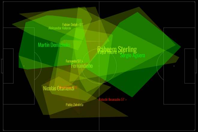
This is a fairly green chart – City policed a lot of territory, and in various parts of the pitch prevented Leicester from making regular gains. But look at their right-hand side: Otamendi didn’t score especially highly, and Zabaleta (who seems to be pushing quite far forward) scored even worse. Teams rightly fear Leicester’s right wing, because that’s where the formidable Mahrez nominally takes the field, but here we saw Mahrez pop up on the left a few times, including for Leicester’s 2nd goal, and Drinkwater also made some penetrative passes. We can see this from Leicester’s attacking chart for the day:
Very left leaning, basically nothing on the right. Despite the fact that City conceded twice from set-pieces, you still saw scare after scare from open play. The combination of a weak defensive right-hand side, and players taking higher positions than was perhaps advisable against the league’s fastest counter-attacking team (still 2nd in Europe after Caen), meant that good PATCH scores in many parts of the pitch did not necessarily add up to a good defensive performance.
Weak Links
Given what we saw in the Man City vs Leicester game, perhaps we should judge a defence by its weakest link? After all, if they’re allowing lots of ball progression in their area, that’s obviously where the opposition are attacking, whether or not they’re thinking of that player as exploitable. If we just look at the lowest score for a defender in each game (using just those with 90+ minutes in a game to be safe), this is what teams come out looking like:
| Team | Mean Weak Link PATCH |
|---|---|
| Chelsea | 2.32 |
| Manchester United | 2.06 |
| Arsenal | 1.99 |
| Manchester City | 1.97 |
| Liverpool | 1.78 |
| Aston Villa | 1.77 |
| Leicester City | 1.74 |
| Tottenham Hotspur | 1.74 |
| Southampton | 1.74 |
| Bournemouth | 1.68 |
| Swansea City | 1.62 |
| Norwich City | 1.61 |
| Crystal Palace | 1.59 |
| West Bromwich Albion | 1.58 |
| Watford | 1.54 |
| Everton | 1.53 |
| West Ham United | 1.48 |
| Stoke City | 1.48 |
| Newcastle United | 1.45 |
| Sunderland | 1.45 |
Nothing radically different here, perhaps I should be a little uncomfortable seeing Villa that high, but they have save percentage and shot creation issues, not necessarily an awful defence. That said, these numbers correlate less well with each of the four measures we compared to earlier, so it seems less representative.
Total Territory
PATCH fundamentally rewards defenders for claiming territory, so lets look into any team characteristics can we pick up from looking at their territory as a whole. Who uses the most space? Who leaves the most gaps?
This is total area per game of players’ defensive territory for each team, measured first as the sum of individual areas, then as a merged team area:
| Team | Total Individual Area | Team Area |
|---|---|---|
| Arsenal | 12375 | 5286 |
| Aston Villa | 12338 | 5590 |
| Bournemouth | 12487 | 5540 |
| Chelsea | 13385 | 5612 |
| Crystal Palace | 14240 | 5750 |
| Everton | 10494 | 5181 |
| Leicester City | 14580 | 6078 |
| Liverpool | 12817 | 5626 |
| Manchester City | 12025 | 5405 |
| Manchester United | 13156 | 5438 |
| Newcastle United | 11767 | 5003 |
| Norwich City | 11949 | 5614 |
| Southampton | 12885 | 5525 |
| Stoke City | 11464 | 5347 |
| Sunderland | 12880 | 5560 |
| Swansea City | 10882 | 5052 |
| Tottenham Hotspur | 13520 | 5522 |
| Watford | 12482 | 5779 |
| West Bromwich Albion | 12943 | 5694 |
| West Ham United | 14022 | 5693 |
Which looks like this:
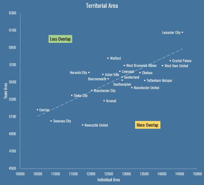
The X axis is the total individual area, which includes overlaps between players. The Y axis is the team shape, the area you get when you merge all the individual territories together and forget overlaps – also worth noting that the lower this value, the more empty spaces the team is leaving on the pitch.
It’s interesting because it reveals teams that are quite expansive in their defensive efforts (to the right are basically the pressers and aggressors, to the left is… Everton, asking very little of its defence). It also shows teams that have an overall compact defensive shape (Newcastle) versus those that are push up more (Leicester, Watford). Above the trend line are teams with less overlap, below are those that are more crowded when defending.
If we apply a similar sort of calculation to PATCH, we can take a team’s area and judge them not by the progression they allow through their territory, but by the progression that happens outside it. If we do that, these are the numbers we see:
| Team | Outside Territory PATCH |
|---|---|
| Manchester City | 24.09 |
| Liverpool | 23.55 |
| Norwich City | 22.78 |
| Southampton | 22.04 |
| Leicester City | 20.77 |
| Watford | 20.75 |
| Tottenham Hotspur | 20.59 |
| Aston Villa | 20.22 |
| West Bromwich Albion | 20.19 |
| Crystal Palace | 19.37 |
| Bournemouth | 19.35 |
| West Ham United | 19.26 |
| Chelsea | 18.34 |
| Manchester United | 17.94 |
| Arsenal | 16.98 |
| Swansea City | 16.51 |
| Stoke City | 16.36 |
| Sunderland | 15.96 |
| Everton | 13.31 |
| Newcastle United | 11.28 |
So Man City, Liverpool and… Norwich (apparently) allow the least progression outside their territory. Newcastle and Everton leave the biggest gaps for opponents to operate inside.
Getting Goal Side
Above you saw how a lot goes on in empty spaces. The thing that worries me most about PATCH, and particularly the approach I’ve taken to trimming events for territory, is space behind a defender. Perhaps we should leave in all goal side events for a defender? Even more, should we project their territory back to the goal line, or even the goalmouth itself?
Well, you’re going to have to wait to find out. In my next post I’m going to finally get around to looking at some individual player scores, and I’ll experiment with how defenders should be blamed for goal side events then.
Defending your PATCH
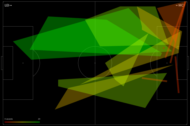
Here is Chelsea defending against West Brom in their 2-2 draw this season:

If I’m pointing you to this post from Twitter, it’s likely that you’ve asked, with varying degrees of alarm, what the hell you’re looking at with a chart like above. Because I’m terrible at making legends, here you go:
- This is a chart of how Chelsea defended in the game.
- Each shape is a player, it represents their defensive ‘territory’ – the part of the pitch they made tackles, interceptions, fouls etc.
- The player’s name is written in the centre of their territory, and you should be able to see that some names, and their associated shapes, are bigger or smaller, depending on how much a player ranges around the pitch.
- Each shape has a colour – this represents how much they allowed the opponent to progress through their territory: more green means the player was more of a brick wall, more red means they were more of a sieve.
- Above, you might see that Oscar put in a ton of work and claimed a large territory – we reward players who claim a lot of territory, which is why he’s more green than some of the players he shared space with, even though he let the same opposition moves through.
- Terry did not protect his space particularly well. Mikel and Fabregas provided little in the way of screening, and Matic, who replaced Fabregas, sat very deep but also offered little as they defended their lead.
Just as a quick sanity check on what you see above, WBA’s two goals came from a long shot from a huge empty space in front of Chelsea’s defence (left open by their midfield) and a move on Terry’s side of the penalty box:

A gap opens up in front Chelsea’s defence

Terry leaves space for a shot
Those are cherry-picked and don’t prove much, of course. No chart captures the entirety of a game, but hopefully you see that this is at least an interesting conversation starter to examine where Chelsea might have protected their territory better. Over the course of several games, you may notice the same patterns happening over and over again. At the same time, these are a great first stab at looking for weaknesses in an opponent’s lineup.
And that’s what you’re looking at. How does it work?
PATCH
A while back I started looking at defence in terms of how a defender prevents their opponents operating in their territory. This included a metric called PATCH (“Possession Adjusted Territorial Control Held”… yeah), which underwent several changes without me really writing it up, despite publishing all sorts of cryptic charts on Twitter. So, my plan today is to go through the whole methodology as it stands today. There’s still work to do, and it’s by no means a hard and fast measure of good and bad defending, but it’s interesting enough to share and hope for some feedback.
Defensive Territory
PATCH is all about defensive territory – where on the pitch a player is responsible for stopping their opponent. We don’t measure this in an idealised way based on formations or anything like that, all we do is look at where a player is actually defending. We take all their defensive actions and draw a line around them – that’s their territory. In the previous version, we only looked at events in a team’s own half or danger zone, so the system wasn’t great at capturing defensive midfielders, who often defend higher up the pitch. That was a problem, but one we needed to solve without including noise from things like aerial challengers on attacking corners etc. It was also a problem that if a player put in even a single tackle in a weird place (a left back on the right wing etc) then the outline of their territory grew hugely.
There are many ways to solve this, I’ve experimented with a couple. The first was to find the average point of a defender’s defensive actions, and just trim events within 1 standard deviation on the X and Y axes. The advantage of this is that it’s dead simple, very quick to do inside a database query, and the resulting area was still somewhat representative of where the player was on the pitch. But not representative enough: it was possible for players to completely disappear if their defensive actions were all taken in a large ring far enough away from the centre, and it occasionally wrongly accused players of retreating into a tiny territory. Here’s an old version of the Chelsea-WBA chart above, look how tiny everyone is, especially John Terry:

I then experimented with a similar approach using the straight-line distance from the centre within the same sorts of bounds, but really this just gave you a slightly more circular version of the previous box. I finally settled on decent compromise between ease of implementation and realism – I trim events to those within the 70th percentile of distance from the centre. Here’s another example, Tottenham’s 4-1 victory over Sunderland:

The one drawback over the previous version is that things look far busier, especially where there are overlaps, which is why I’ve started putting them on a black background, and increasing the transparency of lower-scoring players (because, you know, sieves are more see-through than brick walls). Departure from brand, I know, but probably more readable.
Future avenues to look at are algorithms like local convex hulls, or more probabilistic approaches. You can certainly use some sort of kernel density approach, although I appreciate having hard boundaries to territory as it is. I might be willing to sacrifice the ease of visualising territory for a better approach, however, and I’ve been looking at a fairly complex system whereby you look at defensive events and opponent buildup in previous (representative) games, and use a Bayesian system to determine the degree to which we think a player would usually be defensively responsible in that situation. I’d love to hear any other approaches people have tried.
Ball Progression
The original PATCH metric looked at how many opposition touches a defender allowed in their territory to judge how well they were doing, but this didn’t seem ideal. Some teams with a low block are happy for you to play in front of them to your heart’s content, as long as you don’t make any progress towards goal. Then there are some bad defences that just don’t take many touches to break through and score. So I’ve made a fundamental change here – we now measure ball progression through a defender’s territory. Whenever the ball is passed, or dribbled, or whatever combination of on-the-ball events happens, we look at how much progress the opposition have made towards the defending team’s goal. More than that, we look at the pace with which they’ve moved. Any player whose territory is intersected by the line of this progress gets blamed for it.
So now we’re really measuring something directly relevant – a team moving towards your goal is getting into better and better shooting positions, and preventing, disrupting or postponing this is more or less the core of good defensive work. As ever, it’s not a metric based purely on defensive actions – we still use things like tackles to help mark out a player’s territory, and we hope that there are enough of these events to get an accurate picture. But we’re not judging them on those numbers – we’re judging them in far more direct terms, based on protecting their goal.
Scoring
As with the previous metric, players are rewarded for the size of their territory , and then penalised for allowing the opposition into it, in this iteration based on ball progression. But the previous scores left me a little uncomfortable, with PATCH regularly recommending bad defences over good ones. I went back and looked in depth at the variables that went into the calculation, and especially the relationships between them.
The first thing I looked at was the possession factor, which was in there to account for the fact that teams without the ball can’t attack you. To be able to compare individual players from high and low possession teams, I normalised things to 50% possession. However it’s not as simple as that, because you might expect high possession teams to have fewer opportunities to make defensive actions, so they’d on average have smaller territories. Rather than scratch my head over it, I just looked at the numbers. It was quickly obvious was that possession really doesn’t have a reliable affect on a player’s territory. More surprisingly, the correlation with ball progression allowed is also extremely low. So, possession’s out. We’ll retcon the acronym later.
I also worried that players with large territories were being overly rewarded, and looked at a couple of different options like taking the root of the area. In the end, if you look at the data, it’s pretty much a linear relationship, but I’ve made the coefficients a little more accurate at least. I also looked at the degree to which minutes on the pitch affected defensive territory, and again, it’s almost impossible to find a reliable correlation. Therefore, only ball progressions is weighted per 90.
So that’s the algorithm – get the area, divide it by ball progression, which you weight per 90 and by pace. The bigger your territory, the better you protect it, the higher you’ll score. It looks a little like this:
(k * Area) ÷ ((Total Ball Progression ÷ Minutes Played x 90) ÷ Average Progression Duration)
That’s the gist anyway.
Caveats
This is the usual section where I list things I was too lazy to fix, but I promise I’m thinking about them:
- There are better ways to calculate territory, but not necessarily ones that can run inside an SQL query before I get bored.
- Players are blamed for ball progression no matter how much their territory is intersected by an opponent event. Even in the case where they hoof the ball way over your head, you still get blamed. Long term, I’d like to handle special cases like this, and assign degrees of blame to different territories.
- I’m aware that the gaps between territories are interesting – you can defend your territory brilliantly, but still be in the wrong place. Watch this space.
- Lots of goals, frankly, come from mistakes, which aren’t captured here.
- Different positions might want different approaches both to territory and scoring.
It’s also worth point out a few other people working in the same space. Sander at @11tegen11 naturally has a version, with scores based on the number of defensive actions:
Here’s how deep Leicester sat this match.
And how big N’Golo Kanté is for them. pic.twitter.com/iNm0Zafxii— 11tegen11 (@11tegen11) February 6, 2016
And David Sumpter of @Soccermatics has similar charts looking at just ball recoveries, which is fascinating to study teams’ pressing approaches:
United retook possession a long way forward in last Chelsea match (areas are ‘typical’ positions of ball recovery) pic.twitter.com/Vaz54rV9cO
— Soccermatics (@Soccermatics) February 7, 2016
Happy to hear any other ideas people have!
