Evaluating Defenders With PATCH

Today we’ll look at players in Europe through the lens of my PATCH defensive metric. If you can’t be bothered trawling through an entire post to understand the method, you only really need to know this: PATCH measures how much a defender prevents their opponents from advancing the ball through their territory. Clearly that leaves lots of information about defenders and defences in general on the table, but you’ll have enough information by the end of this post to bash me over the head with specific examples of players you think it’s misjudging. In fact, I’ll even help you out along the way and spell out all my worries about the metric, and the things I think it ought to do in the future.

That said, in PATCH’s defence, it has some nice characteristics:

  • A team’s medianish PATCH score correlates pretty well with shot numbers conceded by a team over a season, at around 0.7.
  • It correlates slightly better with xG conceded by teams, at around 0.75.
  • It persists year-on-year for teams, correlated at around 0.6.
  • A player’s median PATCH persists year-on-year at around 0.3.

But putting numbers aside, let’s see how you feel about some individual player values. If you look at the standard deviation of median PATCH values by minutes played, you can see things settle down at around 600 minutes:

patch-stddev

That’s because at very low values you get some weird outlying games, where players haven’t had any opponents in their territory and so score very highly. Just to be safe, we’ll set a cutoff a little higher, so here are the top European centre-backs with more than 900 minutes this season:

Competition Team Player PATCH
Italian Serie A Fiorentina Gonzalo Rodríguez 6.27
French Ligue 1 Lyon Samuel Umtiti 5.79
Spanish La Liga Real Madrid Pepe 5.52
Spanish La Liga Barcelona Gerard Piqué 5.24
German Bundesliga FC Bayern München Jerome Boateng 5.20
Spanish La Liga Barcelona Javier Mascherano 5.20
Spanish La Liga Málaga Raúl Albentosa 5.19
Italian Serie A Roma Kostas Manolas 5.06
Italian Serie A Lazio Wesley Hoedt 4.99
German Bundesliga Borussia Dortmund Sokratis 4.94
Italian Serie A Fiorentina Davide Astori 4.91
French Ligue 1 Paris Saint-Germain Thiago Silva 4.86
English Premier League Liverpool Martin Skrtel 4.72
English Premier League Liverpool Mamadou Sakho 4.72
Italian Serie A Internazionale Jeison Murillo 4.71
Italian Serie A Milan Alex 4.66
Italian Serie A Juventus Andrea Barzagli 4.63
French Ligue 1 St Etienne Loic Perrin 4.59
French Ligue 1 GFC Ajaccio Roderic Filippi 4.57
Italian Serie A Juventus Leonardo Bonucci 4.49

There are some clumps of teams here, so we should immediately be suspicious that we’re measuring team effects as much as player effects – PATCH currently doesn’t adjust for teams average scores, and for that matter nor does it score leagues differently. But these numbers are mostly defensible. It’s fun to note that Raúl Albentosa was a Derby County signing during Steve McClaren’s reign, and he’s recently been targeting Samuel Umtiti at Newcastle, so it’s nice to know I’ve built the perfect metric for him, even if you don’t buy it.

The same metric works for defensive and centre midfielders too:

Competition Team Player PATCH
Spanish La Liga Barcelona Sergio Busquets 5.66
French Ligue 1 Lyon Maxime Gonalons 5.50
Spanish La Liga Barcelona Ivan Rakitic 5.21
Italian Serie A Fiorentina Milan Badelj 5.19
Italian Serie A Roma Daniele De Rossi 4.84
French Ligue 1 Lyon Corentin Tolisso 4.81
Italian Serie A Fiorentina Borja Valero 4.60
Italian Serie A Fiorentina Matias Vecino 4.48
Spanish La Liga Sevilla Grzegorz Krychowiak 4.45
Italian Serie A Lazio Lucas Biglia 4.31
Italian Serie A Internazionale Felipe Melo 4.30
Spanish La Liga Las Palmas Vicente Gómez 4.28
English Premier League Liverpool Emre Can 4.26
Spanish La Liga Sevilla Steven N’Zonzi 4.26
German Bundesliga Borussia Dortmund Ilkay Gündogan 4.26
Italian Serie A Roma Radja Nainggolan 4.25
German Bundesliga FC Bayern München Xabi Alonso 4.24
German Bundesliga FC Bayern München Arturo Vidal 4.11
Spanish La Liga Rayo Vallecano Raúl Baena 4.10
English Premier League Liverpool Jordan Henderson 4.09

Busquets on top, all is right in the world.

Prospects

We can already see some talented youngsters in the tables above, so let’s focus purely on players that were 23 or under at the start of this season. I’ve relaxed the minutes to 600, here’s the top 30, taken from all midfielders and defenders:

Competition Team Player Date of Birth Minutes PATCH
French Ligue 1 Lyon Samuel Umtiti 14/11/1993 1852 5.79
Italian Serie A Lazio Wesley Hoedt 06/03/1994 1507 4.99
French Ligue 1 Lyon Corentin Tolisso 03/08/1994 2188 4.63
German Bundesliga FC Bayern München Joshua Kimmich 08/02/1995 727 4.54
English Premier League Liverpool Emre Can 12/01/1994 2054 4.44
German Bundesliga VfB Stuttgart Timo Baumgartl 04/03/1996 1287 4.30
German Bundesliga Bayer 04 Leverkusen Jonathan Tah 11/02/1996 2076 4.27
French Ligue 1 Lyon Sergi Darder 22/12/1993 696 4.15
German Bundesliga VfL Wolfsburg Maximilian Arnold 27/05/1994 877 4.10
German Bundesliga FC Bayern München Kingsley Coman 13/06/1996 895 3.98
Spanish La Liga Rayo Vallecano Diego Llorente 16/08/1993 2228 3.97
French Ligue 1 Paris Saint-Germain Marquinhos 14/05/1994 988 3.95
Italian Serie A Empoli Federico Barba 01/09/1993 927 3.93
English Premier League Tottenham Hotspur Dele Alli 11/04/1996 730 3.93
English Premier League Tottenham Hotspur Eric Dier 15/01/1994 2375 3.79
English Premier League Arsenal Héctor Bellerín 19/03/1995 2346 3.79
Spanish La Liga Real Sociedad Aritz Elustondo 11/01/1994 1643 3.68
Spanish La Liga Atlético de Madrid Saúl Ñíguez 21/11/1994 1337 3.66
Italian Serie A Lazio Sergej Milinkovic-Savic 27/02/1995 715 3.65
French Ligue 1 Monaco Wallace 14/10/1994 1654 3.63
German Bundesliga Borussia Dortmund Matthias Ginter 19/01/1994 1414 3.62
Italian Serie A Milan Alessio Romagnoli 12/01/1995 2102 3.62
German Bundesliga Borussia Dortmund Julian Weigl 08/09/1995 1575 3.59
Italian Serie A Lazio Danilo Cataldi 06/08/1994 1024 3.55
Italian Serie A Napoli Elseid Hysaj 02/02/1994 2279 3.52
Spanish La Liga Sevilla Sebastián Cristóforo 23/08/1993 614 3.51
English Premier League Chelsea Kurt Zouma 27/10/1994 1949 3.51
French Ligue 1 Nice Olivier Boscagli 18/11/1997 792 3.48
Spanish La Liga Getafe Emiliano Velázquez 30/04/1994 745 3.44
Italian Serie A Sampdoria David Ivan 26/02/1995 785 3.41

Note: the tables above filter to performances at centre-back or in midfield, if the values differ in this last table it’s because it considers their performances in a wider variety of positions.

So, cheer up Timo Baumgartl, PATCH doesn’t count mistakes. You’ll note again big clumps of players from the same teams (kudos, Lyon) – we know by now we’re probably measuring some systematic effects here. It’s also worth pointing out that if a young player is getting this level of minutes, in the big 5 leagues, they’re probably at a certain level without even looking at their numbers. But again, at first glance, this is a decent list.

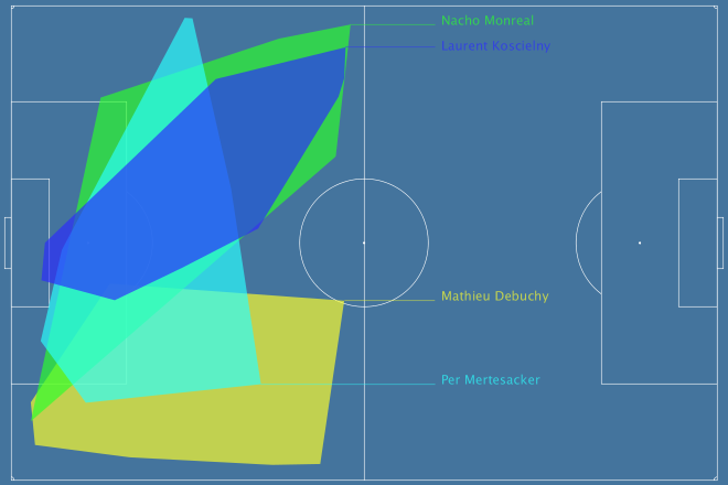
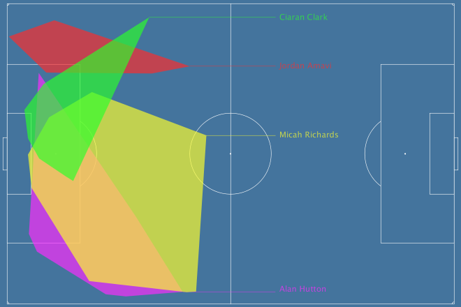
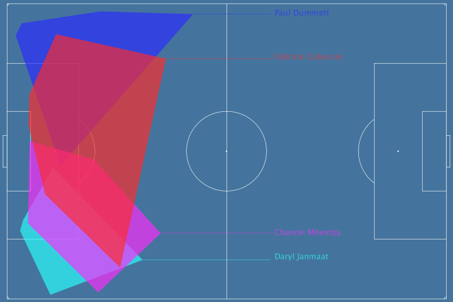
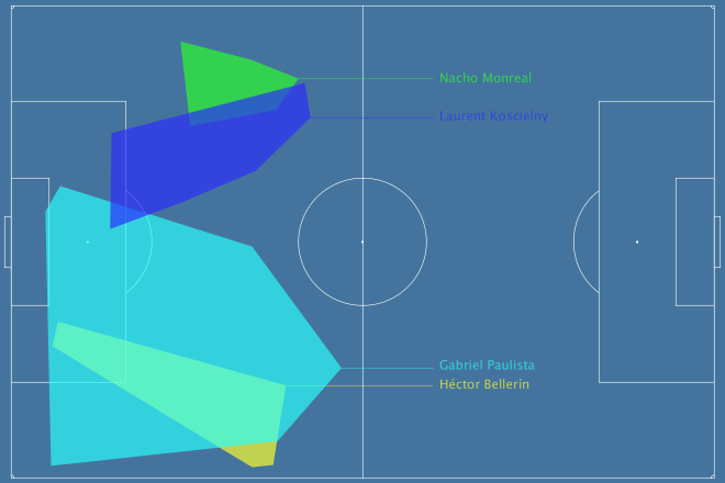
Liverpool’s First Choice Centre-Backs

At the Opta Pro Forum I blurted out to the Liverpool contingent that my pet defensive metric quite liked their defending, to which they replied “ours doesn’t.” So I was a little crestfallen, but I’ll continue to talk myself out of a job here: Liverpool concede the second fewest shots in the league, so I’m right. They also have the worst save percentage in the league but nevertheless renewed Mignolet’s contract, so they’re wrong. QED. Let’s look more closely:

liverpool-cbs

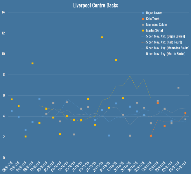
Here you’ve got all Liverpool’s games this season – Rodgers up to the fateful Merseryside derby on the 4th October, Klopp soon after. The markers show individual PATCH performances, and the lines are five-game moving averages (although Touré isn’t quite there yet). The average PATCH for EPL centre-backs is around 3.3, and you’ll note that Liverpool are regularly exceeding that. You can also see that Skrtel had some insane outliers, but maintained pretty good form for Klopp until his injury (which – if you’re to believe renowned fitness troll Raymond Verheijen – was inevitable). The fight for second place is closer, but even taking Lovren and Sakho side-by-side, I don’t believe you’re left with a terrible pairing.

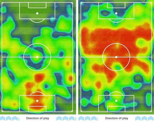
So, I don’t believe Liverpool’s defence is terrible and I think they have a solid foundation both in defence and midfield for Klopp to build on over the next season. I do believe they’ve been unlucky, as James Yorke points out in this article on Statsbomb. It’s funny to compare Everton and Liverpool’s defences this season – they both sit on 36 goals conceded in the league. Tim Howard has taken a lot of heat this year for his performances, all while facing 4.7 shots on target a game – the fourth worst in the league. Mignolet’s been facing 3.3 – the second least. While Howard has now been unceremoniously dropped and is soon to be shipped off to the MLS, Mignolet gets his contract renewed. Sure, some of of this is luck and not entirely his fault, but I genuinely believe you should not lay the blame on Liverpool’s defence, there’s not a lot more they could do to make Mignolet’s life quieter.

Arsenal’s Midfield

Through injuries, sentimentality or pure stubbornness, it’s hard to tell if Wenger knows his best midfield this season. I asked on Twitter and a lively debate ensued, but excluding the lamentation of Wilshere believers, the most common answer was Coquelin & Cazorla, with some pondering ways to insert Ramsey into the mix. What does PATCH think, purely defensively, of their appearances in the centre of the field?

arsenal-cms

Okay, well, first thoughts are that this is a graph format looking to get retired early, but here you have the four players who have put reasonable minutes into Arsenal’s central midfield, with the markers again showing their PATCH values in each game week, and the lines again showing a five game moving average. The average PATCH for a midfielder in the EPL is basically the same as a defender, around 3.3. This graph seems to imply that Cazorla has very good and very average games, and similar could be said for Flamini. Ramsey doesn’t seem like anything special, but is pretty low-variance. Coquelin seemed to start the season very strongly, but was fairly average in the lead-up to his injury.

Let’s break it down more simply, here are the averages:

Player PATCH
Santiago Cazorla 4.17
Francis Coquelin 3.83
Mathieu Flamini 3.79
Aaron Ramsey 3.60

So in black and white, we seem to more or less agree with Arsenal fans’ instincts.

N’Golo Kanté

What of players whose defending we rave about but who don’t make an appearance high up the PATCH ratings? N’Golo Kanté is way down the list, with a very middling  3.12. What’s happened there? Well, let me reiterate that PATCH measures territory and ball progression, nothing else. As I mentioned on the Analytics FC podcast recently, not all ball progression is bad. Much has been made of Leicester’s “bend, don’t break” defensive scheme this season – they give up territory but their low block often makes up for it, this means their midfield isn’t likely to score highly for repelling the opponent. Kanté himself regularly relies on pace and last ditch tackles (and he is an excellent tackler) to retrieve the ball once it’s in his territory, but if a pass has been completed in that territory, PATCH has already given him a demerit.

So… PATCH is useless because it misses demonstrably good players? Well, I’m not sure I’d go as far as calling Leicester’s defence bad, but it’s certainly well below par for a league leader, as Tim at 7amkickoff recently analysed. That said, I’ll admit I’m a little uncomfortable. I’ve said elsewhere, the essence of PATCH, or really any defensive metric, is this:

  1. Whose fault is it?
  2. How bad is it?

In PATCH, the whose fault part is calculated by territory (and there are lots of ways to do this better) and the how bad bit is done through ball progression. Alternatives to the second might pick Kanté up better – how many moves enter his territory, but never leave? That would be an interesting one to look at, and something I’ll explore soon.

For now, let’s just say that he’s valuable for Leicester inasmuch as his defensive skills turn into attacks very effectively, because it’s Leicester’s attack (and let’s face it, their luck) that is powering their title challenge, and not necessarily their defence. And that, dear reader, is another thing that PATCH doesn’t measure in defenders.

Conclusion

Hopefully if you’ve got this far, you believe there’s value in something like PATCH as a way of measuring defenders. It’s certainly entangled with teams’ systematic effects, and we suspect it has some false negatives. I don’t think looking at these outputs that there are tons of false positives however, but then Flamini rears his head so who knows.

I’m constantly working on PATCH, so I’d love to hear your ideas for places it might fall down, or things you’d like to see it applied to. To that end, I’ve bunged PATCH values for all EPL performances this season on Github. This file contains:

  1. Team
  2. Opposition
  3. Match date
  4. Player
  5. Date of Birth
  6. Nationality
  7. Starting lineup X position
  8. Starting lineup Y position
  9. Minutes played
  10. PATCH

Play, critique, ignore, do what you will. I’ll see if I can get to the point where these are updated for a all players in a bunch of leagues every week, but right now I can’t guarantee the scoring is going to be at all stable with all the changes I’m making.

Evaluating Defenders With PATCH

PATCHing Teams

I explained the current PATCH methodology in my previous post. Today I’m going to do a deep dive into how PATCH views the current teams in the EPL. Here’s what the table looks like (pre-Southampton on Saturday):

Team PATCH
Chelsea 2.84
Manchester United 2.79
Liverpool 2.73
Tottenham Hotspur 2.70
Manchester City 2.68
Bournemouth 2.64
Arsenal 2.61
Southampton 2.45
Leicester City 2.38
Aston Villa 2.34
Norwich City 2.28
Watford 2.27
Palace 2.27
West Ham United 2.27
Everton 2.22
Swansea City 2.18
Stoke City 2.13
West Bromwich Albion 2.11
Newcastle United 1.97
Sunderland 1.88

The values for PATCH are the 60th percentile of all performances for each team. You could, if you were highly motivated, work out the actual units for PATCH, but treat it as abstract. 2 is around average, somewhere just under 4 is the 90th percentile amongst player performances and 5+ would be outstanding. Given that, I am reasonably happy with how this shapes up.

PATCH Correlations

At first glance the numbers above don’t look bonkers, but how does the metric correlate with other team defensive stats? Let’s have a look:

Percentile GA xGA Shots Against SoT Against
10th 0.06 0.10 0.08 0.06
20th 0.22 0.30 0.20 0.15
30th 0.28 0.44 0.38 0.30
40th 0.29 0.56 0.54 0.44
50th 0.27 0.61 0.63 0.45
60th 0.27 0.71 0.76 0.55
70th 0.19 0.65 0.71 0.48
80th 0.16 0.60 0.62 0.38
90th 0.10 0.47 0.50 0.29

Those are the R2 values each team’s PATCH values at a certain percentile (10th being the lowest 10%, i.e. worst defensive performances), compared to some traditional measures. It’s great to see that we’re nicely correlated with expected goals against and shots, though I should point out that shots do directly go into the calculation – if you allow a shot through your territory, it’s marked against you. However, that’s only a small proportion of the gains measured. I tested with shots removed from the ball progression metric just to be sure and the correlations barely went down.

Defensive Ranks

So far we’ve only looked at team’s performances en masse, as measured by PATCH. This is what things look like if we break them down by rank in a team’s formation:

defensive-ranks

There are a few interesting patterns that immediately jump out:

  • Bournemouth’s attacking midfielders and forwards are doing a bunch of defensive work.
  • Manchester City’s less so.
  • Tottenham have the least penetrable midfield of any team in the league.
  • As you might expect, Leicester’s attack and defence are a little more robust than their midfield, reflecting the fact that they press high then retreat low.

Lingering on these numbers a little longer, I thought I’d compare these numbers to someone else’s model for a further sanity check. Mark Thompson of Every Team Needs a Ron is one of my favourite writers, and is devoted to studying defenders in all their forms. He has a system to analyse how teams convert possessions into attacks, and attacks into shots, and how they allow their opponents to do the same. I compared the defensive rank data above with his data to see what the correlations were:

Defence Midfield Attack
Attacks per Possession 0.65 0.47 0.40
Shots per Attack 0.46 0.53 0.38

So, comparing the Attack, Midfield, Defence PATCH values from the graph above to Mark’s Attacks per Possession and Shots per Attack, we can get an idea of how much different parts of a team contribute to breaking up attacks. Defensive PATCH values explain 65% of the variance in opponent attacks per possession, whereas midfield is a much lower 47%. This makes some sense, while a lot of teams would love their midfield to quash potential attacks before they happen, it’s far more common that they make it throught to the last line. What’s interesting is the second row, where midfield performances explain shots pre attack better than defence. Again I wonder if this is bad shot quality – the defence don’t (and often don’t want to) stop low-expectation long shots. However if your midfield are putting in a good screening performance, attackers won’t even get the space for bad shots.

That’s one explanation, anyway. At the very least I’m happy to see a decent correlation with someone else’s model.

Patchwork Defences

Defences are more than the sum of their parts. There are plenty of games where teams in aggregate can put in a great performance in terms of total or average PATCH values, but still be torn apart on the field. This happens often because of mistakes, which PATCH will probably never be able to account for, but it also happens because of weak links that let down the greater whole. Have a look at Manchester City from this weekend’s absolutely definitive title decider against Leicester:

defensive-areas-1901664770408076

This is a fairly green chart – City policed a lot of territory, and in various parts of the pitch prevented Leicester from making regular gains. But look at their right-hand side: Otamendi didn’t score especially highly, and Zabaleta (who seems to be pushing quite far forward) scored even worse. Teams rightly fear Leicester’s right wing, because that’s where the formidable Mahrez nominally takes the field, but here we saw Mahrez pop up on the left a few times, including for Leicester’s 2nd goal, and Drinkwater also made some penetrative passes. We can see this from Leicester’s attacking chart for the day:

LEI-MCI

Very left leaning, basically nothing on the right. Despite the fact that City conceded twice from set-pieces, you still saw scare after scare from open play. The combination of a weak defensive right-hand side, and players taking higher positions than was perhaps advisable against the league’s fastest counter-attacking team (still 2nd in Europe after Caen), meant that good PATCH scores in many parts of the pitch did not necessarily add up to a good defensive performance.

Weak Links

Given what we saw in the Man City vs Leicester game, perhaps we should judge a defence by its weakest link? After all, if they’re allowing lots of ball progression in their area, that’s obviously where the opposition are attacking, whether or not they’re thinking of that player as exploitable. If we just look at the lowest score for a defender in each game (using just those with 90+ minutes in a game to be safe), this is what teams come out looking like:

Team Mean Weak Link PATCH
Chelsea 2.32
Manchester United 2.06
Arsenal 1.99
Manchester City 1.97
Liverpool 1.78
Aston Villa 1.77
Leicester City 1.74
Tottenham Hotspur 1.74
Southampton 1.74
Bournemouth 1.68
Swansea City 1.62
Norwich City 1.61
Crystal Palace 1.59
West Bromwich Albion 1.58
Watford 1.54
Everton 1.53
West Ham United 1.48
Stoke City 1.48
Newcastle United 1.45
Sunderland 1.45

Nothing radically different here, perhaps I should be a little uncomfortable seeing Villa that high, but they have save percentage and shot creation issues, not necessarily an awful defence. That said, these numbers correlate less well with each of the four measures we compared to earlier, so it seems less representative.

Total Territory

PATCH fundamentally rewards defenders for claiming territory, so lets look into any team characteristics can we pick up from looking at their territory as a whole. Who uses the most space? Who leaves the most gaps?

This is total area per game of players’ defensive territory for each team, measured first as the sum of individual areas, then as a merged team area:

Team Total Individual Area Team Area
Arsenal 12375 5286
Aston Villa 12338 5590
Bournemouth 12487 5540
Chelsea 13385 5612
Crystal Palace 14240 5750
Everton 10494 5181
Leicester City 14580 6078
Liverpool 12817 5626
Manchester City 12025 5405
Manchester United 13156 5438
Newcastle United 11767 5003
Norwich City 11949 5614
Southampton 12885 5525
Stoke City 11464 5347
Sunderland 12880 5560
Swansea City 10882 5052
Tottenham Hotspur 13520 5522
Watford 12482 5779
West Bromwich Albion 12943 5694
West Ham United 14022 5693

Which looks like this:

territorial-area

The X axis is the total individual area, which includes overlaps between players. The Y axis is the team shape, the area you get when you merge all the individual territories together and forget overlaps – also worth noting that the lower this value, the more empty spaces the team is leaving on the pitch.

It’s interesting because it reveals teams that are quite expansive in their defensive efforts (to the right are basically the pressers and aggressors, to the left is… Everton, asking very little of its defence). It also shows teams that have an overall compact defensive shape (Newcastle) versus those that are push up more (Leicester, Watford). Above the trend line are teams with less overlap, below are those that are more crowded when defending.

If we apply a similar sort of calculation to PATCH, we can take a team’s area and judge them not by the progression they allow through their territory, but by the progression that happens outside it. If we do that, these are the numbers we see:

Team Outside Territory PATCH
Manchester City 24.09
Liverpool 23.55
Norwich City 22.78
Southampton 22.04
Leicester City 20.77
Watford 20.75
Tottenham Hotspur 20.59
Aston Villa 20.22
West Bromwich Albion 20.19
Crystal Palace 19.37
Bournemouth 19.35
West Ham United 19.26
Chelsea 18.34
Manchester United 17.94
Arsenal 16.98
Swansea City 16.51
Stoke City 16.36
Sunderland 15.96
Everton 13.31
Newcastle United 11.28

So Man City, Liverpool and… Norwich (apparently) allow the least progression outside their territory. Newcastle and Everton leave the biggest gaps for opponents to operate inside.

Getting Goal Side

Above you saw how a lot goes on in empty spaces. The thing that worries me most about PATCH, and particularly the approach I’ve taken to trimming events for territory, is space behind a defender. Perhaps we should leave in all goal side events for a defender? Even more, should we project their territory back to the goal line, or even the goalmouth itself?

Well, you’re going to have to wait to find out. In my next post I’m going to finally get around to looking at some individual player scores, and I’ll experiment with how defenders should be blamed for goal side events then.

PATCHing Teams

Defending your PATCH

Here is Chelsea defending against West Brom in their 2-2 draw this season:

defensive-areas-1840762271078623

If I’m pointing you to this post from Twitter, it’s likely that you’ve asked, with varying degrees of alarm, what the hell you’re looking at with a chart like above. Because I’m terrible at making legends, here you go:

  • This is a chart of how Chelsea defended in the game.
  • Each shape is a player, it represents their defensive ‘territory’ – the part of the pitch they made tackles, interceptions, fouls etc.
  • The player’s name is written in the centre of their territory, and you should be able to see that some names, and their associated shapes, are bigger or smaller, depending on how much a player ranges around the pitch.
  • Each shape has a colour – this represents how much they allowed the opponent to progress through their territory: more green means the player was more of a brick wall, more red means they were more of a sieve.
  • Above, you might see that Oscar put in a ton of work and claimed a large territory – we reward players who claim a lot of territory, which is why he’s more green than some of the players he shared space with, even though he let the same opposition moves through.
  • Terry did not protect his space particularly well. Mikel and Fabregas provided little in the way of screening, and Matic, who replaced Fabregas, sat very deep but also offered little as they defended their lead.

Just as a quick sanity check on what you see above, WBA’s two goals came from a long shot from a huge empty space in front of Chelsea’s defence (left open by their midfield) and a move on Terry’s side of the penalty box:

Those are cherry-picked and don’t prove much, of course. No chart captures the entirety of a game, but hopefully you see that this is at least an interesting conversation starter to examine where Chelsea might have protected their territory better. Over the course of several games, you may notice the same patterns happening over and over again. At the same time, these are a great first stab at looking for weaknesses in an opponent’s lineup.

And that’s what you’re looking at. How does it work?

PATCH

A while back I started looking at defence in terms of how a defender prevents their opponents operating in their territory. This included a metric called PATCH (“Possession Adjusted Territorial Control Held”… yeah), which underwent several changes without me really writing it up, despite publishing all sorts of cryptic charts on Twitter. So, my plan today is to go through the whole methodology as it stands today. There’s still work to do, and it’s by no means a hard and fast measure of good and bad defending, but it’s interesting enough to share and hope for some feedback.

Defensive Territory

PATCH is all about defensive territory – where on the pitch a player is responsible for stopping their opponent. We don’t measure this in an idealised way based on formations or anything like that, all we do is look at where a player is actually defending. We take all their defensive actions and draw a line around them – that’s their territory. In the previous version, we only looked at events in a team’s own half or danger zone, so the system wasn’t great at capturing defensive midfielders, who often defend higher up the pitch. That was a problem, but one we needed to solve without including noise from things like aerial challengers on attacking corners etc. It was also a problem that if a player put in even a single tackle in a weird place (a left back on the right wing etc) then the outline of their territory grew hugely.

There are many ways to solve this, I’ve experimented with a couple. The first was to find the average point of a defender’s defensive actions, and just trim events within 1 standard deviation on the X and Y axes. The advantage of this is that it’s dead simple, very quick to do inside a database query, and the resulting area was still somewhat representative of where the player was on the pitch. But not representative enough: it was possible for players to completely disappear if their defensive actions were all taken in a large ring far enough away from the centre, and it occasionally wrongly accused players of retreating into a tiny territory. Here’s an old version of the Chelsea-WBA chart above, look how tiny everyone is, especially John Terry:

terry-bug

I then experimented with a similar approach using the straight-line distance from the centre within the same sorts of bounds, but really this just gave you a slightly more circular version of the previous box. I finally settled on decent compromise between ease of implementation and realism – I trim events to those within the 70th percentile of distance from the centre. Here’s another example, Tottenham’s 4-1 victory over Sunderland:

defensive-areas-1835048780325164.png

The one drawback over the previous version is that things look far busier, especially where there are overlaps, which is why I’ve started putting them on a black background, and increasing the transparency of lower-scoring players (because, you know, sieves are more see-through than brick walls). Departure from brand, I know, but probably more readable.

Future avenues to look at are algorithms like local convex hulls, or more probabilistic approaches. You can certainly use some sort of kernel density approach, although I appreciate having hard boundaries to territory as it is. I might be willing to sacrifice the ease of visualising territory for a better approach, however, and I’ve been looking at a fairly complex system whereby you look at defensive events and opponent buildup in previous (representative) games, and use a Bayesian system to determine the degree to which we think a player would usually be defensively responsible in that situation. I’d love to hear any other approaches people have tried.

Ball Progression

The original PATCH metric looked at how many opposition touches a defender allowed in their territory to judge how well they were doing, but this didn’t seem ideal. Some teams with a low block are happy for you to play in front of them to your heart’s content, as long as you don’t make any progress towards goal. Then there are some bad defences that just don’t take many touches to break through and score. So I’ve made a fundamental change here – we now measure ball progression through a defender’s territory. Whenever the ball is passed, or dribbled, or whatever combination of on-the-ball events happens, we look at how much progress the opposition have made towards the defending team’s goal. More than that, we look at the pace with which they’ve moved. Any player whose territory is intersected by the line of this progress gets blamed for it.

So now we’re really measuring something directly relevant – a team moving towards your goal is getting into better and better shooting positions, and preventing, disrupting or postponing this is more or less the core of good defensive work. As ever, it’s not a metric based purely on defensive actions – we still use things like tackles to help mark out a player’s territory, and we hope that there are enough of these events to get an accurate picture. But we’re not judging them on those numbers – we’re judging them in far more direct terms, based on protecting their goal.

Scoring

As with the previous metric, players are rewarded for the size of their territory , and then penalised for allowing the opposition into it, in this iteration based on ball progression. But the previous scores left me a little uncomfortable, with PATCH regularly recommending bad defences over good ones. I went back and looked in depth at the variables that went into the calculation, and especially the relationships between them.

The first thing I looked at was the possession factor, which was in there to account for the fact that teams without the ball can’t attack you. To be able to compare individual players from high and low possession teams, I normalised things to 50% possession. However it’s not as simple as that, because you might expect high possession teams to have fewer opportunities to make defensive actions, so they’d on average have smaller territories. Rather than scratch my head over it, I just looked at the numbers. It was quickly obvious was that possession really doesn’t have a reliable affect on a player’s territory. More surprisingly, the correlation with ball progression allowed is also extremely low. So, possession’s out. We’ll retcon the acronym later.

I also worried that players with large territories were being overly rewarded, and looked at a couple of different options like taking the root of the area. In the end, if you look at the data, it’s pretty much a linear relationship, but I’ve made the coefficients a little more accurate at least. I also looked at the degree to which minutes on the pitch affected defensive territory, and again, it’s almost impossible to find a reliable correlation. Therefore, only ball progressions is weighted per 90.

So that’s the algorithm – get the area, divide it by ball progression, which you weight per 90 and by pace. The bigger your territory, the better you protect it, the higher you’ll score. It looks a little like this:

(k * Area) ÷ ((Total Ball Progression ÷ Minutes Played x 90) ÷ Average Progression Duration)

That’s the gist anyway.

Caveats

This is the usual section where I list things I was too lazy to fix, but I promise I’m thinking about them:

  • There are better ways to calculate territory, but not necessarily ones that can run inside an SQL query before I get bored.
  • Players are blamed for ball progression no matter how much their territory is intersected by an opponent event. Even in the case where they hoof the ball way over your head, you still get blamed. Long term, I’d like to handle special cases like this, and assign degrees of blame to different territories.
  • I’m aware that the gaps between territories are interesting – you can defend your territory brilliantly, but still be in the wrong place. Watch this space.
  • Lots of goals, frankly, come from mistakes, which aren’t captured here.
  • Different positions might want different approaches both to territory and scoring.

It’s also worth point out a few other people working in the same space. Sander at @11tegen11 naturally has a version, with scores based on the number of defensive actions:

And David Sumpter of @Soccermatics has similar charts looking at just ball recoveries, which is fascinating to study teams’ pressing approaches:

Happy to hear any other ideas people have!

Defending your PATCH

Defence, Territory and Control

There comes a time in your adolescence as a stats writer when your parents rudely awaken you in the middle of the night, bundle you into a car, and drop you in the middle of a dark forest with nothing but a sharp stick. “It’s time you made your own defensive metric,” they tell you before receding into the darkness. It is a rite of passage every statto must endure alone.

Frightened and cold, you look for shelter. xG, you think. I know xG, good old xG, I can use that for something! But others have been here before, the forest has been hunted barrenWhat about those bright green diagrams everyone claims to like, could I just use those? Carving numbers into trees with your trusty pointy stick, you get to work.


As anyone who follows this blog will know, I’m quite interested in space and how teams use it. Today I’m going to look at the territory claimed by defenders and I’m going to propose a metric based on the actions they allow within that territory. It’s just one metric, it’s not the be-all and end-all of measuring defenders or defences, but I think it’s vaguely interesting, and its opinion on a lot of defenders is defensible. It has some flaws that’ll probably be obvious to you, but I’ll mention them as we go.

What does a defender’s territory look like? Here’s how Arsenal looked against Tottenham in the North-London derby:

defensive-areas-1448157062630

Here’s Aston Villa’s clean sheet against Manchester City:

defensive-areas-1448157097475.png

And here’s Newcastle from their 1-0 smash and grab against Bournemouth:

defensive-areas-1448157225615

These are similar to my shot buildup charts, but for defensive actions. For each defender, we take all their own-half defensive actions (tackles, blocks, interceptions, clearances, aerial challenges and indeed fouls), and draw a line around them. This is their territory, it’s the part of the pitch they seem to want to be responsible for.

Now you could argue we could just split the final third of the pitch into four and assign each slice to a defender, but I think the overlaps are very valuable here – you want to know if a defender drifts inside or out, how far they push forwards etc. Obviously drawing the lines like this leaves gaps – nobody’s taking responsibility right at the edges or corners of the pitch. There’s also the problem of a player that makes a single tackle on the other side of the pitch, stretching their territory, perhaps unfairly. We could add a bit of a buffer zone to these areas, and trim some outliers, but for now I’m happy with them as they are – they are the best way we have of outlining a defender’s territory, based entirely on where the defender tries to defend.

Glancing at the charts above, you’ll notice some players have more territory than others. We want a metric that rewards this, if possible – if a player is bossing the entire danger zone, that’s great, even if you might prefer to see their team-mates step in. So our metric’s first ingredient is the surface area of a defender’s territory.

But the positioning on its own is meaningless, we want to know how much control they exert in that space. For this, we count the number of touches opponents take in the defender’s territory. These aren’t touches as you see them on TV, these are just all the aggregate events we see in the data – passes, dribbles, shots, all the stuff opponents want to do in our half. We have to be careful here to count points inside the territory, and only those that overlap the defender’s time on the pitch.

We combine these by dividing the area by the number of touches, then we weight things by possession and per-ninetify everything. What you should picture is the defender scent-marking their territory (I find it easiest to picture John Terry doing this, for some reason), and then every opposition action diluting that scent more and more. Larger territory will necessarily be exposed to more opposition actions, but good defenders will prevent and repel as much of this as possible. Players that make fewer defensive actions will have tiny territories, but can still score highly by keeping opponents out.

What’s nice about this particular metric is that it doesn’t force you to work out whether tackles or interceptions or aerials or whatever are more important, and it doesn’t require you to look at shots and xG (or expected assists etc). It captures defensive pressure in open play, which is where most defending happens.

So, recapping the algorithm:

Area ÷ Opposition Touches ÷ Possession ÷ Minutes Played × 90

I like to refer to this as ‘Possession-adjusted Territorial Control Held’, or PaTCH. I am not good at acronyms, please suggest more. In the meantime, which defenders have a good PaTCH?

Player Team PaTCH
Gabriel Armando de Abreu Arsenal 596.2
John Terry Chelsea 302.0
Chris Smalling Manchester United 268.2
Cedric Ricardo Alves Soares Southampton 265.4
Nicolás Otamendi Manchester City 261.9
Matteo Darmian Manchester United 256.7
Sylvain Distin Bournemouth 255.1
Eliaquim Mangala Manchester City 250.1
Sebastian Prödl Watford 248.4
Virgil van Dijk Southampton 238.4
Mamadou Sakho Liverpool 237.2
Joleon Lescott Aston Villa 233.2
Allan-Roméo Nyom Watford 226.6
Fabricio Coloccini Newcastle United 226.4
Aleksandar Kolarov Manchester City 209.8
Neil Taylor Swansea City 208.4
Ashley Williams Swansea City 202.1
Laurent Koscielny Arsenal 195.3
Simon Francis Bournemouth 194.4
César Azpilicueta Chelsea 189.2
Luke Shaw Manchester United 187.7
Kurt Zouma Chelsea 185.4
Toby Alderweireld Tottenham Hotspur 185.0
Ryan Bertrand Southampton 182.2
Steven Whittaker Norwich City 176.8
Gareth McAuley West Bromwich Albion 175.1
Micah Richards Aston Villa 174.3
Jose Fonte Southampton 171.8
Russell Martin Norwich City 171.0
Glen Johnson Stoke City 170.9
Jeffrey Schlupp Leicester City 167.3
Daley Blind Manchester United 163.9
Bacary Sagna Manchester City 158.7
Phil Jagielka Everton 158.4
Nathaniel Clyne Liverpool 158.3
Ciaran Clark Aston Villa 155.5
Federico Fernandez Swansea City 150.3
Sebastien Bassong Norwich City 148.9
Vincent Kompany Manchester City 146.4
Per Mertesacker Arsenal 146.0
Martin Kelly Crystal Palace 145.1
Nacho Monreal Arsenal 142.1
Craig Cathcart Watford 139.9
Joel Ward Crystal Palace 138.1
Martin Skrtel Liverpool 138.0
Charlie Daniels Bournemouth 135.7
Ben Davies Tottenham Hotspur 135.2
Joseph Gomez Liverpool 134.9
Robbie Brady Norwich City 134.7
Winston Reid West Ham United 132.8
Jan Vertonghen Tottenham Hotspur 132.1
Alan Hutton Aston Villa 131.9
Jordan Amavi Aston Villa 128.6
Aaron Cresswell West Ham United 128.4
Maya Yoshida Southampton 127.4
Tommy Elphick Bournemouth 126.6
Héctor Bellerín Arsenal 119.5
Philipp Wollscheid Stoke City 119.4
Branislav Ivanovic Chelsea 117.8
Kyle Walker Tottenham Hotspur 116.9
Geoff Cameron Stoke City 116.8
Erik Pieters Stoke City 116.0
Carl Jenkinson West Ham United 115.7
Gary Cahill Chelsea 114.5
Marc Muniesa Stoke City 114.3
Kyle Naughton Swansea City 111.3
James Tomkins West Ham United 110.8
Scott Dann Crystal Palace 107.7
Steve Cook Bournemouth 107.0
John Stones Everton 106.8
Daryl Janmaat Newcastle United 104.4
Jonny Evans West Bromwich Albion 103.7
Chris Brunt West Bromwich Albion 103.1
Ritchie de Laet Leicester City 103.1
Danny Rose Tottenham Hotspur 100.0
Wes Morgan Leicester City 97.4
Robert Huth Leicester City 95.3
Brendan Galloway Everton 95.0
Dejan Lovren Liverpool 92.3
Billy Jones Sunderland 90.7
Nathan Aké Watford 90.2
Pape Souaré Crystal Palace 85.4
Seamus Coleman Everton 84.6
Massadio Haidara Newcastle United 83.2
John O’Shea Sunderland 82.7
Younes Kaboul Sunderland 80.5
Craig Dawson West Bromwich Albion 77.5
Chancel Mbemba Newcastle United 74.0
Damien Delaney Crystal Palace 70.1
Sebastián Coates Sunderland 69.1
Patrick van Aanholt Sunderland 68.4
Brede Hangeland Crystal Palace 64.6

These are filtered for defenders with 450+ mins (all data from before Saturday’s games), and I’m calculating the average PaTCH over those games. Note: as usual, ballsed up a bit, the graphics show territory marked out in the defender’s own half, the numbers are actually calculated for territory in the final third. But it’s cool, cos comparing the two sets of numbers will make for an interesting article in a bit.

Gabriel is such an outlier because of Arsenal’s 1-0 win over Arsenal, in which Mitrovic got sent off and Newcastle had one shot. Look at the territory:

defensive-areas-1448159902841

Now look at the heatmap from the BBC (Newcastle on the left):

85262060_arsenalnewcastleheatmaps

Newcastle had one touch in his territory, as far as I can tell, giving an astronomical match PaTCH (yup) in the three-thousands. Anyway, I will think of some better averaging or thresholding to reduce the impact of stuff like this, but still, he sort of earned it.

Elsewhere, you can see the model doesn’t like Sunderland or Crystal Palace much, but is a little bullish on Aston Villa’s defence. Of course this weekend Lescott was benched against Everton, and Villa decided to sit very deep and let Everton play, with horrific results. Everton themselves seem to have ridden their luck a few times – Galloway, Coleman and Stones bomb forward regularly and rely on Barry and McCarthy to pick up the slack in their territory, something I’d like to capture in the numbers at some point. Terry is still good at some stuff, Smalling’s number is consistent with the hype, Otamendi is predictably up there, and Koscielny is doing fine, though he’d probably benefit from that forever delayed defensive midfield signing for Arsenal. Lovren near the bottom, below every Liverpool and Southampton player.

For now, I’m reasonably happy with who shows up at the top and bottom. Over the next few days I’ll play with some historical data to tell some stories, incorporate this metric with a Christmas Shopping piece about defenders, then make some visualisations to see if there’s a good counterpart to the attacking buildup maps.

Defence, Territory and Control