My Stats #8245–8249 & 117

I spend a lot of time working on new models and metrics, watching games and generally mucking about with football stuff, but very little of it sees the light of day. Sometimes I fall out of love with an idea, sometimes it just doesn’t pan out, sometimes I hit the limit of what my brain (or for that matter my free time) can handle and give up.

Today, I’m going to take you on a tour of my drafts folder in WordPress, and as a weird form of primal scream therapy, I’ll give you a sample of some of the ideas I’ve had over the last few months and stalled on. I’ve no idea if this will be in any way useful or inspiring for people, but I hope at the very least that you’ll read it and think, “hey, that guy’s ideas are stupid, I could do this!”

As a festive but belated Easter bonus, I’ve also added a ‘probability of resurrection’ to each idea, so you can see which ones are victims of mere procrastination instead of actual shame.

The Path of Least Resistance

This idea is sort of the intersection of all the shot chart and PATCH stuff I’ve done – can you calculate and plot the areas where a team (or indeed a particular lineup) are weakest? Is it possible to visualise the path of least resistance, along which you’ll find it easiest to progress towards your opponent’s goal?

This isn’t supposed to sound grandiose, or like some universal metric that just tells you how to beat teams, but I genuinely think it would be great to have a visualisation that combined the shot and PATCH charts, to be able to get a feel – at a glance – for where your own team is weak, or where prospective opponents might be weak.

There are a few ways to do this, the first quick attempt I tried was purely visual, plotting big fat lines on a pitch wherever you conceded ball progression, overlaying them, and changing the colour of the overlaps as they get more and more used. This looked almost comically vomitous, so I paused to work on both a better model and visualisation.

Review: promising, until we got to the word ‘vomitous’.
Probability of resurrection: 6/10

Dangerous Dispossessions & Forward Retention

I spent a long time cobbling together stats for an extremely snarky piece about Everton’s ‘Fab Four’ of Barkley, Stones, Deulofeu and Lukaku. The general idea being, each player had bad habits, and we could judge Martinez by the degree to which those habits were being trained out. To be quite honest, three of those players have been fine and/or excellent this season so I cooled on the idea, plus I could never find the exact right metric to test against.

A couple of things I came up with were quite fun though. The first was ‘dangerous dispossessions’. Ross Barkley has spent large swathes of his career dribbling into trouble and losing the ball, and I started watching games with a eye for one thing: how many shots from counter-attacks did Everton conceded when Barkley was dispossessed? The idea being, some players really shouldn’t be dribbling, because they give up more equity than they ever gain. For a second I thought I had him with this, he and Alexis Sanchez featured highly, but after I’d per ninetified everything and used xG instead of raw shots, Barkley stopped sticking out so much.

The second metric I looked at was ‘forward retention’, where you don’t just look at pass completion, you also look at the success of the player you’re passing to, the idea being that some players might play their team-mates into trouble. And then you’ll want to look at whether players are playing passes that are too safe and build a model to allow you to look at the risk vs reward of individual passes etc etc.

Review: better if all this was subsumed into a more general model that looked at events on the pitch and their actual vs likely outcomes.
Probability of resurrection: 3/10

Peak xG

I was thinking about this partly as a way of measuring striker positioning, but also in light of Damien Comolli’s mention of judging defenders by interceptions on the Analytics FC podcast (about 30:52 in). Basically, you can sample along the line of an attempted cross or throughball or whatever, and calculate what could have been the maximum xG for a resulting shot. You can then hope to judge a striker’s positioning by whether they met the ball at its point of peak xG (or if they indeed exceeded it by taking a touch or whatever). You can also hope to judge defenders by measuring how dangerous a shot they prevented through an interception.

Review: probably very simplistic in a world with positioning data, but might be interesting to see a few numbers.
Probability of resurrection: 5/10

Pinball Charts

This was an alternative I imagined to the (rather busy looking, these days) PATCH charts, and part of my frustrated obsession with making charts as animated gifs. The idea was to plot the lines of an opponent’s attacking possession as it moved over the pitch, ‘activating’ defending players’ territories as the lines entered. Territory polygons would start faded out almost completely but become more visible when entered, a bit like a bumper lighting up when hit on a pinball table. If the possession ended in a territory, we’d make it more green (yay, you stopped an attack), if it passed through and out the other side, we’d make it more red (boo, you failed).

I didn’t get very far with this, if only because the graphics library I’ve been using for everything is a little hateful. But I think it would solve a lot of problems with charts that get very busy, and I’m eager to at least see people experiment with whether any useful information can be communicated with animation of this sort of data.

Review: this would probably annoy enough people on Twitter to be worthwhile.
Probability of resurrection: 9/10

Expected Yellows

Clubs are looking for any edge they can get in games, and I would love to build some referee models. The easiest to do with the data that’s out there is expected yellows: given a foul, what is the likelihood of a player being booked for it? Can we find more/less lenient refs, unfairly maligned players versus those immune to punishment, areas of the pitch where it’s safer to put in a professional foul? Could all be interesting, but there’s only about 1000-2000 cards a season depending on the league, and those for a variety of offences, so it’s quite difficult to pin down any patterns with confidence, and that’s before taking into account that the data doesn’t contain how dangerous a particular tackle was.

Expected offsides would be another wonderful model to have if you were intent on destroying the beautiful game at all costs.

Review: not enough data to do a decent job at this stage.
Probability of resurrection: 4/10

Passing Variety

This is one of those weird ones where I’m sure someone already did this, but I may just be misremembering Marek Kwiatowski’s article on Statsbomb about classifying central midfielders. Anyway, what I wanted to do was look at similar metrics to Marek, the pass direction and length, but see which teams had built midfields with a variety of passing styles, as opposed to just the same profiles across the board. Then of course you’d have to look at which approach actually worked better, or whether different lineups enabled teams to handle different opposition better etc. If this sounds familiar to anyone and they know the article I’m talking about, please get in touch so I know I’m not dreaming it.

Review: would be interested to read even if it already exists.
Probability of resurrection: 9/10

Corner Positions

I don’t remember ever making this, but it’s the only one of these that has code which worked first time, so I can actually give you some pictures. what you’re seeing here is players’ aerial performance from corners (straight from corners, whoever wrote this code never bothered to include headers after the first). Size is volume, colour is the ratio won and the centre of each players’ circle is their average position for aerial challenges. Left side of pitch is for corners from the left, right is for right, so picture them coming from the bottom of the screen.

Both Merseyside teams covering themselves with glory here.

Reviewa bit sparse, probably interesting to someone though.
Probability of resurrection: 6/10

CROTCH

This wasn’t actual work per se, but after dropping the Possession Adjusted bit from PATCH, and talking about it on the Analytics FC podcast, it occurred to me that CROTCH would be a magnificent acronym. Control Retained Over Territory something… something. Didn’t pan out, probably for the best.

Reviewno.
Probability of resurrection: 0/10

Conclusion

I’d genuinely forgotten a couple of these until I went through old SQL stored in databases, so it’s been a useful process. By all means take any of the ideas above and run with it (or tell me if you’d desperately like to see it completed). In general I’m happy if you want to replicate anything on the blog as long as you credit me with a little inspiration.

In the meantime, I’ve still got plenty of things sitting in my drafts that I’m actively working on, so I haven’t included those, in the hope that they don’t fall into disrepair also. In fact, I ought to publish this before I forget about it.

My Stats #8245–8249 & 117

Idle Hands

“He’s had nothing to do all game,” we hear, every single week on Match of the Day, as if we’ve just cut to images of Hugo Lloris in a deck chair with a dog-eared copy of War and Peace, startled as a striker thunders by spilling his mojito.

Do keepers really switch off when they’ve had nothing to do? I thought it would be simple enough to check, so I looked at all the shots I have on record in terms of my save difficulty metric.

Methodology

By working out the time between every shot on target faced and the previous goalkeeper event (be it another save, or a goal kick or whatever to wake the keeper out of their trance), you have the number of seconds the keeper has been idle before that shot. I limited the data to shots from open play, as you won’t have the element of surprise from dead-ball situations, and reset the clock at half time, so the maximum time a keeper can be idle is a little north of 45 * 60 = 2700 seconds.

Then to measure keeper over- or under-performance, you can work out the saves above expected for that shot: if a shot has a save difficulty of 70%, we expect a statistically average keeper to only save it 30% of the time. So if they do save it, we’ll score that as 0.7 saves above expected – they got 1 whole save, we expected 0.3 saves (which obviously isn’t actually possible on a single shot, but you get the picture), so they got a profit of 0.7. If they don’t save it, they got a big fat zero saves, and we score it as -0.3.

So, we know for every shot whether the keeper over or under performed when attempting a save (to the extent you believe the outputs of an expected saves model, obviously), and we know how long they’ve been idle. Is there any interesting correlation here? Do higher numbers for idleness result in saves under the expected value?

Results

There is no overall correlation between idleness and shot stopping. I looked at the measure above, along with raw save percentage, with saves grouped into buckets by various lengths of idleness. The chart below shows the save percentage as the green area, and the saves above expected as the line.

idle-saves

This shows basically nothing – the saves above expected values are tiny, and dwarfed by the error of any particular xG model you choose to use. You can also safely ignore the big jump towards the end of the half – the sample size is miniscule. So, keepers can rest easy against their goalposts?

On a hunch I filtered the data down to what Opta deem as ‘fast breaks’. If you’re going to catch an idle keeper off guard, maybe you just need to be quick about it. It’s a smallish dataset (just over 4000 shots) but behold this trend:

idle-saves-fast-break

So there you go, have we found something? By the time we’re in that 1200-1499 second bucket, we’re talking 117 shots, with 72 in the next bucket, so again, small sample. I’ve also chosen the bucket size fairly arbitrarily – at 150 seconds per bucket, things are far more chaotic, and we should be wary of Simpson’s paradox when aggregating data. But it does seem to be a hint that maybe something’s going on. There’s at least a 10 percentage point drop in save percentage as idle time increases, and keepers are also saving fewer shots than we expect, which should account for any shot quality issues above and beyond raw save percentage.

Are we sure we have the right cause though? I checked if it was just that teams create better quality chances later into a half (encouraging teams on to them for the first half hour to create counter attacks, or probing and finding weaknesses, I dunno) but saw no real differences per minutes of the half. Then I thought that perhaps it’s nothing to do with keepers at all, maybe defences are the problem. So I created this chart – it shows the same save percentage area as above, but instead of saves over/under expected, I just put the average chance quality and the average save difficulty. This tells us how good the oppositions chances were, and how hard they were to save, regardless of how the keeper dealt with them.

fast-break-idle-xg
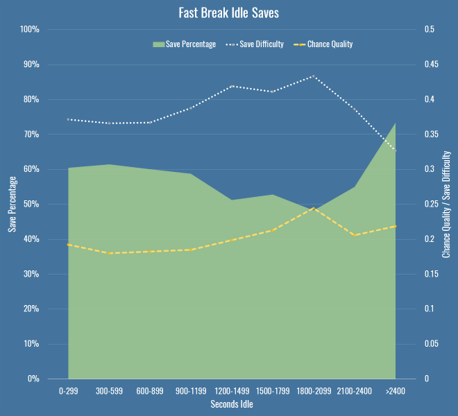
The important thing to note here is that my chance quality model includes almost nothing about the actual shot as taken by a striker – it’s mostly about the position of the shot, and the buildup to it. For that metric to be going up (again only slightly, and again with a small sample size) it’s entirely possible that the fault doesn’t only lie with idle keepers, but with idle defences too, for allowing better chances. It’s also possible that the under-performance of keepers in terms of expected saves (to the extent we believe it exists) is because we have no measure for defensive pressure.

So what do we know? If there is a decline in performance due to idleness, it’s small, hard to prove with confidence, and may in fact be due to defences and not keepers. Not very convincing, I’m sure you’ll agree, but I was recently reminded how important it was to publish low-significance and null results along with everything else (if only to ease the pressure on the wasteland that is my drafts folder). I also googled around a bit and found nothing mentioning this, so I thought it would be good to get it out there for posterity. At the very least, every time you hear the old cliché in commentary, you’ll know there’s probably little reason to worry that keepers who have been idle will suddenly forget to stop shots.

Caveats

A few notes and avenues for future work if you’re bothered:

  • By all means replicate this any way you like, it’s simple enough even if you have public shot data derived from the StatsZone app or BBC live text commentary. I’d be fascinated to hear if you find any patterns I’ve missed.
  • I’ve not looked at individual keepers – it’s possible there are some particular keepers that switch off, although I doubt it, and it’ll be a small sample size.
  • I didn’t include periods of extra time, just because I wanted to make sure that we were always comparing apple-shaped things.
  • I wasn’t strictly measuring idleness as time between saves, I was assuming that a catch or a goal kick was enough to wake a keeper up, but perhaps that’s an assumption to test.
  • I’m only looking at shot stopping, so I can’t rule out that idle keepers underperform on interceptions or catches in some way.
  • There are other measures one could use for fast breaks, or indeed counters, that may increase the sample size.
Idle Hands

Evaluating Defenders With PATCH

Today we’ll look at players in Europe through the lens of my PATCH defensive metric. If you can’t be bothered trawling through an entire post to understand the method, you only really need to know this: PATCH measures how much a defender prevents their opponents from advancing the ball through their territory. Clearly that leaves lots of information about defenders and defences in general on the table, but you’ll have enough information by the end of this post to bash me over the head with specific examples of players you think it’s misjudging. In fact, I’ll even help you out along the way and spell out all my worries about the metric, and the things I think it ought to do in the future.

That said, in PATCH’s defence, it has some nice characteristics:

  • A team’s medianish PATCH score correlates pretty well with shot numbers conceded by a team over a season, at around 0.7.
  • It correlates slightly better with xG conceded by teams, at around 0.75.
  • It persists year-on-year for teams, correlated at around 0.6.
  • A player’s median PATCH persists year-on-year at around 0.3.

But putting numbers aside, let’s see how you feel about some individual player values. If you look at the standard deviation of median PATCH values by minutes played, you can see things settle down at around 600 minutes:

patch-stddev

That’s because at very low values you get some weird outlying games, where players haven’t had any opponents in their territory and so score very highly. Just to be safe, we’ll set a cutoff a little higher, so here are the top European centre-backs with more than 900 minutes this season:

Competition Team Player PATCH
Italian Serie A Fiorentina Gonzalo Rodríguez 6.27
French Ligue 1 Lyon Samuel Umtiti 5.79
Spanish La Liga Real Madrid Pepe 5.52
Spanish La Liga Barcelona Gerard Piqué 5.24
German Bundesliga FC Bayern München Jerome Boateng 5.20
Spanish La Liga Barcelona Javier Mascherano 5.20
Spanish La Liga Málaga Raúl Albentosa 5.19
Italian Serie A Roma Kostas Manolas 5.06
Italian Serie A Lazio Wesley Hoedt 4.99
German Bundesliga Borussia Dortmund Sokratis 4.94
Italian Serie A Fiorentina Davide Astori 4.91
French Ligue 1 Paris Saint-Germain Thiago Silva 4.86
English Premier League Liverpool Martin Skrtel 4.72
English Premier League Liverpool Mamadou Sakho 4.72
Italian Serie A Internazionale Jeison Murillo 4.71
Italian Serie A Milan Alex 4.66
Italian Serie A Juventus Andrea Barzagli 4.63
French Ligue 1 St Etienne Loic Perrin 4.59
French Ligue 1 GFC Ajaccio Roderic Filippi 4.57
Italian Serie A Juventus Leonardo Bonucci 4.49

There are some clumps of teams here, so we should immediately be suspicious that we’re measuring team effects as much as player effects – PATCH currently doesn’t adjust for teams average scores, and for that matter nor does it score leagues differently. But these numbers are mostly defensible. It’s fun to note that Raúl Albentosa was a Derby County signing during Steve McClaren’s reign, and he’s recently been targeting Samuel Umtiti at Newcastle, so it’s nice to know I’ve built the perfect metric for him, even if you don’t buy it.

The same metric works for defensive and centre midfielders too:

Competition Team Player PATCH
Spanish La Liga Barcelona Sergio Busquets 5.66
French Ligue 1 Lyon Maxime Gonalons 5.50
Spanish La Liga Barcelona Ivan Rakitic 5.21
Italian Serie A Fiorentina Milan Badelj 5.19
Italian Serie A Roma Daniele De Rossi 4.84
French Ligue 1 Lyon Corentin Tolisso 4.81
Italian Serie A Fiorentina Borja Valero 4.60
Italian Serie A Fiorentina Matias Vecino 4.48
Spanish La Liga Sevilla Grzegorz Krychowiak 4.45
Italian Serie A Lazio Lucas Biglia 4.31
Italian Serie A Internazionale Felipe Melo 4.30
Spanish La Liga Las Palmas Vicente Gómez 4.28
English Premier League Liverpool Emre Can 4.26
Spanish La Liga Sevilla Steven N’Zonzi 4.26
German Bundesliga Borussia Dortmund Ilkay Gündogan 4.26
Italian Serie A Roma Radja Nainggolan 4.25
German Bundesliga FC Bayern München Xabi Alonso 4.24
German Bundesliga FC Bayern München Arturo Vidal 4.11
Spanish La Liga Rayo Vallecano Raúl Baena 4.10
English Premier League Liverpool Jordan Henderson 4.09

Busquets on top, all is right in the world.

Prospects

We can already see some talented youngsters in the tables above, so let’s focus purely on players that were 23 or under at the start of this season. I’ve relaxed the minutes to 600, here’s the top 30, taken from all midfielders and defenders:

Competition Team Player Date of Birth Minutes PATCH
French Ligue 1 Lyon Samuel Umtiti 14/11/1993 1852 5.79
Italian Serie A Lazio Wesley Hoedt 06/03/1994 1507 4.99
French Ligue 1 Lyon Corentin Tolisso 03/08/1994 2188 4.63
German Bundesliga FC Bayern München Joshua Kimmich 08/02/1995 727 4.54
English Premier League Liverpool Emre Can 12/01/1994 2054 4.44
German Bundesliga VfB Stuttgart Timo Baumgartl 04/03/1996 1287 4.30
German Bundesliga Bayer 04 Leverkusen Jonathan Tah 11/02/1996 2076 4.27
French Ligue 1 Lyon Sergi Darder 22/12/1993 696 4.15
German Bundesliga VfL Wolfsburg Maximilian Arnold 27/05/1994 877 4.10
German Bundesliga FC Bayern München Kingsley Coman 13/06/1996 895 3.98
Spanish La Liga Rayo Vallecano Diego Llorente 16/08/1993 2228 3.97
French Ligue 1 Paris Saint-Germain Marquinhos 14/05/1994 988 3.95
Italian Serie A Empoli Federico Barba 01/09/1993 927 3.93
English Premier League Tottenham Hotspur Dele Alli 11/04/1996 730 3.93
English Premier League Tottenham Hotspur Eric Dier 15/01/1994 2375 3.79
English Premier League Arsenal Héctor Bellerín 19/03/1995 2346 3.79
Spanish La Liga Real Sociedad Aritz Elustondo 11/01/1994 1643 3.68
Spanish La Liga Atlético de Madrid Saúl Ñíguez 21/11/1994 1337 3.66
Italian Serie A Lazio Sergej Milinkovic-Savic 27/02/1995 715 3.65
French Ligue 1 Monaco Wallace 14/10/1994 1654 3.63
German Bundesliga Borussia Dortmund Matthias Ginter 19/01/1994 1414 3.62
Italian Serie A Milan Alessio Romagnoli 12/01/1995 2102 3.62
German Bundesliga Borussia Dortmund Julian Weigl 08/09/1995 1575 3.59
Italian Serie A Lazio Danilo Cataldi 06/08/1994 1024 3.55
Italian Serie A Napoli Elseid Hysaj 02/02/1994 2279 3.52
Spanish La Liga Sevilla Sebastián Cristóforo 23/08/1993 614 3.51
English Premier League Chelsea Kurt Zouma 27/10/1994 1949 3.51
French Ligue 1 Nice Olivier Boscagli 18/11/1997 792 3.48
Spanish La Liga Getafe Emiliano Velázquez 30/04/1994 745 3.44
Italian Serie A Sampdoria David Ivan 26/02/1995 785 3.41

Note: the tables above filter to performances at centre-back or in midfield, if the values differ in this last table it’s because it considers their performances in a wider variety of positions.

So, cheer up Timo Baumgartl, PATCH doesn’t count mistakes. You’ll note again big clumps of players from the same teams (kudos, Lyon) – we know by now we’re probably measuring some systematic effects here. It’s also worth pointing out that if a young player is getting this level of minutes, in the big 5 leagues, they’re probably at a certain level without even looking at their numbers. But again, at first glance, this is a decent list.

Liverpool’s First Choice Centre-Backs

At the Opta Pro Forum I blurted out to the Liverpool contingent that my pet defensive metric quite liked their defending, to which they replied “ours doesn’t.” So I was a little crestfallen, but I’ll continue to talk myself out of a job here: Liverpool concede the second fewest shots in the league, so I’m right. They also have the worst save percentage in the league but nevertheless renewed Mignolet’s contract, so they’re wrong. QED. Let’s look more closely:

liverpool-cbs

Here you’ve got all Liverpool’s games this season – Rodgers up to the fateful Merseryside derby on the 4th October, Klopp soon after. The markers show individual PATCH performances, and the lines are five-game moving averages (although Touré isn’t quite there yet). The average PATCH for EPL centre-backs is around 3.3, and you’ll note that Liverpool are regularly exceeding that. You can also see that Skrtel had some insane outliers, but maintained pretty good form for Klopp until his injury (which – if you’re to believe renowned fitness troll Raymond Verheijen – was inevitable). The fight for second place is closer, but even taking Lovren and Sakho side-by-side, I don’t believe you’re left with a terrible pairing.

So, I don’t believe Liverpool’s defence is terrible and I think they have a solid foundation both in defence and midfield for Klopp to build on over the next season. I do believe they’ve been unlucky, as James Yorke points out in this article on Statsbomb. It’s funny to compare Everton and Liverpool’s defences this season – they both sit on 36 goals conceded in the league. Tim Howard has taken a lot of heat this year for his performances, all while facing 4.7 shots on target a game – the fourth worst in the league. Mignolet’s been facing 3.3 – the second least. While Howard has now been unceremoniously dropped and is soon to be shipped off to the MLS, Mignolet gets his contract renewed. Sure, some of of this is luck and not entirely his fault, but I genuinely believe you should not lay the blame on Liverpool’s defence, there’s not a lot more they could do to make Mignolet’s life quieter.

Arsenal’s Midfield

Through injuries, sentimentality or pure stubbornness, it’s hard to tell if Wenger knows his best midfield this season. I asked on Twitter and a lively debate ensued, but excluding the lamentation of Wilshere believers, the most common answer was Coquelin & Cazorla, with some pondering ways to insert Ramsey into the mix. What does PATCH think, purely defensively, of their appearances in the centre of the field?

arsenal-cms

Okay, well, first thoughts are that this is a graph format looking to get retired early, but here you have the four players who have put reasonable minutes into Arsenal’s central midfield, with the markers again showing their PATCH values in each game week, and the lines again showing a five game moving average. The average PATCH for a midfielder in the EPL is basically the same as a defender, around 3.3. This graph seems to imply that Cazorla has very good and very average games, and similar could be said for Flamini. Ramsey doesn’t seem like anything special, but is pretty low-variance. Coquelin seemed to start the season very strongly, but was fairly average in the lead-up to his injury.

Let’s break it down more simply, here are the averages:

Player PATCH
Santiago Cazorla 4.17
Francis Coquelin 3.83
Mathieu Flamini 3.79
Aaron Ramsey 3.60

So in black and white, we seem to more or less agree with Arsenal fans’ instincts.

N’Golo Kanté

What of players whose defending we rave about but who don’t make an appearance high up the PATCH ratings? N’Golo Kanté is way down the list, with a very middling  3.12. What’s happened there? Well, let me reiterate that PATCH measures territory and ball progression, nothing else. As I mentioned on the Analytics FC podcast recently, not all ball progression is bad. Much has been made of Leicester’s “bend, don’t break” defensive scheme this season – they give up territory but their low block often makes up for it, this means their midfield isn’t likely to score highly for repelling the opponent. Kanté himself regularly relies on pace and last ditch tackles (and he is an excellent tackler) to retrieve the ball once it’s in his territory, but if a pass has been completed in that territory, PATCH has already given him a demerit.

So… PATCH is useless because it misses demonstrably good players? Well, I’m not sure I’d go as far as calling Leicester’s defence bad, but it’s certainly well below par for a league leader, as Tim at 7amkickoff recently analysed. That said, I’ll admit I’m a little uncomfortable. I’ve said elsewhere, the essence of PATCH, or really any defensive metric, is this:

  1. Whose fault is it?
  2. How bad is it?

In PATCH, the whose fault part is calculated by territory (and there are lots of ways to do this better) and the how bad bit is done through ball progression. Alternatives to the second might pick Kanté up better – how many moves enter his territory, but never leave? That would be an interesting one to look at, and something I’ll explore soon.

For now, let’s just say that he’s valuable for Leicester inasmuch as his defensive skills turn into attacks very effectively, because it’s Leicester’s attack (and let’s face it, their luck) that is powering their title challenge, and not necessarily their defence. And that, dear reader, is another thing that PATCH doesn’t measure in defenders.

Conclusion

Hopefully if you’ve got this far, you believe there’s value in something like PATCH as a way of measuring defenders. It’s certainly entangled with teams’ systematic effects, and we suspect it has some false negatives. I don’t think looking at these outputs that there are tons of false positives however, but then Flamini rears his head so who knows.

I’m constantly working on PATCH, so I’d love to hear your ideas for places it might fall down, or things you’d like to see it applied to. To that end, I’ve bunged PATCH values for all EPL performances this season on Github. This file contains:

  1. Team
  2. Opposition
  3. Match date
  4. Player
  5. Date of Birth
  6. Nationality
  7. Starting lineup X position
  8. Starting lineup Y position
  9. Minutes played
  10. PATCH

Play, critique, ignore, do what you will. I’ll see if I can get to the point where these are updated for a all players in a bunch of leagues every week, but right now I can’t guarantee the scoring is going to be at all stable with all the changes I’m making.

Evaluating Defenders With PATCH