Today I’ve been experimenting with how to visualise the attacking geometry data I’ve been calculating. If you’ve seen the previous posts you’ll know that I’ve been mostly able to calculate width, height and duration for passing moves that lead to shots. I want to use this data to get a feel for how different teams attack and ultimately what types of attack are effective.
The data is still a bit problematic. I’m only interested in attacking buildup – shots from free-kicks, or directly after turnovers don’t show up because there’s only one event in the move, the shot itself. There’s also a bit of fuzziness that perhaps over-eagerly associates passages of play with an attack – this is because of quick changes in possession. Basically you have two options:
- Reset the buildup whenever the attacking team loses the ball. This means you’re incredibly sensitive to attempted clearances or aerial challenges.
- Allow a little leeway for the attacking team to win possession back.
I chose the latter – after an unsuccessful pass which gives the opponents the ball, if the attacking team can get the ball back within 5 seconds, it’s credited as part of the same attacking move. It results in us capturing many more moves around the box (where deflections, clearances and aerial challenges are common) at a cost of elongating some moves in the middle of the park where you might argue that the ball is actually evenly contested. There are other caveats that I hope are sensible: I don’t track shots after rebounds unless they grow into their own move, otherwise I’d risk measuring the build-up play twice. I also don’t track moves across dead-ball situations, so fast throw-ins or free-kicks don’t get added to previous build-up play.
Once you have that data to build upon, it’s very easy to take some averages and lose interesting truths – by averaging out Tottenham’s numbers, for example, you lose sight of their fast vertical attacks as they’re swamped by patient side-to-side buildup play. So instead of creating a team-by-team visualisation, I’m attempted to cram all of a team’s attacks in a single game onto one image. My hope is that this lets you look how and where they’re attacking at a glance – what parts of the pitch, how wide the move is, how long it took, how much vertical space it gained. Just the sheer volume of space a team uses while attacking should give a fairly good indicator of their control in a match.
Anyway, let’s see – I’d appreciate any comments about these. It’s possible it’s too much for one visualisation, and perhaps they’re a bit garish when you have a team with tons of shots. But hopefully you’ll agree that there’s some interesting information to be gleaned just from a quick glance.
Let’s start with a busy one, this is Tottenham’s attacking play against Aston Villa:
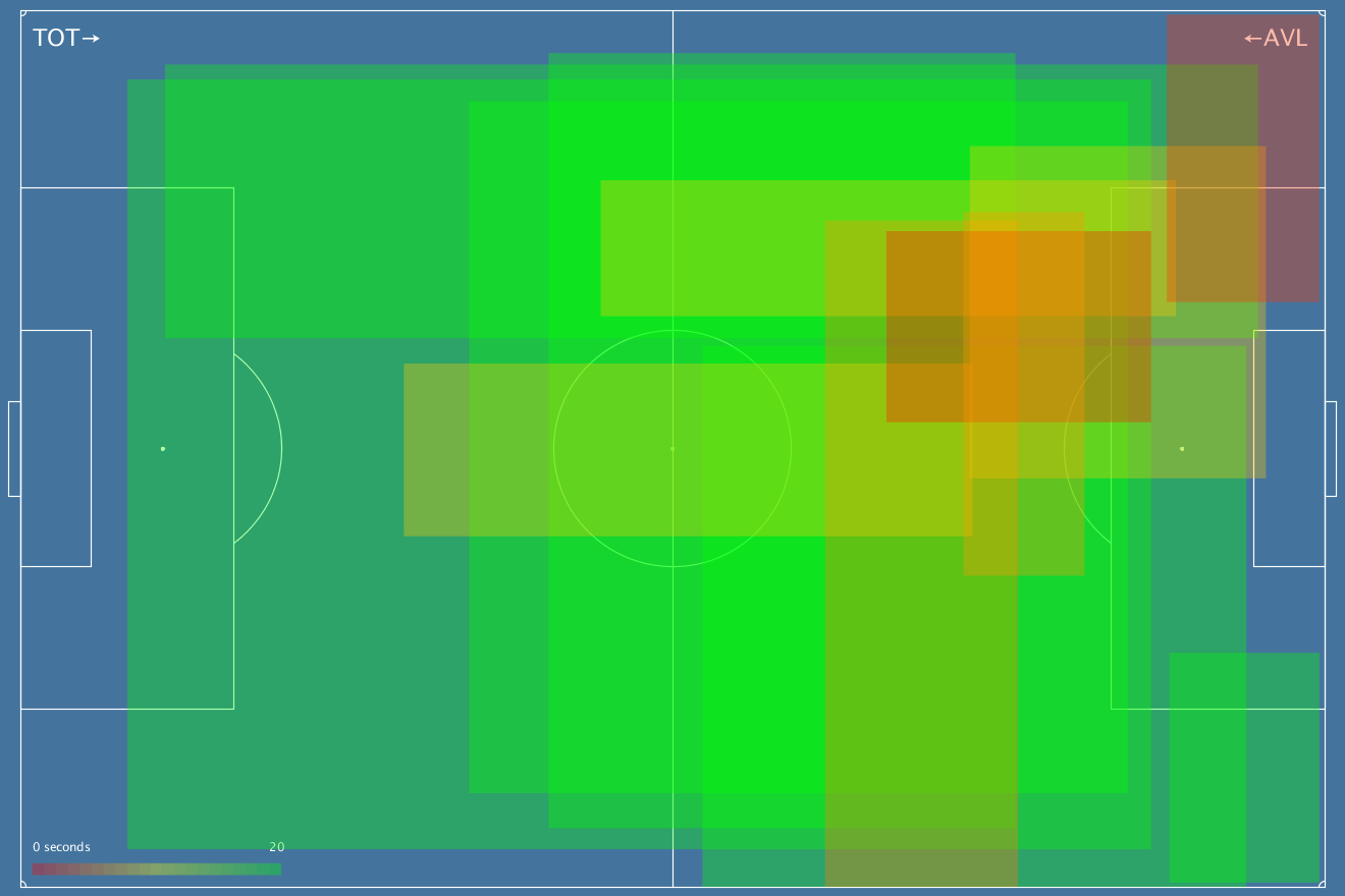
The boxes are the bounds of an attack, so you can see how wide and how high it went. The colour represents duration – faster attacks are more red, slower attacks with more buildup are green. What can you see here beyond a bit of a mess? Well, tons of shots, for one. Some slow, expansive buildup play, but plenty of more faster penetrative moves too, especially through the centre and to the left of the penalty box, where the first and second goals came from.
Here’s the reverse, with Aston Villa’s attacks from that game:
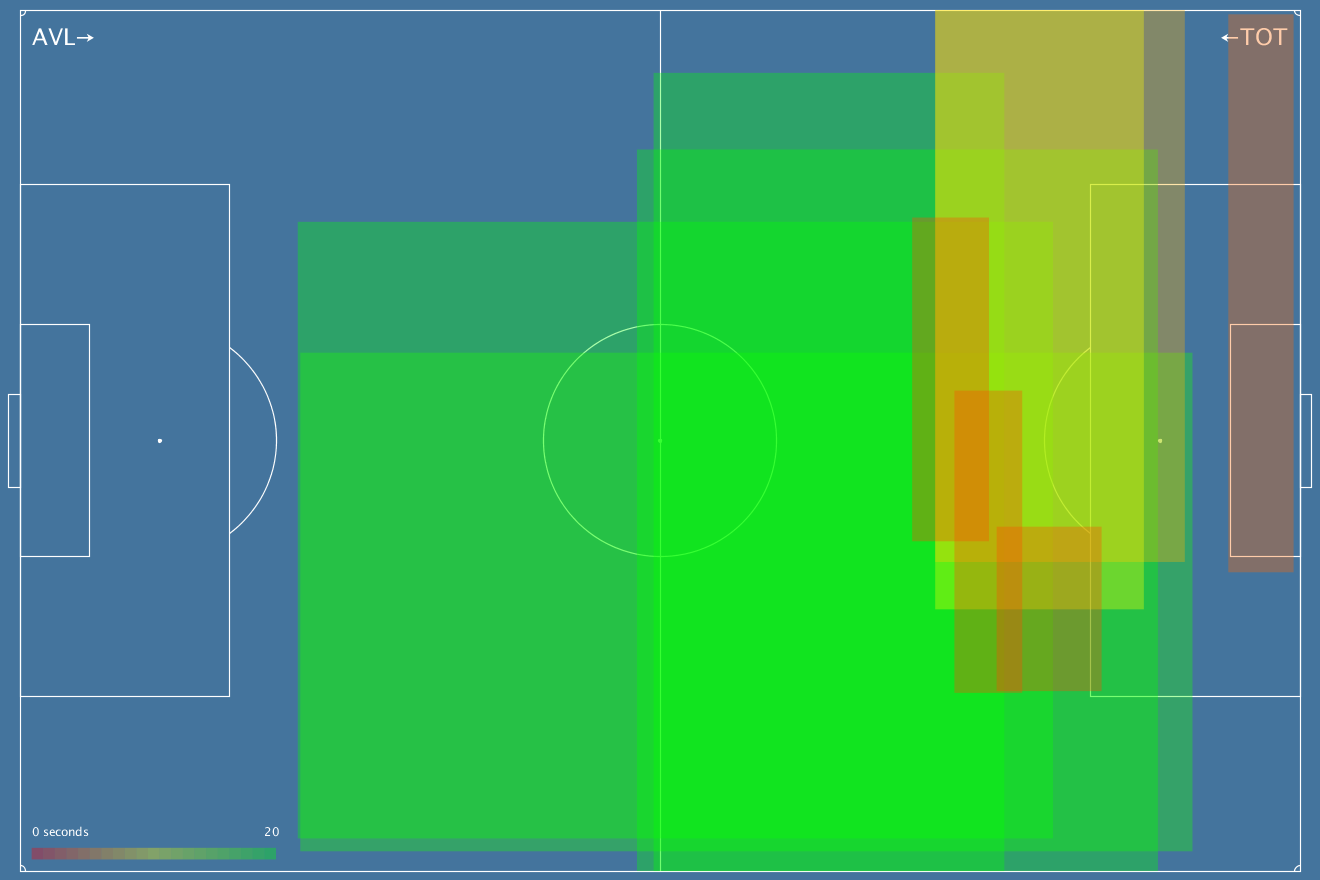
Much less going on here, a lot of wide, flat moves, not a ton of penetration.
Here’s Liverpool against Chelsea:
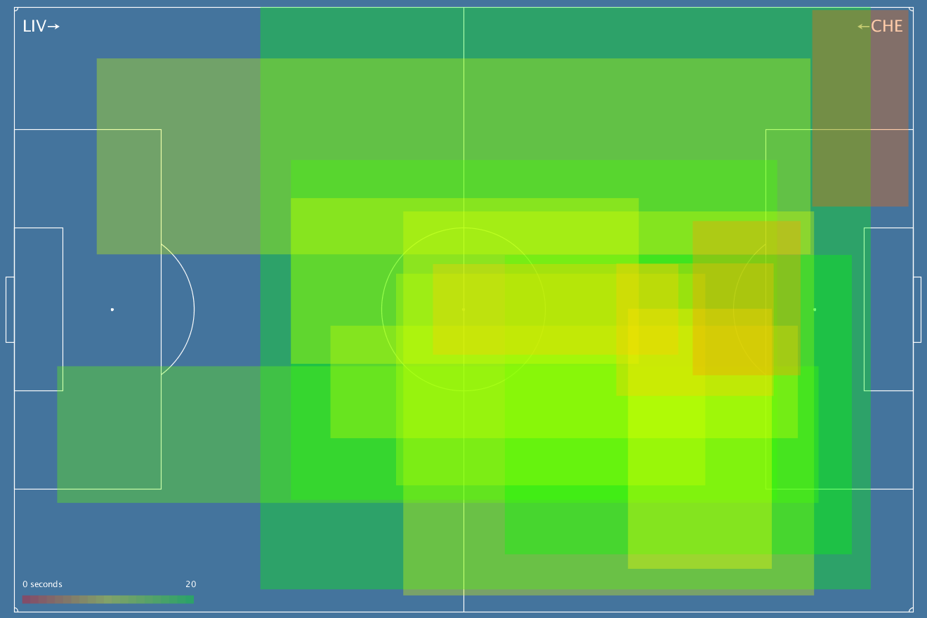
Lots going on in the middle, including a few signs of pace. Chelsea’s chart is pretty abject though:
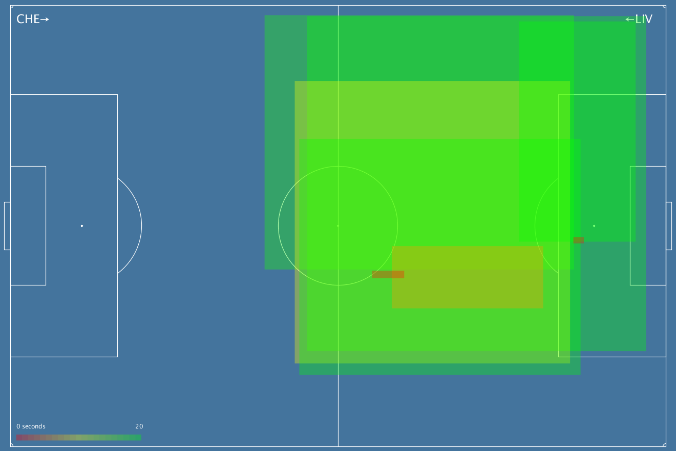
I mean, at least they’re starting high up the pitch, but these slow, spacey moves don’t seem that scary, and they’re not pushing far into the box. Those tiny, slightly redder boxes? I thought they were a bug, but no – the one near the half way line is Oscar winning the ball and shooting from 40-odd yards. The one in the box is Falcao winning a header after a rebound of Sakho from an Oscar shot (remember we don’t follow moves across rebounds).
But if you want pure comedy value, let’s have a look at Crystal Palace’s 0-0 draw with Man Utd:
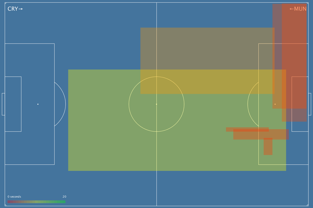
Not a lot going on here, but Palace one of teams with shortest moves in the league and that shows here, on top of a little bit of excitement on that right-hand side of the box. But forget all of that, up next is the single saddest chart I have ever seen in my life:
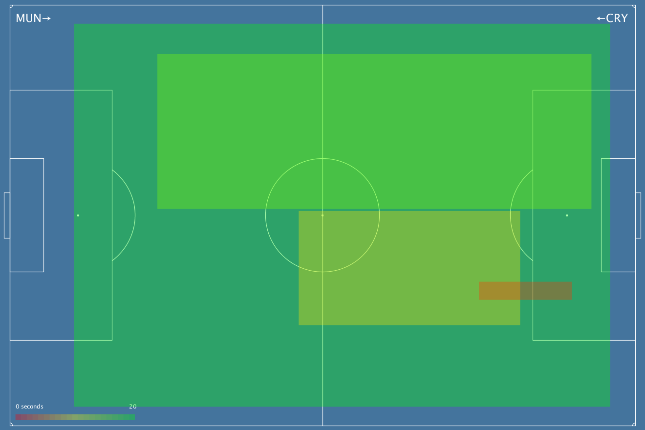
I shit you not. Now, this isn’t every shot Man Utd took, they had a free-kick on target if you remember, and those don’t show up in this data. But seriously, this was what their slow, rambling build-up looked like when it actually happened. Good clean sheet, though.
So… the busier these get the harder they are to parse, I think, but I still like them. If anyone has any ideas for different ways they’d like to see this data mangled, by all means get in touch. Have REPL, will program. And if there are any particular games you’d like to see this way, just ask and I’ll tweet them out.

[…] но одобренной нашим футбольным экспертом Дамиром, представление результатов футбольных матчей, автор: Том Лоуренс (Thom Lawrence). Прямоугольники — атаки, […]
LikeLike
[…] Visualising Attacking Shape […]
LikeLike
[…] thought out, dead-end crap. I got likes and retweets… precious #numbers on Twitter for those polygonal attacking charts, and numbers are the mind killer. You get addicted to the numbers. You feel validated by the […]
LikeLike