Gab Marcotti, talking on the excellent Analytics FC podcast a couple of weeks ago, mentioned a stat that’s sometimes talked about in Europe, but less so over here in the UK – a team’s centre of gravity. This is a single point on the field that shows the team’s average position. It might not seem hugely revealing taken in isolation, but comparing teams, matches, or seasons, you can see some movement and draw some conclusions.
I thought about ways to visualise this, and thought just a couple of dots on an empty pitch would be a little underwhelming, but then I realised we could go a bit further. I want to try to create the simplest possible visualisation that can give you the general gist of a team’s positioning and passing, and so I’ve calculated the following:
- A team’s centre of gravity in each match. This is just the average of all that team’s touches in the match.
- The average starting position of that team’s passing, which will hopefully show roughly where the team is using the ball and starting moves. I’ll call this pass origin.
- The average ending position of the team’s passes, which might reveal the length of their passes, or a preference for one wing over the other. Although note that sideways passes can cancel each-other out, so you’ll see most lines pointing through the middle – later we might want a way to show a team’s preference for forwards versus sideways passing, but we don’t have it here. Anyway, I’ll call this ending position of passes pass destination.
I’ve calculated these by using all touches, but only successful passes, and I’ve removed goal kicks and drop kicks because I feared they would somewhat skew the numbers. Let’s tell the tale of two matches and see if we can make sense of them – here’s Arsenal’s 5-2 win over Leicester from September:
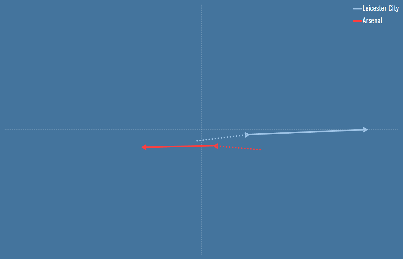
I’ll jazz these up at some point, but for now, here’s what you’re seeing: the graph represents the middle third of the middle third of the pitch, so a rectangular block in the middle, the centre spot being where the dotted axes cross. The start of the dotted line is the centre of gravity, the average of a team’s touches. The end of the dotted line, and the start of the solid line, is the pass origin – the average position in which passes were attempted. And the end of that line is the pass destination, the average position of a pass completion. The arrows show the direction of play. So what conclusions would we draw at a glance here?
- Leicester seemed to be pushing up near the half way line. Some of this might be score effects – they only led for 5 minutes, and trailed from 33 mins onwards. But some might just be a decision to play a high line against a good attack, a decision we’ve seen blow up before.
- Leicester’s passing was longer than Arsenal’s. Perhaps you’ll remember the long ball that led to Vardy’s opener.
- Arsenal leaned a little to the left of the pitch, which was, incidentally, hat-trick scorer Alexis Sanchez’s side that day.
Whether or not that tells much of a story of the match on the day is up for debate, obviously I can interpret the lines to fit the facts but that proves little. But let’s compare to another Arsenal game, this time the 3-0 win over Manchester United:
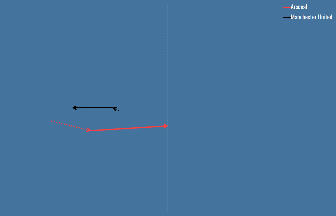
Well this is a slightly different Arsenal – much deeper, with Man Utd camped out in the Arsenal half, chasing a 3-0 deficit after 20 minutes. You’d be forgiven for perhaps interpreting the deeper Arsenal play and longer balls as a superb counter-attacking performance, but I think that’s misleading – they dominated totally early on, and then shelled effectively. That identifies straight away a risk with these visualisations, and indicates I should probably be at least splitting them into halves, or event better dividing them up for each goal. Perhaps it’s possible to fit that on one graph, who knows.
Wanna see a real counter-attacking performance? Here you go:
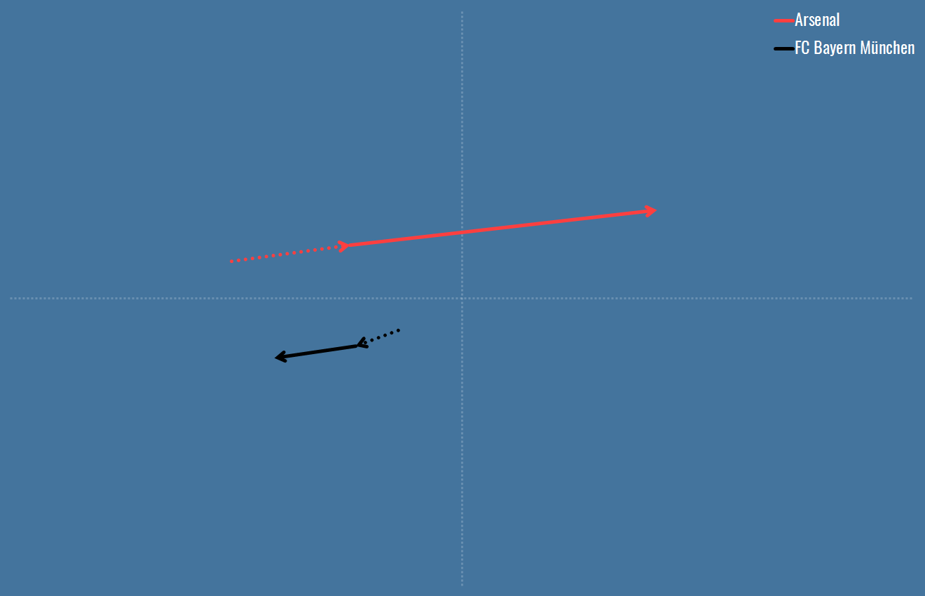
Deep again, even longer balls forwards, and Bayern compressed here as you might expected when you average their 600-odd passes.
So, I think this is an interesting way of glancing at games. It doesn’t reveal the whole story, but I think with a bit more granularity, it’s an interesting kicking off point for a game’s narrative. When I’ve got these automated I’ll start putting them out for each game, and there are a few comparisons I’d like to make in the future, e.g. Barcelona’s evolution over the last few years. If anyone has any specific requests or wants some limited data to play with their own visualisations, just get in touch.
And finally, another shout out to the Analytics FC podcast which inspired the work here!

[…] Visualising Centre of Gravity […]
LikeLike